
Content Switcher
A Content Switcher is a useful widget that allows you to change between multiple types of information on a webpage. You can use it for things like showing different product images, price lists, feature lists, or organized details. You can also use Elementor templates, Dynific Addons Templates, and sections inside the content section.
There are three different layouts to choose from, and you can select one and add your own content or use a pre-made design to display your information. It’s a versatile way to share content on your website.
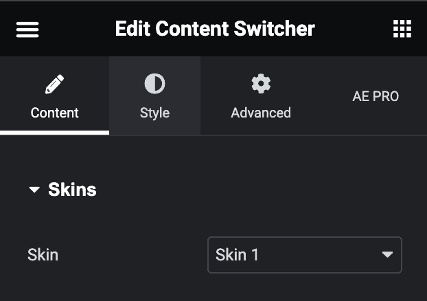
Content
Skins
- Skin: Select the layout from the preset layout skins.
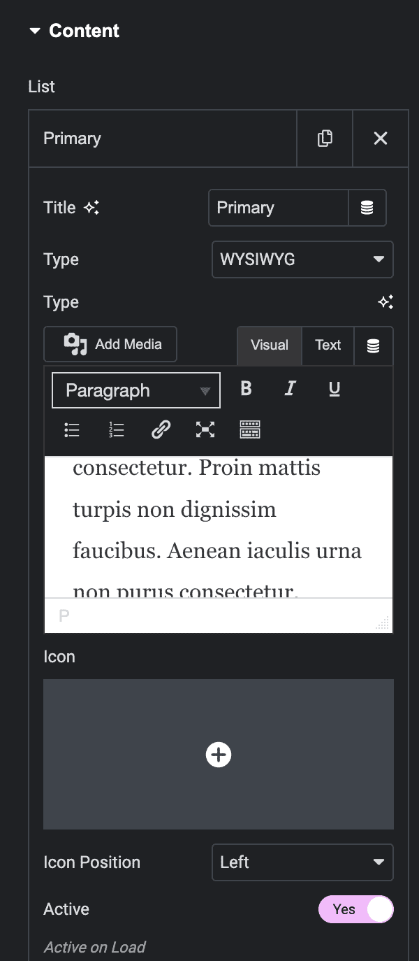
Content
- Title: Give a suitable title for each list item
- Type: Select existing Elementor templates and Sections, DA – Templates, or add your content directly in the Richtext editor. In the editor, you can edit the text visually and add images from the Media Library.
- Icon: Set an icon for each item in the switcher
- Icon Position: Adjust the position of the icon like left or right
- Active: Toggle the switch to set the content active on load.
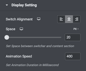
Display Settings
- Switch Alignment: Set the alignment for the switcher button and select from left, right, or center.
- Space: Set the space between the switcher and the content section.
- Animation Speed: Set the animation duration in milliseconds.
Style
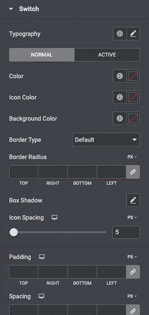
Switch
- Typography: Set the typography options for the text inside the switch button
- Color: Choose the background color of the switcher for Normal and Active States
- Icon Color: Set the icon color.
- Background Color: Select the background color.
- Border Type: Select the type of border, choosing from none, solid, double, dotted, dashed, or grooved.
- Border-radius: Set the border radius of a switch.
- Box-shadow: Set the box shadow of the switch.
- Icon Spacing: Adjust the space between the icon and the text.
- Padding: Set the padding.
- Spacing: Set the spacing.
Box Style
- Box Color: Set the Box color.
- Box Padding: Set the box padding.
- Border Type: Select the type of border, choosing from none, solid, double, dotted, dashed, or grooved.
- Border-radius: Set the border radius of a switch.
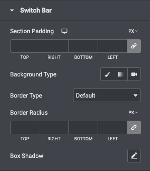
Switch Bar
- Section Padding: Set the padding parameters for the switcher container section.
- Background Type: Set the background type for the container.
- Border Type: Select the type of border, choosing from none, solid, double, dotted, dashed, or grooved.
- Border Radius: Set the border radius around the container to control corner roundness.
- Box Shadow: Set the box shadow.
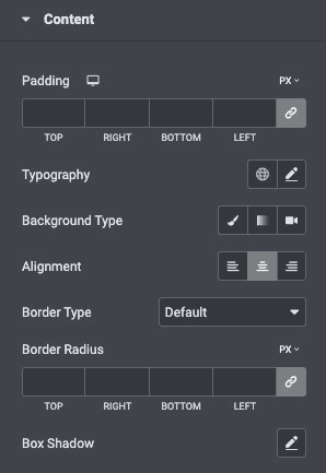
Content
- Padding: Set the padding for the content
- Typography: Set the typography.
- Background Type: Choose the background type from classic or linear.
- Alignment: Select the alignment.
- Border Type: Select the type of border, choosing from none, solid, double, dotted, dashed, or grooved
- Width: Set the width of the border around the content section
- Color: Choose a color for the border
- Border Radius: Set the radius of the border to control corner roundness.
- Box Shadow: Set the box shadow.
Check out the Demo page of Content Switcher.