
DA – Search Form
DA – Search Form widget displays the native WordPress search form. If gives you some design capabilities to enhance the look and feel of the form.
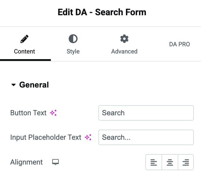
Content
General
- Button Text: Specify the button text. The default is “Search”.
- Input Placeholder Text: Here, you can specify the text that you want to keep as a placeholder in your search field.
- Alignment: It is used to specify a position to the search button. Alignment can be set as Left, Center, and Right.
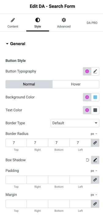
Style
General
Button Style
- Button Typography: Set the typography of button.
- Normal/Hover State
- Background Color: Choose the background color of search button.
- Text Color: Select the text color of button.
- Border Type: Choose the border type.
- Border Radius: Set the border radius.
- Box Shadow: Set the box shadow.
- Padding: Adjust the padding.
- Margin: Adjust the margin.
Input Style
- Input Typography: Set the typography of input text.
- Normal/Hover State
- Background Color: Choose the background color of input area.
- Text Color: Select the text color of input text.
- Border Type: Choose the border type.
- Border Radius: Set the border radius.
- Box Shadow: Set the box shadow.
- Padding: Adjust the padding.
- Margin: Adjust the margin.
