
YouTube Feeds
The YouTube Feed widget lets you display videos from your YouTube channel, playlist, or even keyword-based search directly on your website. With this widget, you can create a beautiful video gallery that matches your site’s design and keeps your visitors engaged.
It also gives you options to show channel details, choose layouts, style video cards, and manage how the videos appear, making it easy to showcase your YouTube content in an interactive way. It also offers to display the channel name, description, videos count, and even playlist name by using shortcode to get the dynamic details.
The YouTube Feed widget features the following controls.
Note: Make sure to add your YouTube API key in Addon Elements → Configuration to use this widget. Learn how to create a YouTube API key.
Content
Feed
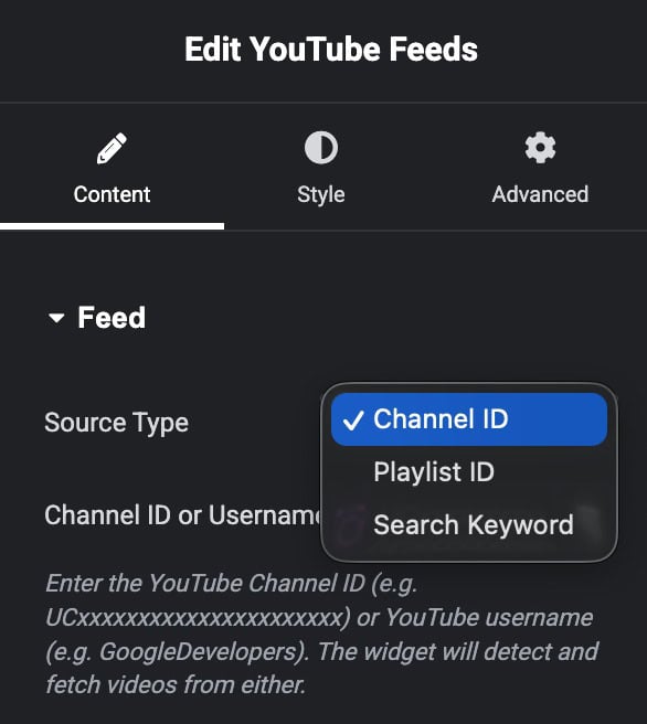
- Source Type: Choose how you want to show videos – by playlist ID, channel ID, or a search keyword.
- Playlist ID: Add your YouTube playlist ID to show videos from that playlist.
- Channel ID: Add your YouTube channel ID to show videos from your channel.
- Search Keyword: Type any word to fetch and display YouTube videos related to that keyword.
Header
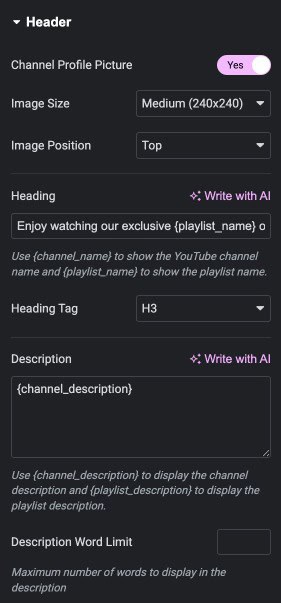
- Channel Profile Picture: Turn this on to show the channel’s profile image.
- Image Size: Specify the size of image.
- Image Position: Choose the position of image.
- Heading: Add a heading or use shortcodes to show dynamic content.
- Heading Tag: Select the heading tag.
- Description: Write a description or use shortcodes to display dynamic content.
- Description Word Limit: Set the maximum number of words to show in the description.
Channel Meta Data
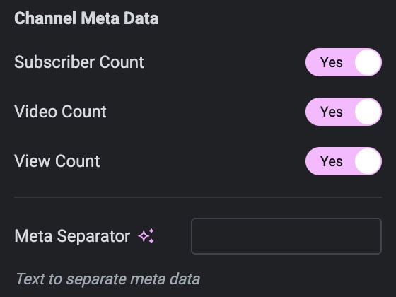
- Subscriber Count: Turn this on to show the total number of subscribers on your channel.
- Video Count: Turn this on to show the total number of videos on your channel.
- View Count: Turn this on to show the total number of views on your channel.
- Meta Data Separator: Choose the symbol or character to separate the channel details (like subscribers, videos, views).
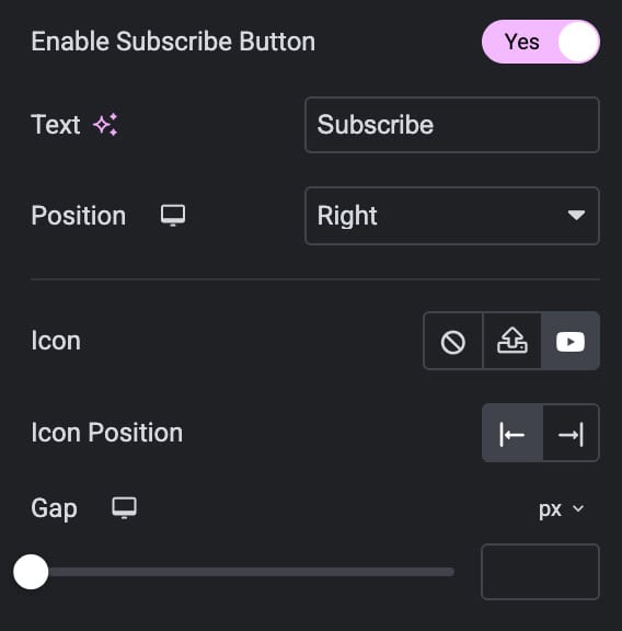
- Enable Subscribe Button: Turn this on to show a subscribe button.
- Text: Write the text to display on the button.
- Position: Choose where the icon should appear.
- Icon: Choose the icon for subscribe button.
- Icon Position: Choose the position of icon.
- Gap: Set the space between the icon and the button text.
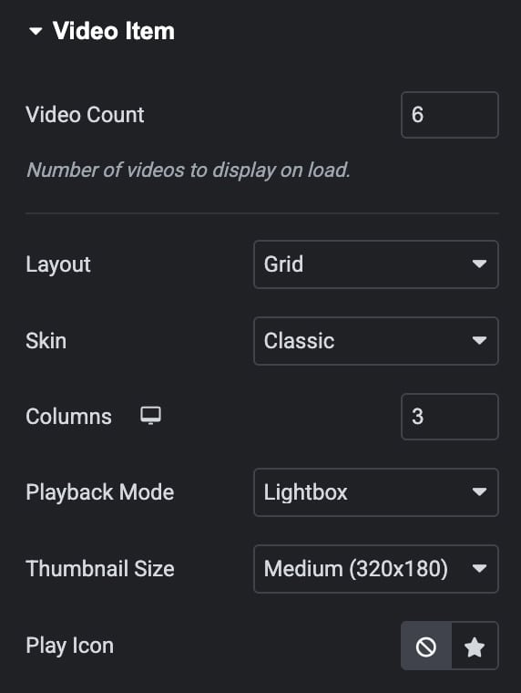
Video Item
- Video Count: Specify the number of videos to displayed.
- Layout: Pick a layout style to display the videos.
- Skin: Choose how the video layout looks, Classic or Card (works with Grid and Carousel).
- Columns: Select how many columns to display (for Grid and Masonry layouts).
- Playback Mode: Decide how videos play, Inline (play in the same box) or Lightbox (open in a popup).
- Thumbnail Size: Choose the size of the video thumbnail.
- Play Icon: Select the icon to use for the play button.
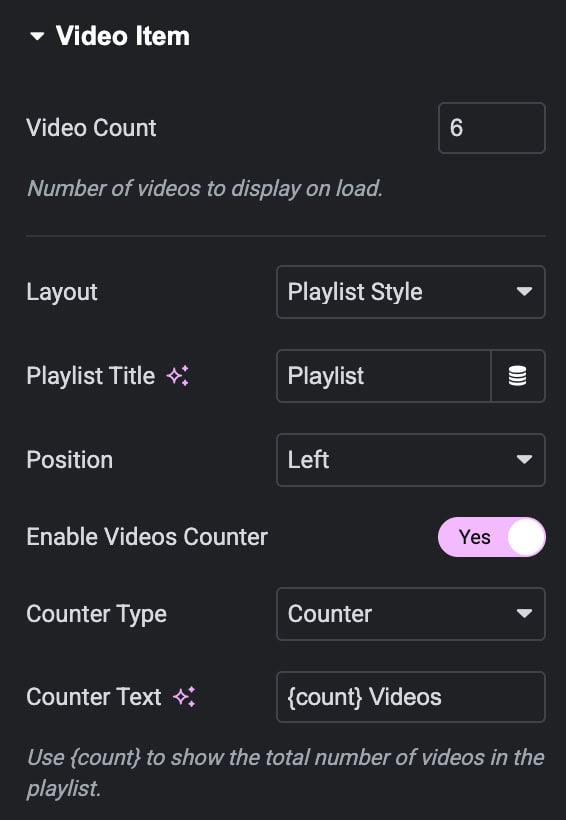
Settings for Playlist Style Layout
- Playlist Title: Add a title for the playlist.
- Position: Choose whether to show the playlist on the left or right side.
- Enable Video Counter: Turn this on to show numbers on videos.
- Counter Type: Select the style of counter from range or counter.
- Counter Text: Add text to show after the counter.
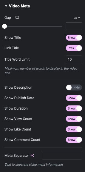
Video Meta
- Gap: Specify the gap between content.
- Show Title: Turn this on to display the video title.
- Link Title: Enable this so the video opens when someone clicks the title.
- The Word Limit: Set a word limit for the title.
- Show Description: Turn this on to display the video description.
- Show Publish Date: Enable this to display the video publish date.
- Show Duration: Turn this on to show the video’s duration.
- Show Views Count: Turn this on to show the total views of the video.
- Show Likes Count: Turn this on to show the total likes of the video.
- Show Comments Count: Turn this on to show the total comments of the video.
- Meta Data Separator: Choose the symbol/character to separate meta details.
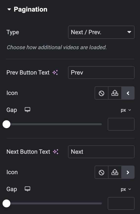
Pagination
- Pagination Type: Choose how users move through videos, Next/Prev buttons, Load More button, or None.
Next/Prev Pagination
- Prev Button Text: Write the text for the previous button.
- Icon: Select an icon for the previous button.
- Gap: Set the space between the icon and the button text.
- Next Button Text: Write the text for the next button.
- Icon: Select an icon for the next button.
- Gap: Set the space between the icon and the button text.
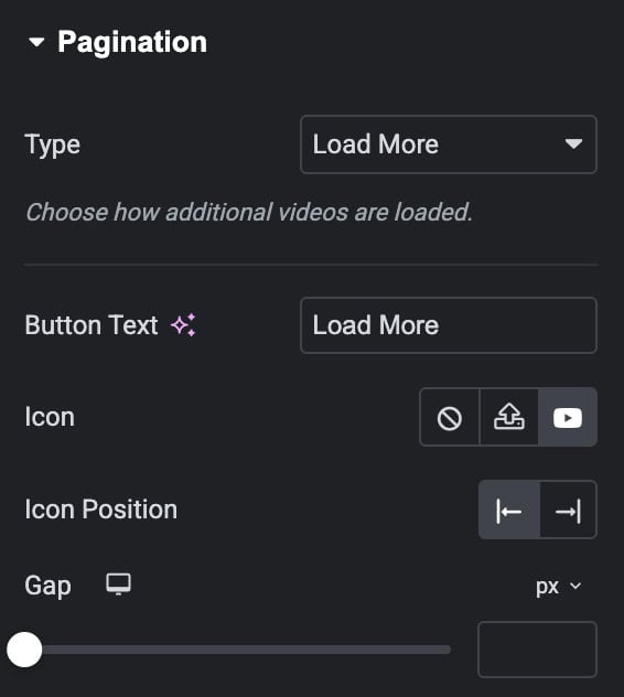
Load More Pagination
- Button Text: Enter the text for the “Load More” button.
- Icon: Choose an icon to display on the button.
- Icon Position: Select where the icon should appear, left or right of the text.
- Icon Gap: Set the space between the icon and the button text.
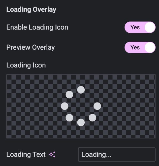
Loading Overlay
- Enable Loading Icon: Enable the option to display an icon during loading.
- Preview Overlay: See a preview of the loading icon in the editor.
- Loading Icon: Choose the icon.
- Loading Text: Enter the text to show while videos are loading.
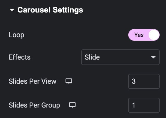
Carousel Settings
Note: These settings are applicable when you select Carousel as layout.
- Loop: Turn this on to make the carousel repeat infinitely.
- Effects: Choose the transition effect between slides.
- Slides Per View: Set how many slides are visible at a time.
- Slides Per Group: Set how many slides move at once when navigating.
Settings
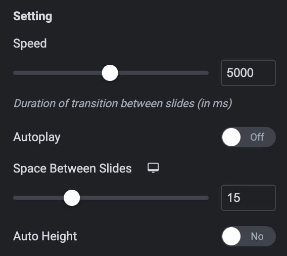
- Speed: Set how fast the slides transition.
- Autoplay: Turn this on to make the carousel play automatically.
- Pause on Interaction: Stop autoplay when the user interacts with the carousel.
- Duration: Set how long each slide stays visible during autoplay.
- Pause on Hover: Stop autoplay when the user hovers over the carousel.
- Auto Height: Turn this on to adjust the carousel height automatically based on slide content
Pagination
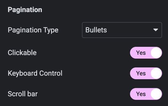
- Pagination: Choose how pagination looks, Bullets, Progress Bar, or Fraction.
- Clickable: Turn this on to allow users to click the bullets to navigate slides (applicable for Bullets type)
- Keyboard Controls: Turn this on to let users navigate slides using keyboard arrows.
- Scroll Bar: Turn this on to show a scroll bar for navigation.
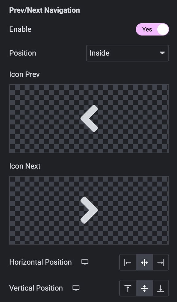
Navigation
- Navigation: Turn this on to show navigation arrows.
- Position: Choose where the navigation arrows appear – Inside or Outside the carousel.
- Previous Icon: Select the icon for the previous arrow.
- Next Icon: Select the icon for the next arrow.
- Horizontal Position: Set the horizontal placement of the arrows.
- Vertical Position: Set the vertical placement of the arrows.
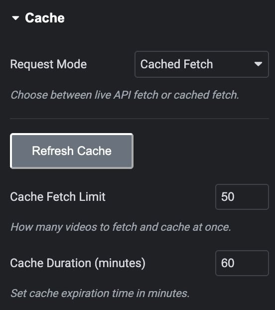
Cache
- Request Mode: Choose between Live API fetch or Fetch Cache.
- Refresh Cache: Click to clear and refresh the cached data.
- Cache Fetch Limit: Set how many videos to fetch and store in the cache.
- Cache Duration: Set how long the cached data should be saved before updating.
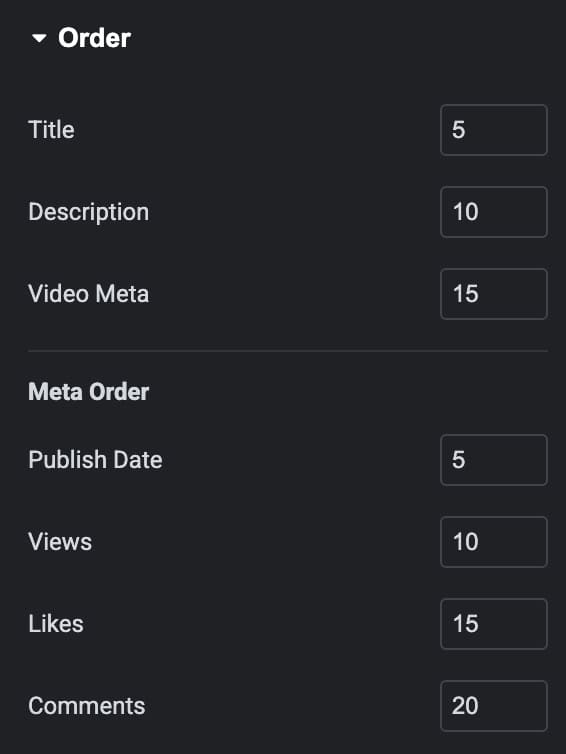
Order
Choose the order in which videos details appear.
- Title
- Description
- Video Data
Meta Order
- Publish Date
- Views
- Likes
- Comments
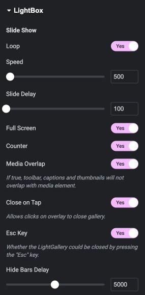
Lightbox
- Loop: Enables the slideshow to restart automatically after the last slide.
- Speed: Controls how fast slides transition during the slideshow.
- Slide Delay: Sets the waiting time before switching to the next slide.
- Full Screen: Allows the LightBox to open in full-screen mode.
- Counter: Shows the slide number and total slides in the gallery.
- Media Overlap: Prevents toolbar, captions, and thumbnails from overlapping the media.
- Close on Tap: Lets users close the gallery by tapping on the overlay.
- Esc Key: Allows closing the LightBox using the “Esc” key.
- Hide Bars Delay: Sets how long it takes for the top and bottom bars to auto-hide.
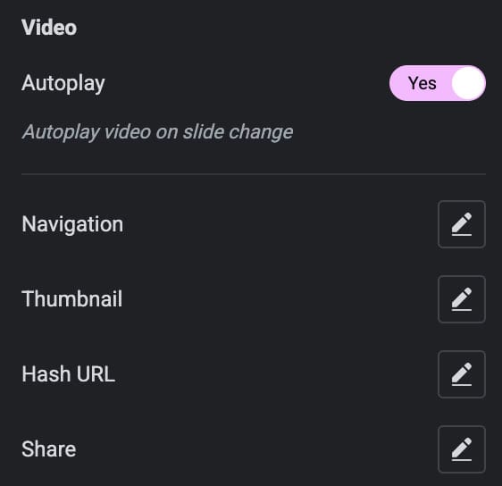
Video
- Autoplay: Automatically plays the video when the slide changes.
- Navigation: Enables navigation controls to move between slides.
- Thumbnail: Displays thumbnail previews for quick slide selection.
- Hash URL: Updates the browser URL based on the current slide.
- Share: Allows users to share the current media or gallery.
Style
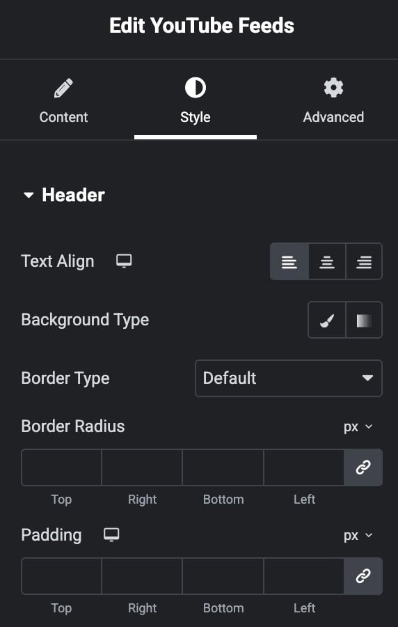
Header
- Text Align: Adjusts the horizontal alignment of the header text (left, center, or right).
- Background Type: Sets the header’s background style using color or gradient options.
- Border Type: Selects the border style for the header.
- Border Radius: Rounds the corners of the header by applying a custom radius value.
- Padding: Adds inner spacing inside the header area on all four sides.
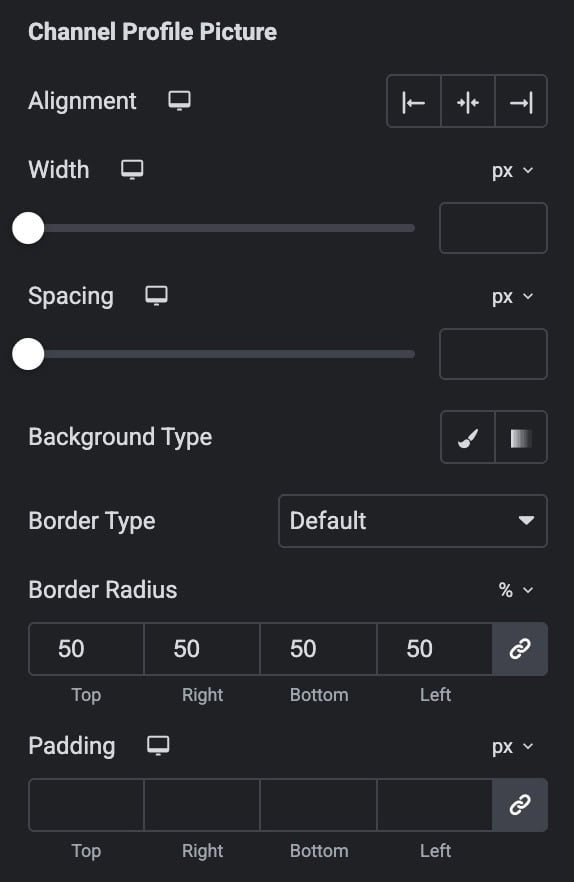
Channel Profile Picture
- Alignment: Sets the horizontal position of the profile picture.
- Width: Controls the size of the profile picture by adjusting its width.
- Spacing: Adds space around the profile picture for better layout separation.
- Background Type: Applies a solid color or gradient as the background behind the picture.
- Border Type: Selects the border style for the profile picture frame.
- Border Radius: Rounds the corners of the profile picture to create soft or circular shapes.
- Padding: Adds inner spacing between the profile picture and its container edges.
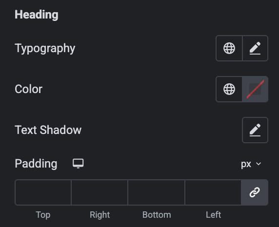
Heading
- Typography: Controls the typography of the heading text.
- Color: Sets the text color for the heading.
- Text Shadow: Adds a shadow effect.
- Padding: Adds the padding.
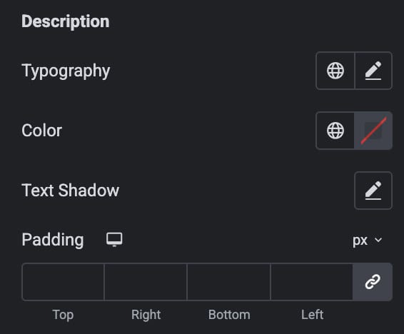
Description
- Typography: Controls the typography of the heading text.
- Color: Sets the text color for the heading.
- Text Shadow: Adds a shadow effect.
- Padding: Adds the padding.
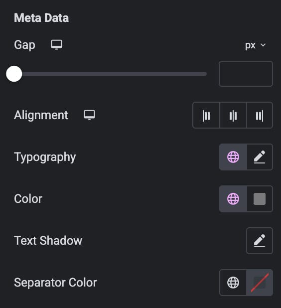
Meta Data
- Gap: Controls the spacing between individual meta items.
- Alignment: Sets the horizontal alignment of the meta data (left, center, or right).
- Typography: Adjusts the font style, size, weight, and spacing for meta text.
- Color: Defines the text color for the meta information.
- Text Shadow: Adds a shadow effect behind meta text for better emphasis.
- Separator Color: Sets the color of the separator line or symbol between meta items
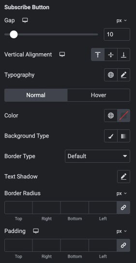
Subscribe Button
- Gap: Sets the spacing between the subscribe button and surrounding elements.
- Vertical Alignment: Adjusts the button’s vertical placement.
- Typography: Controls the button typography.
- Color (Normal/Hover): Defines the button text color for normal and hover states.
- Background Type: Applies a solid or gradient background to the button.
- Border Type: Selects the border style applied to the button frame.
- Text Shadow: Adds a shadow effect behind the button text for emphasis.
- Border Radius: Rounds the button’s corners.
- Padding: Adds inner spacing inside the button around its text.
Icon
- Color: Sets the color of the icon displayed inside the button.
- Hover Color: Changes the icon color when the user hovers over the button.
Video Item
Set the styling for Normal, Hover, and Active states.
- Background Type: Sets the background color or gradient for the video item.
- Border Type: Chooses the border style applied to the video item.
- Box Shadow: Adds a shadow around the video item for depth and emphasis.
- Border Radius: Rounds the corners of the video item for a softer look.
- Padding: Adds inner spacing inside the video item’s container.
Thumbnail
- Image Object Fit: Controls how the thumbnail image fills its container.
- Border Type: Sets the border style around the thumbnail image.
- Border Radius: Rounds the corners of the thumbnail for smoother edges.
- Overlay Color: Applies a colored overlay on top of the thumbnail image
Play Icon
- Primary Color: Sets the main color of the play icon.
- Secondary Color: Applies an additional color for dual-tone icon designs.
- Size: Controls the overall size of the play icon.
- Padding: Adds spacing around the icon within its container.
- Rotate: Rotates the play icon by a specified degree.
- Border Width: Adjusts the thickness of the icon’s border on each side.
- Border Radius: Rounds the icon’s corners to create softer or circular edges.
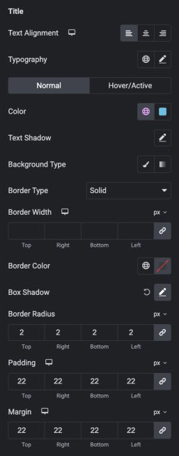
Title
Set some styling for normal and hover/active states.
- Text Alignment: Sets the horizontal alignment of the title (left, center, or right).
- Typography: Controls the title’s font style, size, weight, and spacing.
- Color: Defines the title text color.
- Text Shadow: Adds a shadow effect behind the title text for visual depth.
- Background Type: Applies a solid or gradient background behind the title.
- Border Type: Selects the style of the border around the title area.
- Box Shadow: Adds a shadow around the title container for emphasis.
- Border Radius: Rounds the corners of the title container.
- Padding: Adds inner spacing within the title container.
- Margin: Sets the outer spacing around the title element.
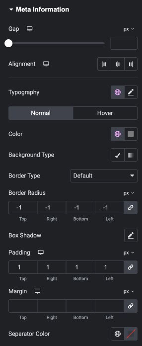
Meta Information
Set some Styling for Normal/Hover States.
- Gap: Adjusts the spacing between individual meta items.
- Alignment: Sets the horizontal alignment of the meta information (left, center, or right).
- Typography: Controls the typography for meta text.
- Color Defines the text color of meta information.
- Background Type: Applies a solid or gradient background behind the meta section.
- Border Type: Selects the style of the border around the meta information container.
- Border Radius: Rounds the corners of the meta information area.
- Box Shadow: Adds a shadow around the meta container for visual depth.
- Padding: Adds inner spacing inside the meta information container.
- Margin: Sets the outer spacing around the meta information block.
- Separator Color: Defines the color of the divider between meta items.
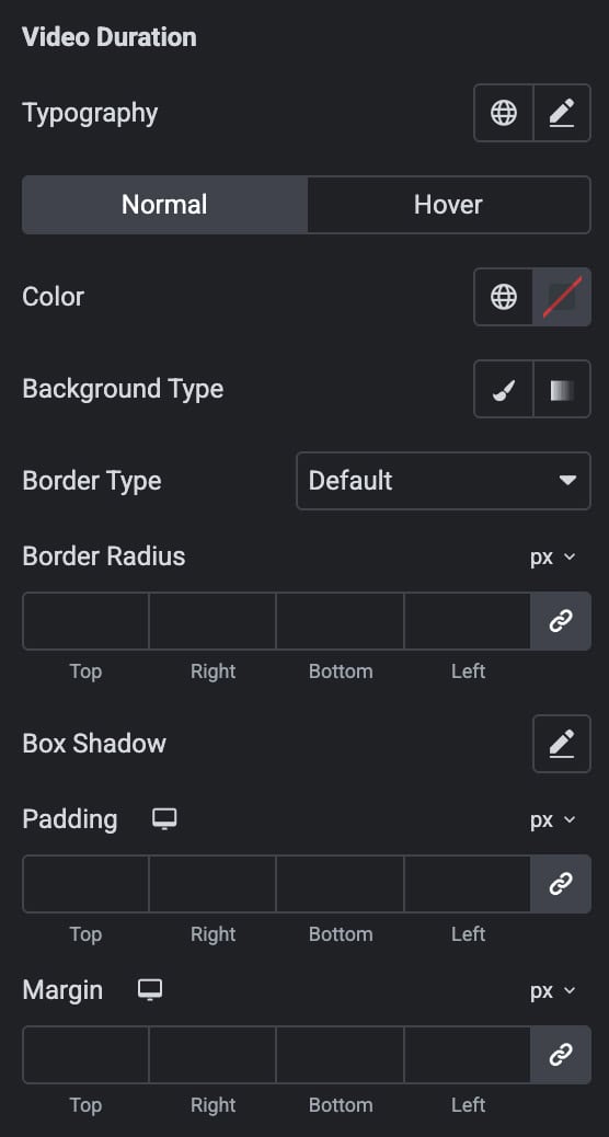
Video Duration
Set some Styling for Normal/Hover States.
- Typography: Controls the font style, size, and weight of the duration text.
- Color: Sets the text color for the duration in normal and hover states.
- Background Type: Applies a solid or gradient background behind the duration label.
- Border Type: Selects the style of the border around the duration container.
- Border Radius: Rounds the corners of the duration label container.
- Box Shadow: Adds a shadow around the duration label for visual depth.
- Padding: Adds inner spacing inside the duration container.
- Margin: Sets the outer spacing around the duration element.
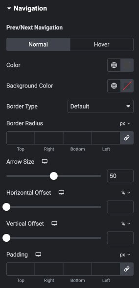
Navigation
Note: These settings are applicable for Carousel Layout.
- Color: Sets the color of the navigation arrows for normal and hover states.
- Background Color: Applies a background color behind the navigation arrows.
- Border Type: Selects the border style for the navigation buttons.
- Border Radius: Rounds the corners of the navigation button container.
- Arrow Size: Controls the size of the navigation arrow icons.
- Horizontal Offset: Adjusts how far the navigation arrows move horizontally.
- Vertical Offset: Adjusts how far the navigation arrows move vertically.
- Padding: Adds inner spacing inside the navigation button container.
Dots
- Dots Size: Controls the size of each navigation dot.
- Top Offset: Adjusts the vertical position of the dots from the top.
- Active Dot Color: Sets the color of the currently active dot.
- Inactive Dot Color: Defines the color of inactive/unselected dots.
- Margin: Adds outer spacing around the dots container.
Scrollbar
- Scrollbar Size: Controls the thickness of the scrollbar track.
- Scrollbar Drag Color: Sets the color of the draggable scrollbar handle.
- Scrollbar Color: Defines the background color of the scrollbar track.
Container
Note: These settings are not applicable for Carousel Layout.
- Row Gap: Controls the vertical spacing between items arranged in rows.
- Column Gap: Controls the horizontal spacing between items arranged in columns.
- Background Type: Applies a solid or gradient background to the container.
- Border Type: Sets the border style around the container.
- Border Radius: Rounds the corners of the container for a smoother shape.
- Padding: Adds inner spacing inside the container around its content.
Pagination
Note: These settings are not applicable for Carousel Layout.
- Alignment: Sets the horizontal alignment of the pagination (left, center, or right).
- Spacing: Adjusts the space between individual pagination items.
- Typography: Controls the font style, size, and weight for pagination text.
Normal / Hover
- Color: Sets the pagination text color for normal and hover states.
- Background Type: Applies a solid or gradient background behind each pagination item.
- Border Type: Selects the border style for pagination items.
- Border Radius: Rounds the corners of each pagination item.
- Padding: Adds inner spacing inside each pagination item.
Playlist
Note: These settings are applicable for Playlist Style Layout.
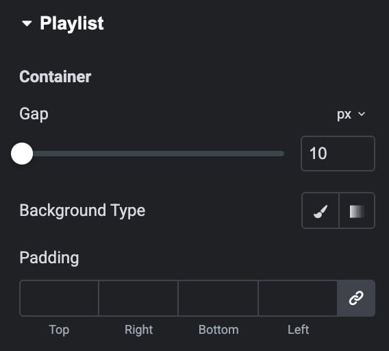
Container
- Gap: Controls the spacing between playlist items inside the container.
- Background Type: Applies a solid or gradient background to the playlist container.
- Padding: Adds inner spacing inside the playlist container around its content.
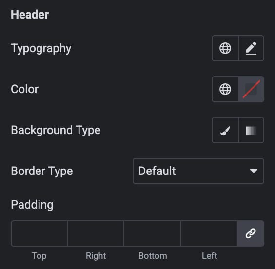
Header
- Typography: Controls the font style, size, and weight of the header text.
- Color: Sets the text color for the header.
- Background Type: Applies a solid or gradient background to the header area.
- Border Type: Selects the border style around the header.
- Padding: Adds inner spacing inside the header section.
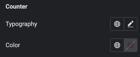
Counter
- Typography: Adjusts the font styling of the counter text.
- Color: Sets the text color for the counter value.
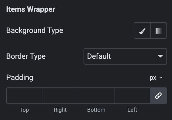
Items Wrapper
- Background Type: Applies a solid or gradient background to the item wrapper.
- Border Type: Defines the border style for the wrapper container.
- Padding: Adds inner spacing inside the item wrapper area.
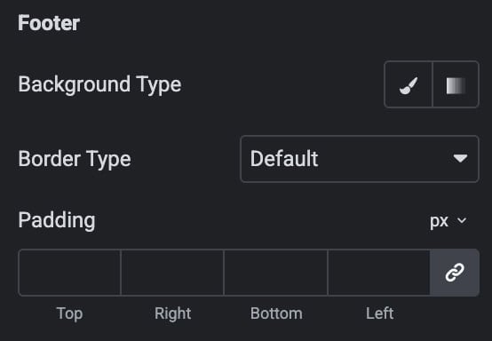
Footer
- Background Type: Applies a solid or gradient background to the footer area.
- Border Type: Sets the border style around the footer.
- Padding: Adds inner spacing inside the footer section.
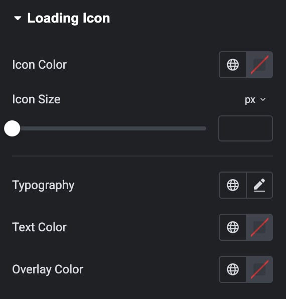
Loading Icon
- Icon Color: Sets the color of the loading/spinner icon.
- Icon Size: Controls the overall size of the loading icon.
- Typography: Adjusts the font styling of the loading text.
- Text Color: Defines the color of the loading message text.
- Overlay Color: Applies a background overlay color behind the loading area.