DA – Post Content
DA – Post Content is used to display the content of your post. Under it, you have many different options to style your content.
Content
Layout Settings
- Content: Here, you can define the source of the content. You can use this widget to show Post Content and Term Description (e.g., Category description).
- Show Excerpt: This option lets you define whether you want to show the full content of just the excerpt. For an excerpt, you can choose the word length of your content. You will be asked to input the word length under the Excerpt Size option. It will use the Post Excerpt if available otherwise, it will use Post Content and strip it as per defined excerpt size.
- Enable the_content hooks: Activate this option to enable the hook.
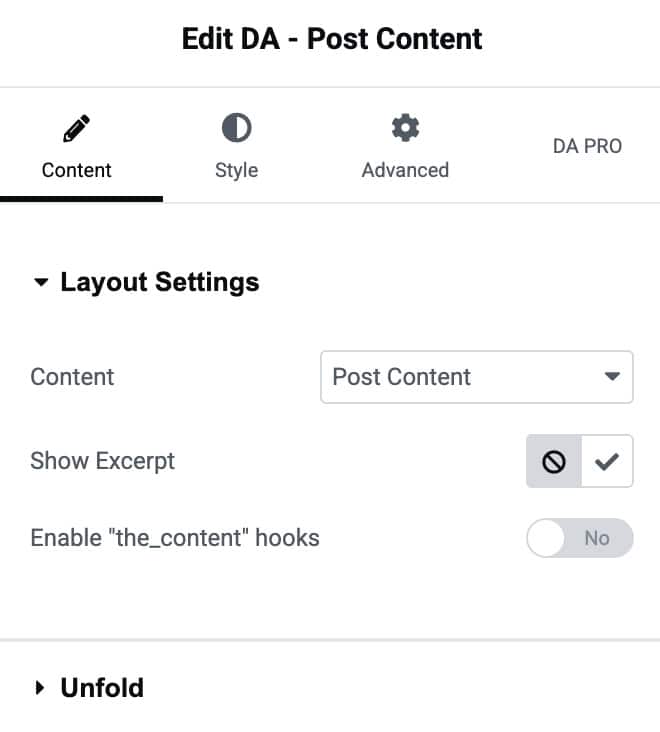
Unfold
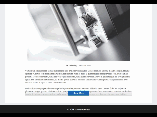
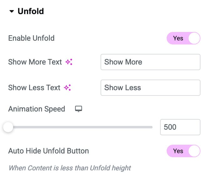
Unfold provide a unique feature where all your content is not visible on page load. A limited part of the content is displayed initially, with a button to expand at the end of the content. You can click on that button to toggle content visibility.
- Enable Unfold: Activate the option to enable the unfold feature.
- Show More text: Edit and input the text you want to show on the button when your content is hidden, and you want to expand the content.
- Show Less Text: Input the text you want to show on the button when your content is in expanded form.
- Animation Speed: This option will help you to increase or decrease the speed of the toggle button.
- Auto hide Unfold Button: Enable this option to automatically hide the unfold button when content length is short.
Style
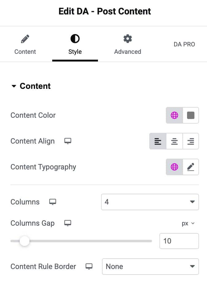
Content
- Content Color: Set the text color for the content displayed in the widget.
- Content Align: Adjust the horizontal alignment of the content.
- Content Typography: Customize the font style, size, weight, and spacing for the content text.
- Columns: Choose the number of columns to display the content in.
- Columns Gap: Adjust the spacing between each column for better layout control.
- Content Rule Border: Select a border style to separate content items visually.
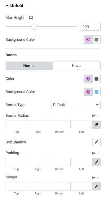
Unfold
- Max Height: Set the maximum height of the content before the “Unfold” button appears.
- Background Color: Choose the background color for the folded content area.
Button
- Color: Set the button text color for normal or hover state.
- Background Color: Choose the button background color for normal or hover state.
- Border Type: Select the border style for the unfold button (default, solid, dashed, etc.).
- Border Radius: Control how rounded the button corners appear (linked or individual).
- Box Shadow: Add a shadow effect to the button for depth and emphasis.
- Padding: Adjust the inner spacing inside the button for better sizing.
- Margin: Add outer spacing around the button to position it properly.