DA – Taxonomy
DA – Taxonomy widget is used to display terms from custom taxonomies of the current Post.
There are various options available to manage the content and layouts of the output.
It can be used on a single post template and also in Block Layout to be used by the Post Blocks widget.
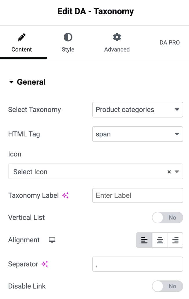
Content
General
- Select Taxonomy: Select the taxonomy from which you want to display the terms
- HTML Tag: Select the HTML tag that you need to be used for rendering taxonomy items – div, span, H1, etc…
- Icon: You can choose an icon to be displayed before the taxonomy item (Term)
- Taxonomy Label: Specify a label that will appear before the Term.
- Vertical List: You can choose to display multiple terms in the vertical list. (Default is horizontal)
- Alignment: Helps to adjust your content Alignment.
- Separator: Specify a separator to be used to separate multiple terms.
- Disable Link: Disable the archive link on Taxonomy Terms.
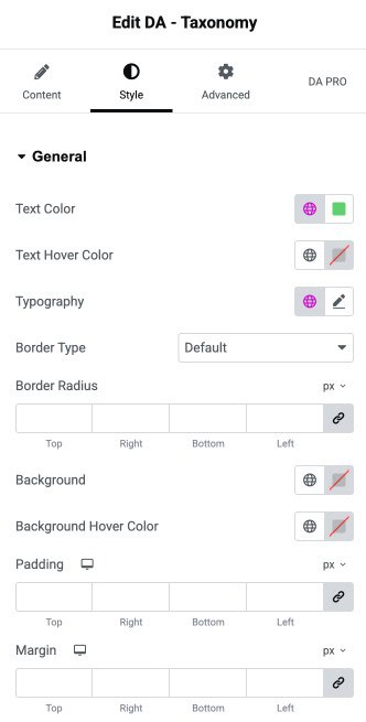
Style
General
- Text Color: Set the default color for the general text content.
- Text Hover Color: Choose the text color shown when the user hovers over it.
- Typography: Control the font styling such as size, weight, family, and spacing.
- Border Type: Select the border style for the element.
- Border Radius: Define rounded corners for the element by adjusting radius values.
- Background: Set the background color or gradient for the general element.
- Background Hover Color: Choose the background color applied on hover.
- Padding: Add inner spacing around the element on all sides.
- Margin: Add outer spacing around the element on all sides.