DA – Trigger
Use the DA – Trigger widget for the accordion and carousel layouts to invoke an action when the trigger item is clicked. For example, create Triggers for actions like moving to the previous slides, pausing the carousel animation, or closing all accordion tabs when the trigger item is clicked. You can create Triggers for all the DA widget that supports Carousel and Accordion layouts, like DA-Post Blocks ADV, ACF Repeaters, etc. You just need to use the trigger id of that particular widget inside the DA – Trigger widget.
Content
General
- Skin: Select the display style of the triggers.
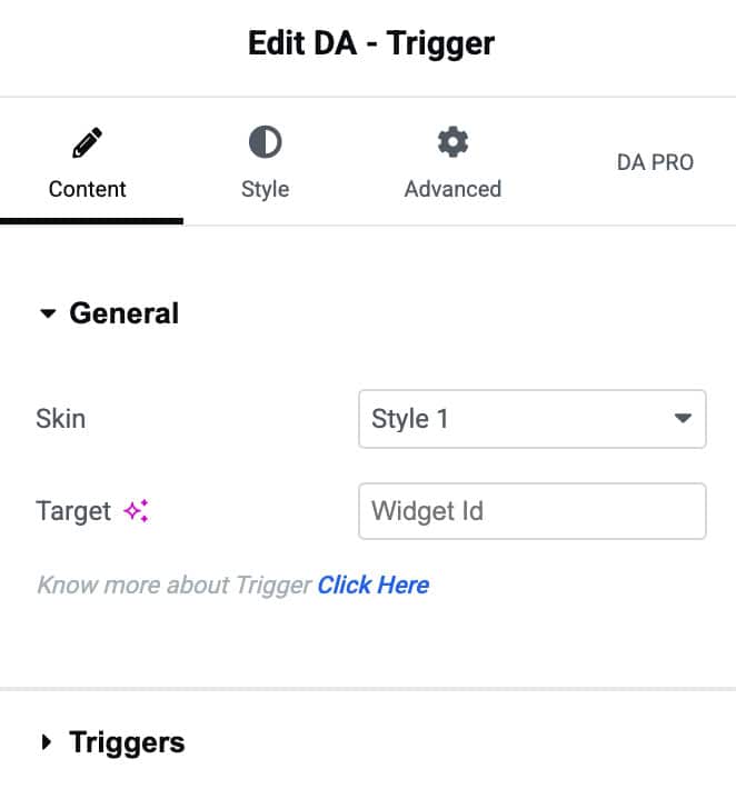
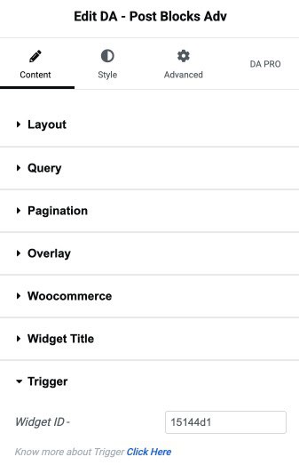
- Target: Enter the trigger id to invoke the trigger action on Carousel or Accordion layouts. You will get this id under the Trigger label of all the widgets supporting the Carousel and Accordion layout styles. For example, in Post Blocks Advanced, When you select layout style as Carousel or Accordion, you will see the Trigger option, just copy the id and paste it.
Triggers
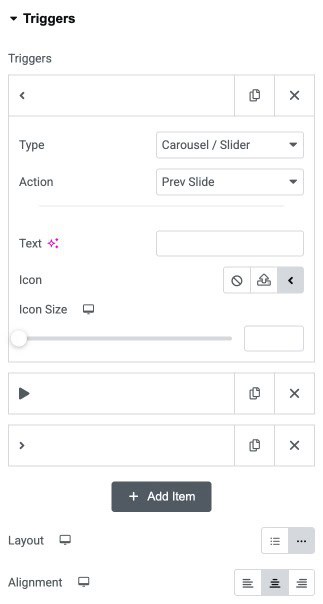
- Triggers: Click on the Add item button to add more items.
- Type: Select the Accordion or Carousel for which you want to add triggers
- Action: Specify the action to be performed by the triggers like previous, next, etc., based on Carousel and accordion-type.
- Text: Enter the text for the trigger button.
- Icon: Select an icon for the item.
- Icon Size: Set icon size.
- Layout: Set the positioning for the triggers like horizontal or vertical.
- Alignment: Set the trigger item alignment like left, center, or right.
Style
General
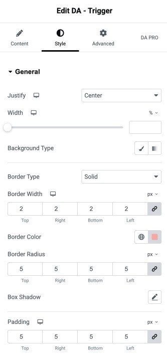
- Justify: Align the content horizontally inside the container (left, center, right, or justified).
- Width: Adjust the width of the container using the responsive slider.
- Background Type: Choose a solid or gradient background for the container.
- Border Type: Select the style of the border (solid, dashed, none, etc.).
- Border Width: Set the thickness of the border on all sides of the container.
- Border Color: Choose the color for the container border.
- Border Radius: Adjust the roundness of the container’s corners (linked or individual).
- Box Shadow: Apply shadow effects to the container for improved depth and styling.
- Padding: Add inner spacing inside the container to control content spacing.
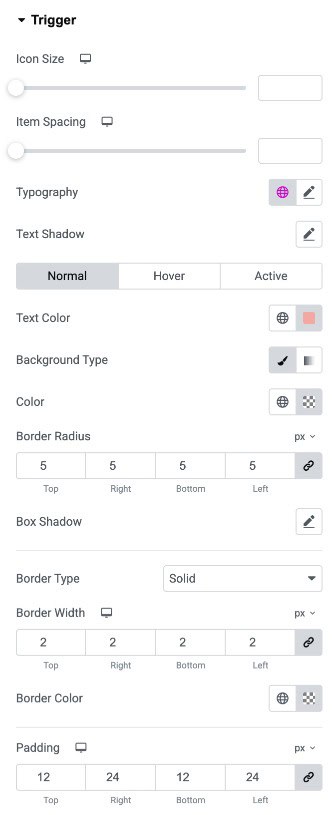
Trigger
- Icon Size: Adjust the size of the trigger icon using the slider.
- Item Spacing: Set the spacing between the trigger icon and the trigger text.
- Typography: Customize the font style, size, weight, and spacing for the trigger text.
- Text Shadow: Apply a shadow effect to the trigger text for added emphasis.
Normal/Hover/Active State
- Text Color: Set the default text color for the trigger.
- Background Type: Choose a solid or gradient background for the trigger.
- Color: Set the background color when using solid background type.
- Border Radius: Adjust the roundness of the trigger button’s corners.
- Box Shadow: Add a shadow effect to the trigger button for visual depth.
- Border Type: Select the border style for the trigge.
- Border Width: Adjust the thickness of the border on all sides of the trigger.
- Border Color: Choose the color for the trigger’s border.
- Padding: Add inner spacing inside the trigger button for proper sizing and alignment.