
DA – Taxonomy Custom Field
To display data from custom taxonomy, you can use the DA – Taxonomy Custom Field widget. It supports popular custom field plugins like ACF and Pods. You can even use it to fetch data from your custom-coded taxonomies. All you need is the meta key that has been used to save data in wp post_meta table.
Content
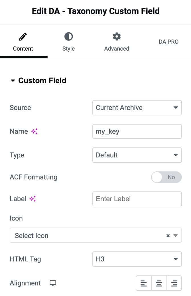
- Source: Select the source for the custom field as from Current Archives or Current Post. On selecting the Current Post, you will get an option to select the custom taxonomies and posts.
- Name: Name/Key of the custom field. Some custom field also calls it as Field Slug. If you are using a custom-coded custom field, this will be your custom field’s meta key.
- Type: It defines how this custom field data will be displayed on the front.
- Default: It refers to the default text mode. Whatever is saved in that field will be displayed as such.
- HTML: It is used to render data on the front end while maintaining Html formatting. It is beneficial in case you are adding data in the custom field using the WYSIWYG editor.
- Link: This option is used when your custom field contains a URL. You can use it as an anchor link on the front end. It can also be used on the front end to display a link on a dynamic text (fetch from another custom field).
- Image: It is useful when your custom field is returning the image path or image id. The best way is to configure your field to return the image id. Some custom field plugins like ACF allow you to set the return mode of the field.
- Video: Use it if your custom field has Youtube or Vimeo video URL. After selecting this option, you will get further options to customize player UI.
- Audio: It renders a native audio player with an Audio file URL entered in the custom field.
- oEmbed: It is used to embed videos, images, tweets, audio, and other content. Your custom field should return a valid oEmbed URL. Check here for a list of all WordPress-supported oEmbed providers.
- Date: If your custom field returns an item in data format, you can use it.
- ACF Formatting: Through this, you can give formatting to the ACF.
- Label: Here, you can provide a label to the field.
- Icon: An icon can be given to the field from here.
- HTML Tag: Select the HTML tag that you need to use for rendering field items.
- Alignment: Give alignment to the retrieved data like Left, Center, and Right accordingly.
Style
Custom Field
- Color: Set the default text color for the custom field value.
- Text Hover Color: Choose the text color when the user hovers over the custom field.
- Typography: Customize the font size, weight, style, and spacing for the custom field text.

Icon Settings
- Icon Color: Set the default color of the icon displayed next to the custom field.
- Icon Hover Color: Choose the icon color on hover for interactive feedback.
- Icon Spacing: Adjust the spacing between the icon and the text.
- Icon Size: Control the size of the icon using a slider.
- Background Color: Set the background color for the icon container.
- Border Type: Select the border style (default, solid, dashed, none, etc.) for the custom field box.
- Border Radius: Control how rounded the corners of the custom field container appear.
- Item Shadow: Add a shadow effect to the custom field container for depth.
- Padding: Add inner spacing around the custom field for better layout and spacing.
- Label Spacing: Adjust the spacing between the label and its value for improved readability.