DA – ACF Flexible Content
Using this widget, you can display the ACF Flexible Content field data. This widget allows you to display the ACF Flexible Content in different styles and templates.
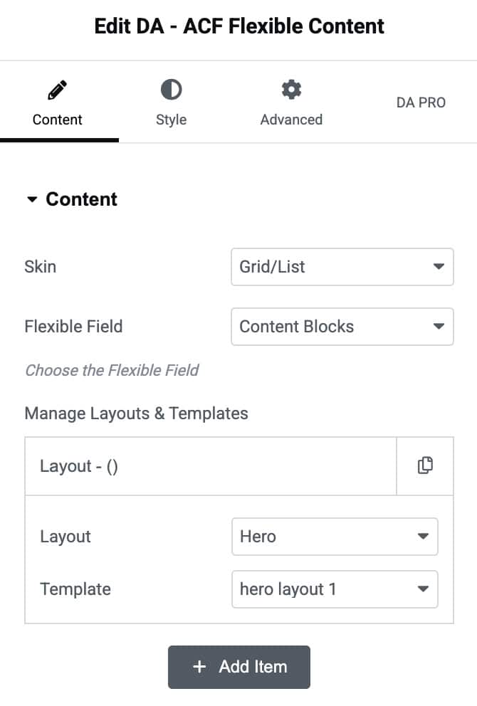
Content
Content
- Skin: Select the Grid or Carousel Layout style to display the ACF data.
- Flexible Field: Here, you need to select the field group that you created for flexible content.
- Manage Layout & Templates: Click on the Add item button to add ACF data.
- Item 1
- Layout: Select the layout created under the ACF Flexible Content field type.
- Template: Now, choose the ACF Block Layout created for the Flexible Content
- Item 1
You can add multiple repeater layouts by clicking on the Add Item button.
Grid
- Grid Layout: Select the layout style for the grid structure like List or Default.
- Column: You can specify the number of columns in which you want to display the information.
- Column Gap: Here, you can specify the amount of space between columns.
- Row Gap: Amount of space to be kept within two individual rows.

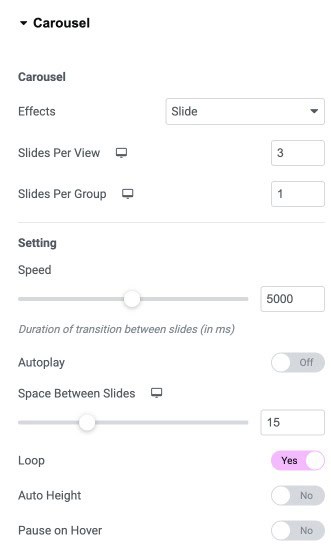
Carousel
Note: For Custom Field Type – Image set “Return Format” to “Post ID.” and for Gallery Type, set “Image Array” as return format.
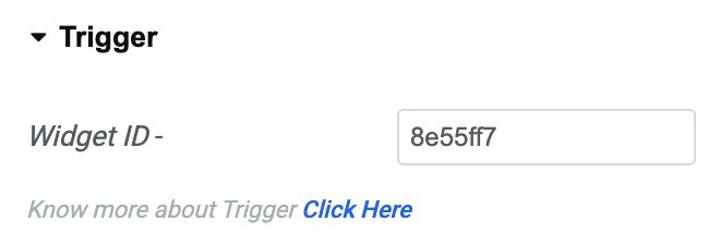
When selecting skin as Carousel, you will get control options to set the Carousel, and also a trigger – widget id is created to be used in DA – Trigger widget.
- Effects: Choose how each slide transitions, either Slide, Fade, Overflow, or Flip
- Slides Per View: Set number of slides to view at one time, maximum of 10
- Slides Per Group: Set number of slides to scroll per swipe, maximum of 10
Settings
- Speed: Set the time it takes for each slide to appear. This time is in milliseconds, so 1000 ms is equal to 1 second.
- Autoplay: Enable to apply autoplay to the slides
- Space Between Slides: Set the time between each slide.
- Loop: Show Carousel in a continuous loop, infinitely. Yes or No
- Auto Height: Enable to set the auto height to the Carousel
- Pause On Hover: Select whether or not to pause autoplay when on hover.
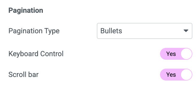
Pagination
- Pagination Type: Select None, Bullet, Fraction, or Progress
- Keyboard Control: Enable the option to activate the keyboard control.
- Scroll Bar: Enable the scroll bar
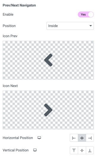
Prev/Next Navigation
- Enable: Enable the option to display the navigation icons.
- Position: Choose the position of icons.
- Icon prev: Select the icon you want for previous.
- Icon Next: Select the icon you want for next.
- Horizontal Position: Specify the horizontal position.
- Vertical Position: Specify the vertical position.
Triggers
Copy this widget Id and paste it in the DA- Trigger widget to add trigger action for the Carousel.
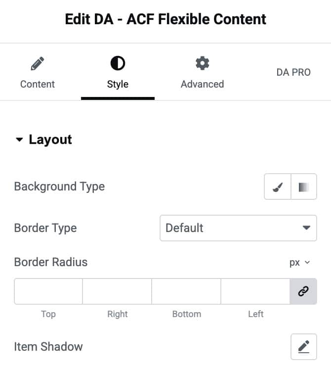
Style
Layout
- Background Type: Choose a solid or gradient background for the layout container.
- Border Type: Select the style of the border.
- Border Radius: Adjust the roundness of the container’s corners.
- Item Shadow: Apply shadow effects to the container for added depth and visual emphasis
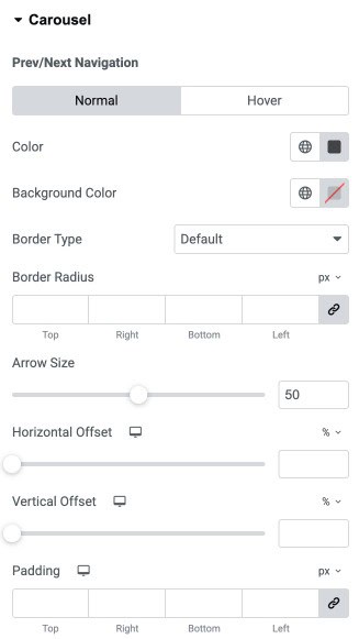
Carousel
Prev/Next Navigation
- Color: Set the arrow icon color for normal and hover states.
- Background Color: Define the background color behind the arrow icons.
- Border Type: Select the border style for navigation arrows (default, solid, dashed, etc.).
- Border Radius: Adjust the roundness of the arrow container’s corners.
- Arrow Size: Control the size of the navigation arrow icons.
- Horizontal Offset: Move the navigation arrows horizontally (left/right).
- Vertical Offset: Move the navigation arrows vertically (up/down).
- Padding: Add inner spacing around the navigation arrow container.
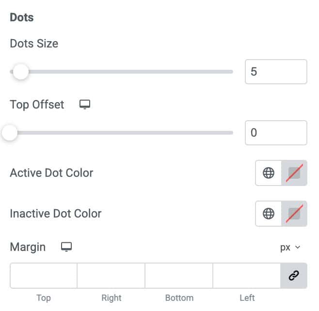
Dots
- Dots Size: Adjust the size of the pagination dots.
- Top Offset: Set the vertical spacing between the dots and the carousel.
- Active Dot Color: Choose the color for the currently active pagination dot.
- Inactive Dot Color: Choose the color for all inactive pagination dots.
- Margin: Add outer spacing around the pagination dots.
Note: Pagination styling options vary depending on the pagination type selected (Dots, Fraction, Progress Bar). Only the relevant controls will appear based on your chosen pagination style.
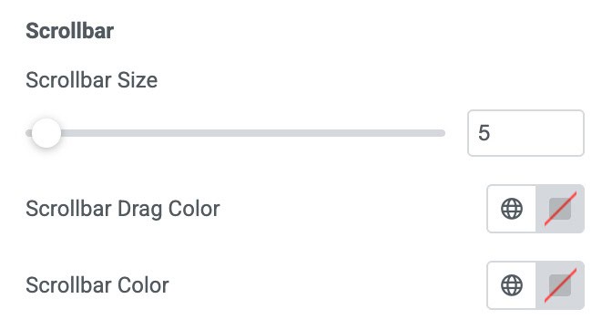
Scrollbar
- Scrollbar Size: Adjust the thickness of the scrollbar used for navigation.
- Scrollbar Drag Color: Set the color of the draggable scrollbar thumb.
- Scrollbar Color: Choose the background color of the scrollbar track.