DA – Taxonomy Block
DA – Taxonomy Block is used to display the terms and posts from the custom taxonomies in a block-wise manner. Thus it gives you the freedom to arrange your content in a particular fashion. Furthermore, it has a specific pre-designed layout that can be used to create different layouts for your created taxonomies.
Content
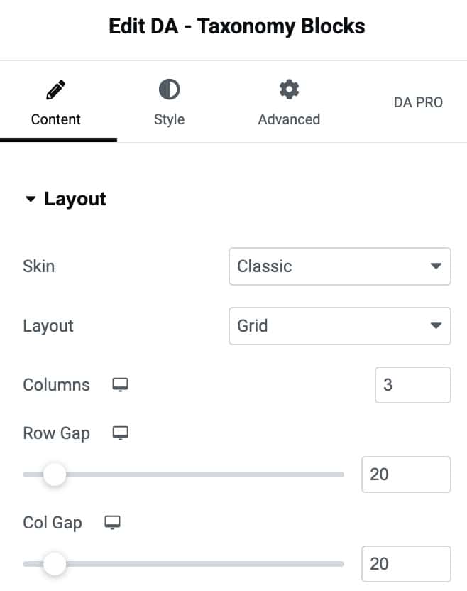
Layout
- Skin: Here, you can choose the design in which you want your blocks to appear. It provides you with three options to choose from (Classic, Card, List, and Term+Post Loop).
- Layout: Select the layout styles like Grid or Carousel when selecting Classic or Card options in the Skin. When choosing the List option in Skin, you will get different layout style settings.
- Columns: Here, you can specify the number of columns you want to display on a single page containing taxonomy terms.
- Row Gap: Here, you can give space between rows.
- Col Gap: Adjust the space between columns
Title
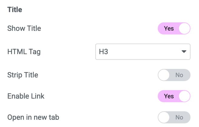
- Show Title: Enable it if you want to display the title.
- Html Tag: Various Html tags can be used.
- Strip Title: It is used when you have a long title and want to strip it. It can be enabled or disabled. If it is enabled, it further gives you more options.
- Strip Mode: You can select to strip a word or a letter.
- Strip size: It takes a numeric value representing the number of words to be shown.
- Append title: Indicate what to append if the Title needs to be trimmed.
- Enable Link: It is used to assign a link to your block when you click on it.
- Open in a new tab: You can use it to open the taxonomy block in a new separate window.
Overlay Title
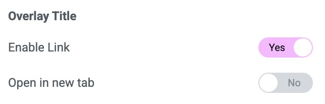
- Enable Link: It is used to assign an overlay link to your block when you click on it.
- Show image: An image can be given to the blocks.
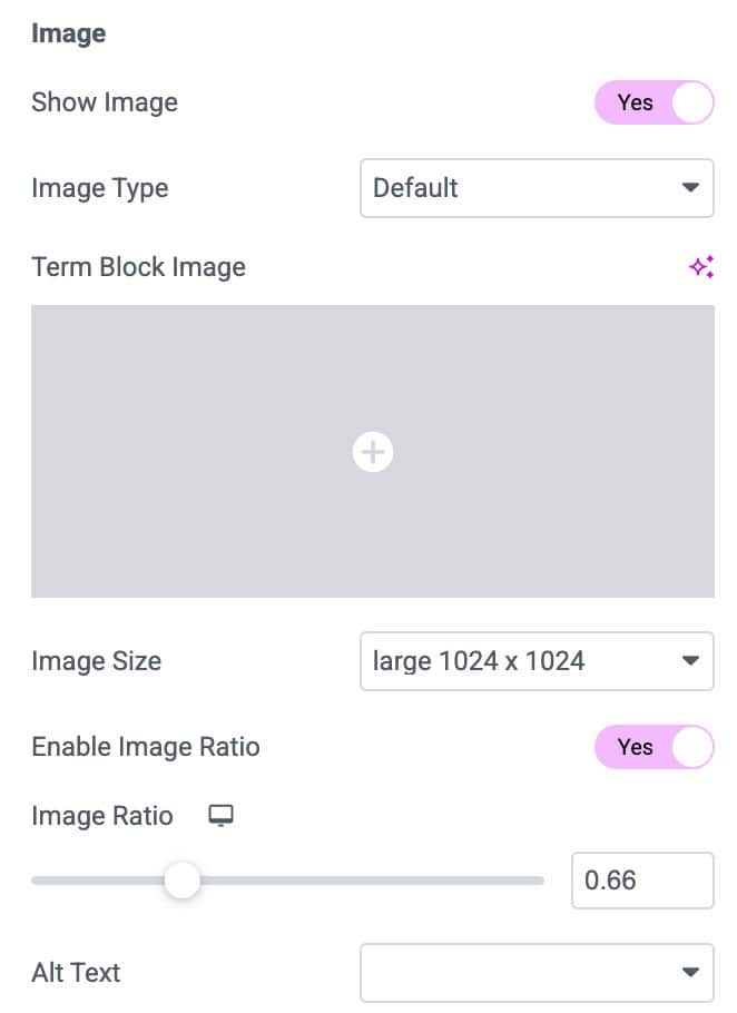
Image
- Show Image: Enable it to display a custom image to each taxonomy block.
- Image Type: You can display a default image or choose a custom field option to display an image on each block.
- Custom Field key: Give the name of the custom field containing the image.
- Fallback Image: Add a fallback image if there is no image.
- Image Size: Select the size of the image like large, medium, small, etc.
- Enable Image Ratio: You can set a ratio between the height and widget of the image.
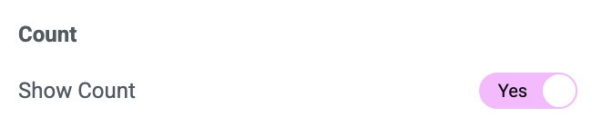
Count
- Show Count: It displays the count of posts associated with the particular taxonomy.
Query
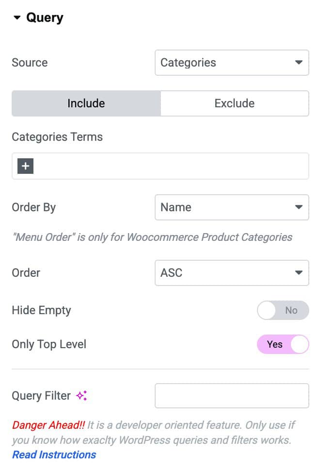
- Source: Select the source for which you are creating a taxonomy block.
- Categories Terms: Enter the categories name which you want to include or exclude
- Order By: In this, you can order your categories in a certain manner. You can use different options like Date, Title, etc., to filter your post.
- Order: It sorts in ascending or descending order based on the criteria selected in the Order By option.
- Hide Empty: You can use this option if you do not want to display empty taxonomy elements.
- Only Top-Level: Enable it to display only the parent categories.
- Query Filter: Apply the query filter properties.
Carousel
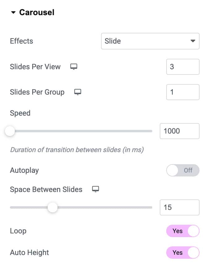
When selecting Carousel in Layout style, you will get more setting options:
- Effects: Choose how each slide transitions, either Slide, Fade, Overflow, or Flip
- Slides Per View: Set the number of slides to view at one time, a maximum of 10
- Slides Per Group: Set the number of slides to scroll per swipe, a maximum of 10
Settings
- Speed: Set the time it takes for each slide to appear. This time is in milliseconds, so 1000 ms is equal to 1 second.
- Autoplay: Enable to apply autoplay to the slides
- Space Between Slides: Set the time between each slide.
- Loop: Show the carousel in a continuous loop, infinitely. Yes or No
- Auto Height: Enable to set the auto height to the carousel
- Pause On Hover: Select whether or not to pause autoplay when on hover.
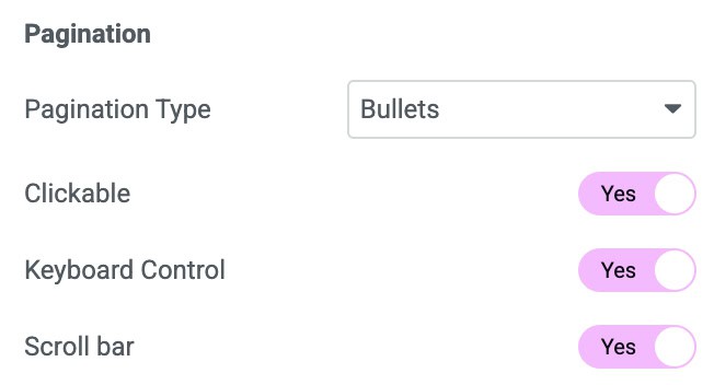
Pagination
- Pagination Type: Select None, Bullet, Fraction, or Progress
- Scroll Bar: Enable the scroll bar
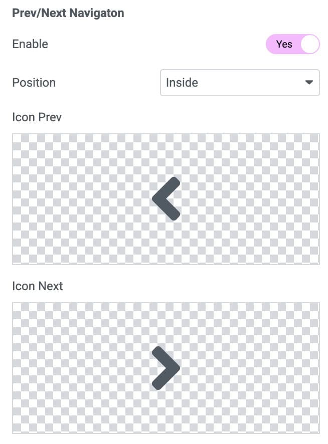
Prev/Next Navigation
- Enable: Enable to apply pagination to the carousel
- Position: Set the position Inside or Outside or Along with title.
- Icon Prev: Select an icon for the previous navigation icon
- Icon Next: Select an icon for the next navigation icon
Term+Post Loop
When selecting Skin as Term + Post-Loop, you will get an entirely different settings option for layout and style.
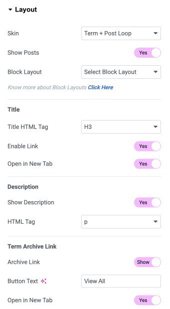
Layout
- Show Post: Enable it to show all posts within a taxonomy.
- Block Layout: Select the black layout created to display the posts.
- Title Hmtml Tag: Select the HTML tag to display the title.
- Enable Link: It is used to assign a link to your block when you click on it.
- Open in a new tab: You can use it to open the taxonomy block in a new separate window.
- Show Description: Enable it to display the text description associated with each taxonomy.
- HTML Tag: Html tag to display the description.
- Archive Link: Enable Link to the taxonomy archive page.
- Button Text: Enter the button text.
- Open In New Tab: Open the archive page in the new tag.
Post
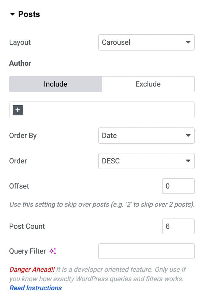
- Layout: You can also display all taxonomy posts inside a Grid or a Carousel style when selecting Term+ Post Loop skin. There are more additional settings for Grid and Carousel.
- Author: Include and exclude posts by a specific author.
- Order By: Set the post order based on date, title, etc.
- Order: Sort the post ascending or descending.
- Offset Set post offset.
- Post Count: Set the post count.
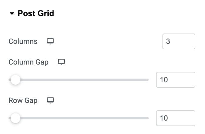
Post Grid
- Columns: Specify the number of columns.
- Column Gap: Adjust the gap between columns.
- Row Gap: Adjust the gap between rows.
Style
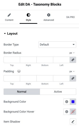
Layout
- Border Type: Choose the border style.
- Border Radius: Set the border radius.
- Padding: Set the padding.
- Background Color: Select the background color.
- Background Color Hover: Select the background hover color.
- Item Shadow: Apply the shadow effects.
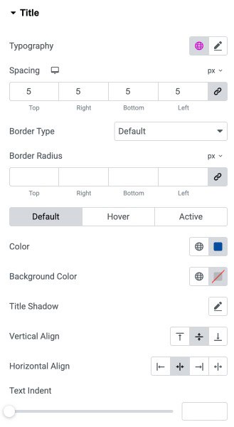
Title
- Typography: Customize the typography of the title.
- Spacing: Adjust the space between items or elements for proper layout control.
- Border Type: Select the border style.
- Border Radius: Control the border radius.
- Color: Set the text color for the selected element.
- Background Color: Choose the background color.
- Title Shadow: Apply a shadow effect of the title text.
- Vertical Align: Align the text or content vertically.
- Horizontal Align: Align the text or content horizontally.
- Text Indent: Adjust the indentation of the text from the left side to create spacing or hierarchy.
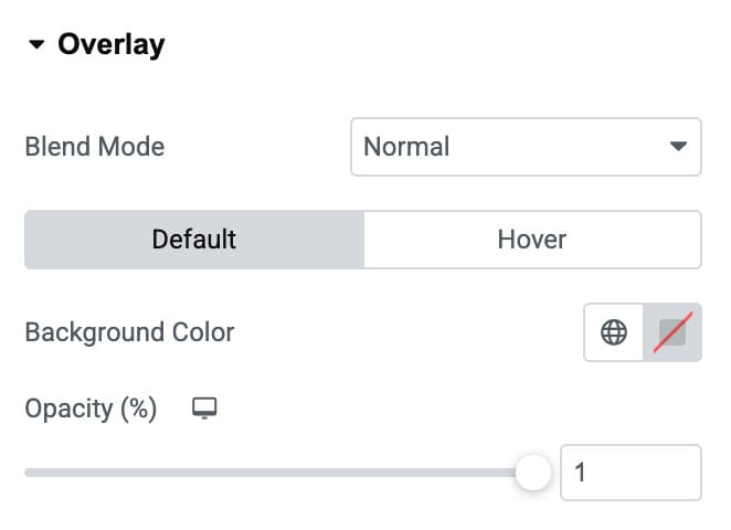
Overlay
- Blend Mode: Choose how the overlay blends visually with the content beneath.
- Background Color: Set the overlay’s background color.
- Opacity (%): Adjust the transparency level of the overlay for better visual control.
Image
Normal/Hover
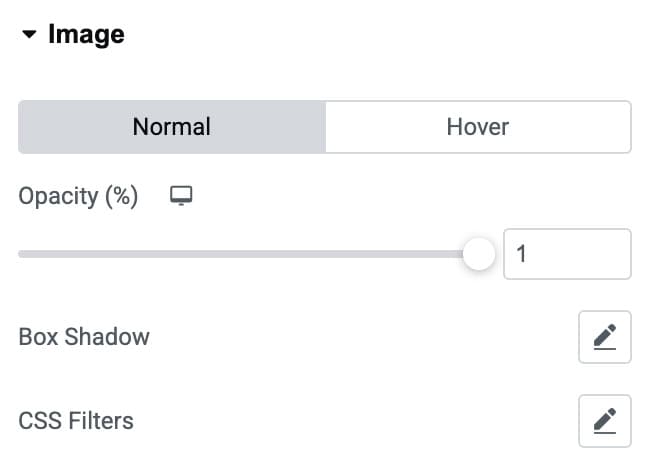
- Opacity (%): Adjust the transparency level of the image.
- Box Shadow: Apply shadow effects around the image to add depth and visual emphasis.
- CSS Filters: Apply visual filters such as blur, brightness, contrast, or saturation to style the image creatively.
Layout
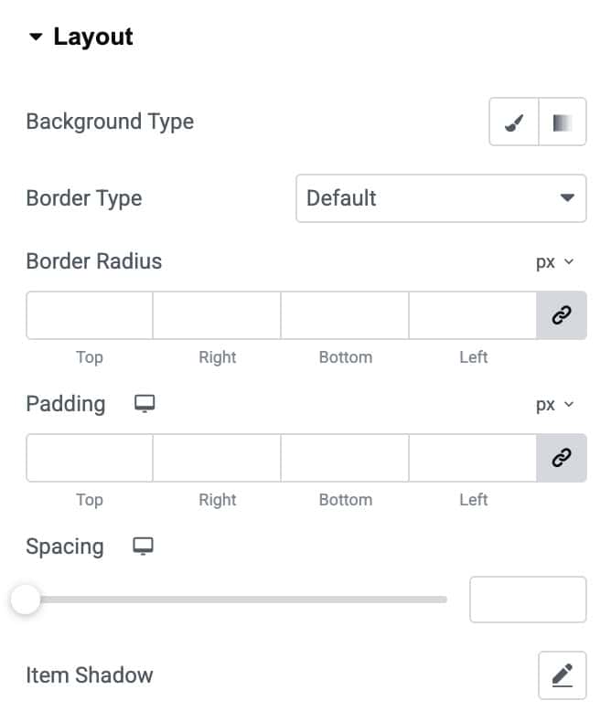
- Background Type: Select a solid or gradient background to style the layout container.
- Color: Choose a background color that appears behind the content or image.
- Image: Upload or select an image to display as the primary background element.
- Border Type: Choose the border style (solid, dashed, dotted, etc.) for the layout container.
- Border Radius: Adjust the corner curves to create rounded or sharp edges.
- Padding: Add inner spacing around the content to control layout spacing and balance.
- Spacing: Set the outer spacing between this item and surrounding elements.
- Item Shadow: Apply shadow effects to add depth and visual emphasis to the layout element.
Title
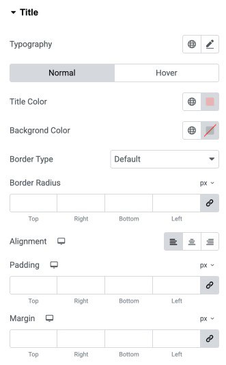
- Typography: Customize the font style, size, weight, and spacing of the title text.
Normal / Hover - Title Color: Set the text color of the title.
- Background Color: Apply a background color behind the title text.
- Border Type: Choose the style of the border applied to the title container.
- Border Radius: Adjust the roundness of the title container’s corners.
- Alignment: Align the title to the left, center, or right based on your design.
- Padding: Add inner spacing around the title text for better structure.
- Margin: Add external spacing around the title to control its placement.
Description
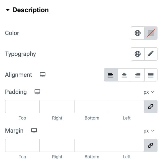
- Color: Set the text color of the description content.
- Typography: Customize the typography for the description text.
- Alignment: Align the description text to the left, center, right, or justify it as needed.
- Padding: Add inner spacing around the description area to improve readability and layout.
- Margin: Add outer spacing around the description block to control its placement within the design.
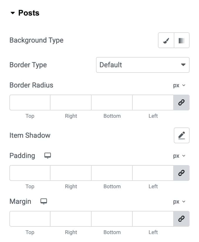
Posts
- Background Type: Choose and apply a background color or gradient for each post item.
- Border Type: Select the border style for post containers.
- Border Radius: Round the corners of each post item by adjusting the radius values.
- Item Shadow: Add a shadow effect to individual posts for depth and emphasis.
- Padding: Add inner spacing inside each post item for better content layout and spacing.
- Margin: Add outer spacing around each post item to control placement within the grid or list.
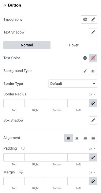
Button
- Typography: Customize the button typography.
- Text Shadow: Add a shadow effect to the button text for enhanced visibility or design depth.
Normal / Hover - Text Color: Define the button text color for both normal and hover modes.
- Background Type: Choose a solid color or gradient as the button background.
- Color: Set the background color for the button.
- Border Type: Select the border style (solid, dotted, dashed, etc.) for the button.
- Border Radius: Adjust the corner roundness of the button to create sharp or curved edges.
- Box Shadow: Apply shadow effects around the button to add depth and dimension.
- Alignment: Position the button to the left, center, right, or justify within its container.
- Padding: Control the inner spacing inside the button to adjust its size and breathing space.
- Margin: Add spacing around the button to manage its placement relative to other elements.
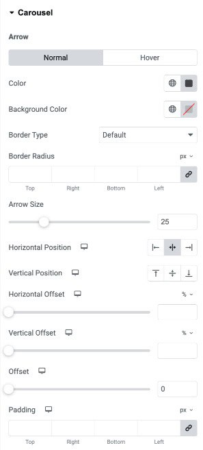
Carousel
Arrow Normal/Hover
- Color: Set the arrow icon color for normal and hover states.
- Background Color: Choose a solid or gradient background for the navigation arrows.
- Border Type: Select the border style for the arrow container (solid, dotted, dashed, etc.).
- Border Radius: Adjust corner roundness of the arrow container to create rectangle, rounded, or circular styles.
- Arrow Size: Control the size of the arrow icon for better visibility and design consistency.
- Horizontal Position: Align arrows horizontally.
- Vertical Position: Align arrows vertically.
- Horizontal Offset: Shift arrows left or right for precise horizontal positioning.
- Vertical Offset: Move arrows up or down to fine-tune placement vertically.
- Offset: Apply overall position adjustment for additional fine control.
- Padding: Add inner spacing around the arrows to adjust their clickable area and overall size.
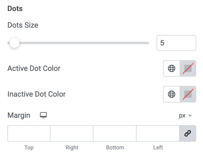
Dots
- Dots Size: Adjust the size of each navigation dot to make them subtle or more prominent.
- Active Dot Color: Choose the color for the currently active slide’s dot to highlight the selected slide.
- Inactive Dot Color: Set the color for all non-active dots to maintain visual contrast.
- Margin: Add spacing around the dots container to properly position them within the carousel layout.
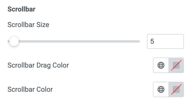
Scrollbar
- Scrollbar Size: Control the thickness of the scrollbar to make it minimal or more noticeable.
- Scrollbar Drag Color: Set the color for the draggable part of the scrollbar (the thumb).
- Scrollbar Color: Choose the background color for the scrollbar track.