DA – Post Blocks Adv
The DA – Post Block Adv widget gives you more advanced features and the options to filter your posts, custom post types, and taxonomies. This widget is an advanced version of our widget DA – Post Blocks. In the advanced post block widget, you will get multiple layout styles like Grid, Carousel, and Accordion to display your posts in a different style.
More enhanced filters are available to filter out your post and taxonomies based on multiple relations and conditions.
Content
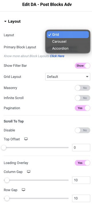
Layout
- Skin: Select the layout style for the post blocks like Grid, Carousel, or Accordion.
- Primary Block Layout: Select the block layout created to render the post block widget.
- Show Filter Bar: Enable displaying a filter bar at the top to filter posts based on categories and tags.
- Grid Layout: Select the Grid style like List, Smart Grid, Checker Board.
- Masonry: It is used to represent images seamlessly.
- Infinite Scroll: The Infinite scroll option loops the posts slides infinitely.
- Pagination: Choose how you wish to paginate the results. It further gives more options.
- Loading Overlay: Enable to add an overlay effect on page load
- Column Gap: Set the exact gap between the columns
- Row Gap: Set the amount of gap between rows.
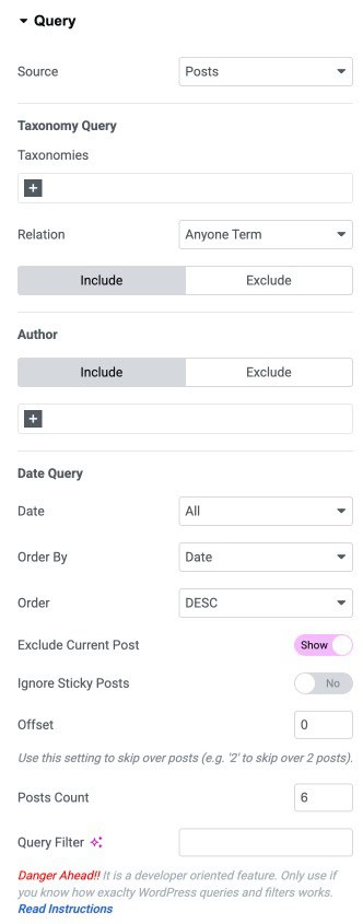
Query
- Source: Select the source of the Post type to be fetched. The source can be a post, page, custom post type, or you can manually select the post.
- Taxonomy Query
- Taxonomies: Select the taxonomy terms to filter posts based on Categories, Tags, and Formats.
- Relation: Select relation to Any One Term, or All Terms
- Author: Select the name of the author whose post you want to Include or Exclude
- Date Query
- Date: You can display posts for a specific time period
- Order By: In this, you can order your post in a certain manner. You can use different options like Date, Title, etc., to filter your post.
- Order: It sort your post in ascending or descending order based on the criteria selected in the Order By option.
- Exclude Current Post: Enable it if you do not want to display your latest post in the block.
- Order By: In this, you can order your post in a certain manner. You can use different options like Date, Title, etc., to filter your post.
- Post Count: You can use the Post Count option to display a specific number of posts on a single page. It takes a numeric value which signifies the number of posts to be displayed at a time.
- Offset: Use this setting to skip over posts (e.g., “2” to skip over 2 posts)
- Query Filter: Here, you can add your own custom code to filter the posts
FacetWP
- Enable it to apply FacetWP filtering.
Pagination
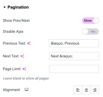
If you have selected the Pagination option in the layout, then you have more settings available.
- Show Pagination: Enable/Disable pagination
- Show Prev/Next: Choose whether to show previous-next links at the beginning and end of pagination.
- Disable Ajax: Enable it you want to use ajax.
- Previous Text: Text to show on the previous link.
- Next Text: Text to show on the next link.
- Page Limit: Specify the number of pages to be shown in pagination.
- Alignment: Alignment of pagination.
Filters
You will get more options if you enable the Show Filter option.
- Taxonomy: Here, you can select the taxonomy name you want to display on the filter bar. All your created Taxonomies list is displayed, from which you can choose.
- Default Term: Select the default filter menu item.
- Exclude Term: Enter the names of the custom taxonomies and terms you want to exclude from the filters.
- Order By: Set order of the filter menu items, based on name, term your post in a certain manner. You can use different options like Date, Title, etc., to filter your post.
- Order: Sort the filters in ascending or descending order based on the Order By option criteria.
- Only Parent: Enable it to include only the parent items
- Show All: Enable to display an All button on the filter bar.
- Tab ‘Alt’ Text: Here, you can assign a name to the Show Alt-tab.
- Collapse Filter: Enable it to collapse the menu items
- Collapse After: Set the numeric count after which to add the Collapse menu.
- Collapse Text: Assign text to the collapse button
- Icon: Add an icon to the collapse menu
- Enable Hashtags in Filters: Creates unique URLs that can open specific filter tabs on load.
- Fragment: On enabling Hashtags, clicking on the filter will update the URL without updating the page.

Overlay
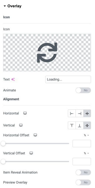
When the Overlay option is enabled, you get more settings.
- Icon: Select an icon to be used for the overlay effect
- Text: Enter the text to be displayed along with an icon on the overlay
- Animate: Enable to apply animation on the icon
- Horizontal: Set horizontal alignment for the overlay icon
- Vertical: Set vertical alignment for the overlay icon
- Horizontal Offset: Adjust the horizontal offset
- Vertical Offset: Adjust the vertical offset
- Preview Overlay: Enable it to preview the overlay effect
Infinite Scroll
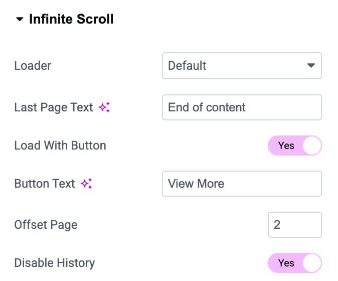
On enabling the Infinite Scroll option in the Layout tab, you will get these extra setting options:
- Last Page Text: Enter the text to be displayed when you reach the last page.
- Load With Button: Enable it to display a button at the bottom of the posts
- Button Text: Enter the text for the button
- Offset Page: Set the offset to skip over pages
- Disable History: Enable to disable the last viewed history
WooCommerce
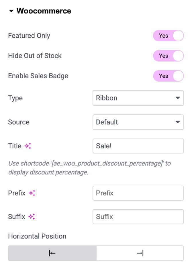
You will get more customized options to configure the Post Blocks for WooCommerce specific pages.
- Featured Only: Enable it to display only the featured products in post blocks.
- Hide Out of Stock: Enable this to hide the out-of-stock items displayed inside the post blocks.
- Enable Sales Badge: To add a sales badge on products, enable this option.
- Type: Choose the layout style for the sales badge like a Ribbon, Badge, or a Custom Image.
- Source: Select the source as Default or get data from Custom Field.
- Title: Enter the title to be displayed on the badge.
- Prefix: Add text to display before the title text.
- Suffix: Add text to display after the Title text.
- Horizontal Position: Adjust the horizontal positioning of the Badge like left or right.
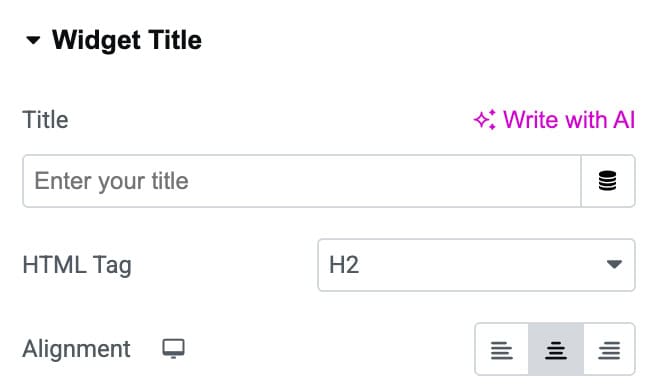
Widget Title
- Title: Enter the text you want to display as your widget’s heading.
- HTML Tag: Choose the HTML heading tag for your title.
- Alignment: Set how the title should be aligned within the widget.
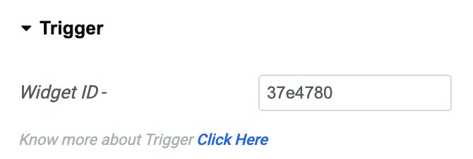
Trigger
- Widget ID: A unique identifier automatically generated for the widget. You can use this ID when setting up triggers or advanced interactions.
Check how you can create Smart Grid & Checkerboard Layouts using the Post Blocks Adv widget in Elementor.
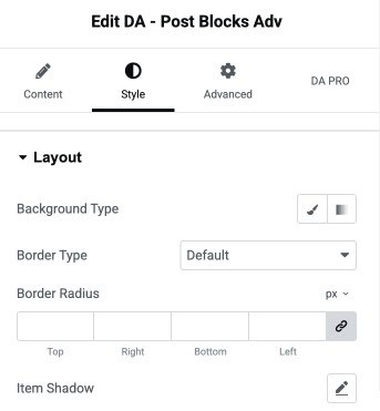
Style
Layout
- Background Type: Select a solid color or gradient background for the element.
- Border Type: Choose the style of the border.
- Border Radius: Set the border radius.
- Item Shadow: Apply shadow effects.
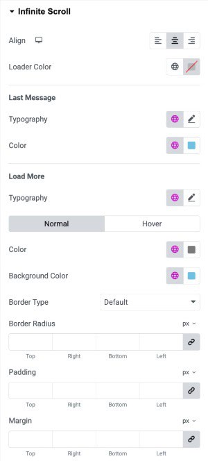
Infinite Scroll
- Align: Set the alignment of the infinite scroll loader (left, center, or right).
- Loader Color: Choose the color of the loading animation displayed during infinite scroll.
Last Message
- Typography: Customize the font style for the final message when no more content is available.
- Color: Set the text color for the final message.
Load More
- Typography: Adjust the font settings for the “Load More” button text.
- Load More State (Normal/Hover): Customize styles separately for normal and hover button states.
- Color: Choose the text color for the “Load More” button.
- Background Color: Set the background color for the “Load More” button.
- Border Type: Select the button’s border style (default, solid, dashed, etc.).
- Border Radius: Control the roundness of the button’s corners.
- Padding: Add inner spacing inside the “Load More” button for better spacing and design.
- Margin: Add outer spacing around the button to adjust its placement in the layout.
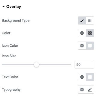
Overlay
- Background Type: Choose a solid or gradient background for the overlay.
- Color: Set the overlay background color to enhance visibility and contrast.
- Icon Color: Select the color for the overlay icon.
- Icon Size: Adjust the size of the overlay icon using the slider.
- Text Color: Choose the color of any text displayed on the overlay.
- Typography: Customize the font style, size, and weight of the overlay text.
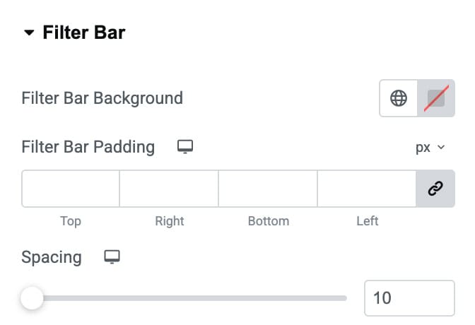
Filter Bar
- Filter Bar Background: Set the background color or gradient for the filter bar area.
- Filter Bar Padding: Add inner spacing around the filter bar content.
- Spacing: Adjust the spacing between individual filter labels.
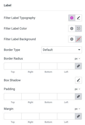
Label Settings
- Filter Label Typography: Customize the font style, size, and weight of the filter labels.
- Filter Label Color: Set the text color for the filter labels.
- Filter Label Background: Choose the background color for each filter label.
- Border Type: Select the border style for filter labels.
- Border Radius: Control the roundness of label corners (linked or individual).
- Box Shadow: Apply shadow effects to labels for depth and emphasis.
- Padding: Add inner spacing inside each filter label for better layout and visibility.
- Margin: Add outer spacing around labels to adjust their placement in the filter bar.
Items
- Horizontal Gap: Adjust the horizontal spacing between items.
- Vertical Gap: Adjust the vertical spacing between items.
- Padding: Add inner spacing inside each item (top, right, bottom, left).
- Border Type: Select the border style for each item (default, solid, dashed, etc.).
- Typography: Customize the font style, size, and weight for item text.
- Color: Set the text color for items in normal/hover/active state.
- Background: Choose the background color for items in normal/hover/active state.
- Border Radius: Control the roundness of item corners.

Sale Badge
- Background Color: Set the background color of the sale badge.
- Distance: Adjust the spacing between the sale badge and the product image or container.
- Text Color: Choose the text color for the sale badge label.
- Typography: Customize the typography of the badge text.
- Border Type: Select the border style for the badge.
- Border Radius: Control how rounded the badge corners appear.
- Box Shadow: Add shadow effects to the badge for depth and emphasis.
- Padding: Set the inner spacing around the badge text.
- Margin: Add outer spacing around the sale badge to adjust its position.
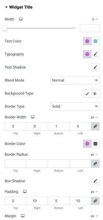
Widget Title
- Width: Adjust the width of the widget title container using a slider.
- Text Color: Set the text color for the widget title.
- Typography: Customize the font style, size, weight, and spacing for the title text.
- Text Shadow: Add a shadow effect to the title text for visual emphasis.
- Blend Mode: Control how the widget title blends with the background.
- Background Type: Choose a solid or gradient background for the widget title container.
- Border Type: Select the border style for the widget title.
- Border Width: Define the thickness of the border for each side of the title box.
- Border Color: Choose the color for the widget title border.
- Border Radius: Control how rounded the corners of the title container appear.
- Box Shadow: Apply shadow effects to the widget title container for depth.
- Padding: Add inner spacing around the title text to adjust layout and readability.
- Margin: Set outer spacing around the widget title to control its placement in the layout.