DA – ACF Repeater
DA – ACF Repeater are used to fetch data of an entire row. Repeaters are helpful as you can retrieve information from a row containing multiple fields through them. The entire data is contained in a block that can be represented using different layout styles.
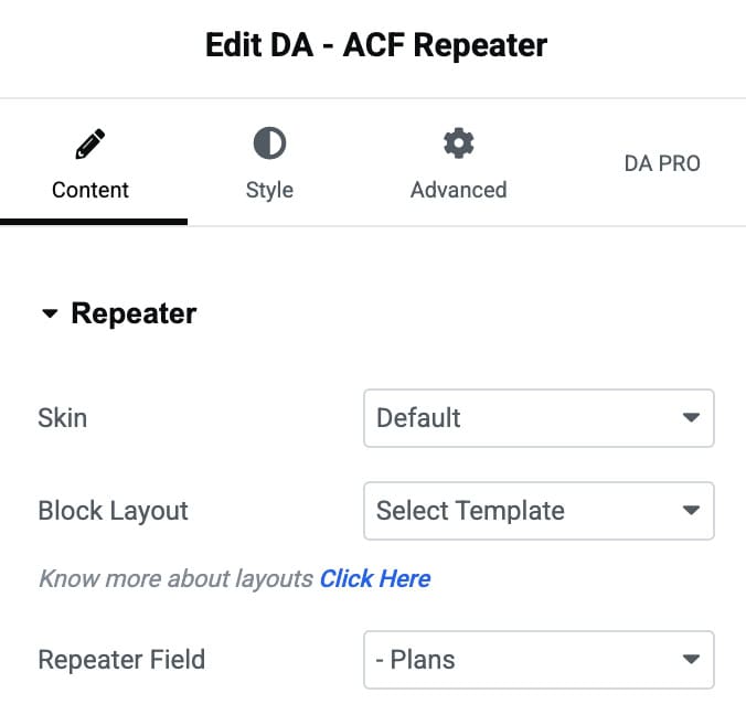
Content
Repeater
- Skin: Select from Default, Accordion, or Tabs to arrange the repeater field data differently.
- Block Layout: Select the block layout created for the Repeater field.
- Repeater Field: Select the name of the repeater class created or the name of Nested Repeaters.
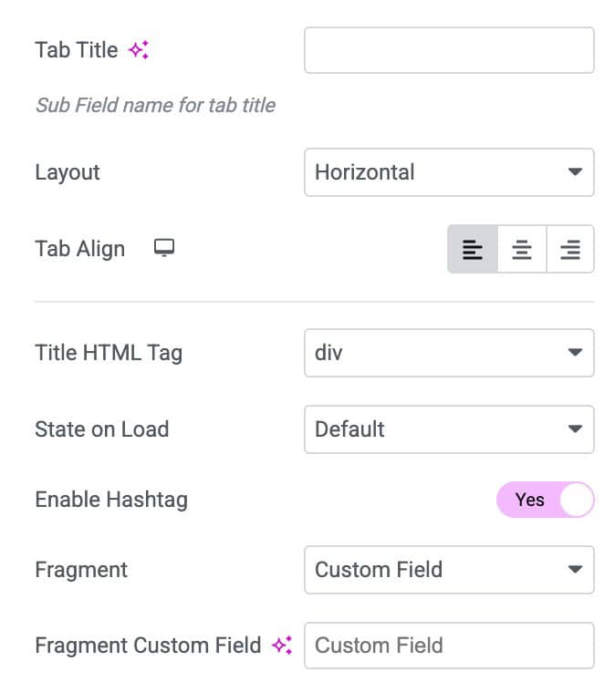
- Tab Title: Enter the title for tab.
- Layout: Choose the layout from horizontal or vertical.
- Align: Select the alignment.
- Title HTML Tag: Choose the title HTML tag.
- State on Load: Chose the tab state when the page load.
- Enable Hashtag: Activate this to display the hashtag.
- Fragment: Choose data as default or from custom field.
- Content Templates: Enter the text as content templates.
- Icon: Choose the collapsed accordion icon.
- Active Icon: Select the icon for accordion active state.
- Enable Toggle Button: Enable the option to activate the toggle.
- Expand Text: Enter the text that display as when accordion is expand.
- Collapse Text: Enter the text that display as when accordion is collapse.
- Separator: Specify the separator.

List Item
- Layout: Controls the overall structure and design of each list item.
- List Marker: Adds a symbol, icon, or number before each list item.
- Link to: Allows you to link the list item to a URL, page, or dynamic content.
- Strip Text: Removes unwanted characters or formatting from the item text.
- Strip Mode: Defines how the text will be stripped.
- Strip Size: Sets how many characters to remove based on the selected strip mode.
- Append Title: Adds additional text at the end of the list item automatically.
- Fallback: Provides backup text when dynamic content is empty or unavailable.

Layout
- Layout Mode: When selecting default skin, it gives you four layout options: Grid, Carousel, Smart Grid, and Checker board.
- Masonry: It is used to present the images seamlessly.
- Column: You can specify the number of columns in which you want to display the information.
- Column Gap: Here, you can specify the amount of space to be kept between columns.
- Row Gap: Amount of space to be kept within two individual rows.
- Pagination: Enable the option to display the pagination.
- No Post Message: Enter the message that display when no content is displayed.
- Choose Grid Layout: Select the layout (applicable for Smart Grid)
- Secondary Template: Choose the template (applicable for Smart Grid & Checker board layout)

Carousel
Note: These settings are applicable when you select Carousel as layout.
- Effects: Select the transition animation style between slides.
- Slides Per View: Set how many slides are visible at the same time.
- Slides Per Group: Decide how many slides should move together in each transition.
Settings
- Speed: Adjust the slide transition duration in milliseconds.
- Autoplay: Enable automatic sliding without user interaction.
- Space Between Slides: Control the gap between each slide.
- Auto Height: Automatically adjust carousel height based on slide content.
- Pause on Hover: Pause autoplay when the cursor hovers over the carousel.

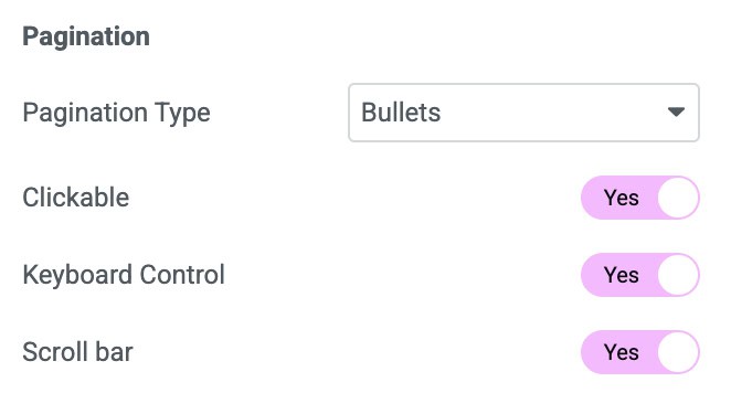
Pagination
- Pagination Type: Choose the style of pagination such as bullets or fraction.
- Clickable: Allow users to click pagination dots to switch slides.
- Keyboard Control: Enable arrow key navigation for the carousel.
- Scroll Bar: Add a draggable scrollbar for slide navigation.
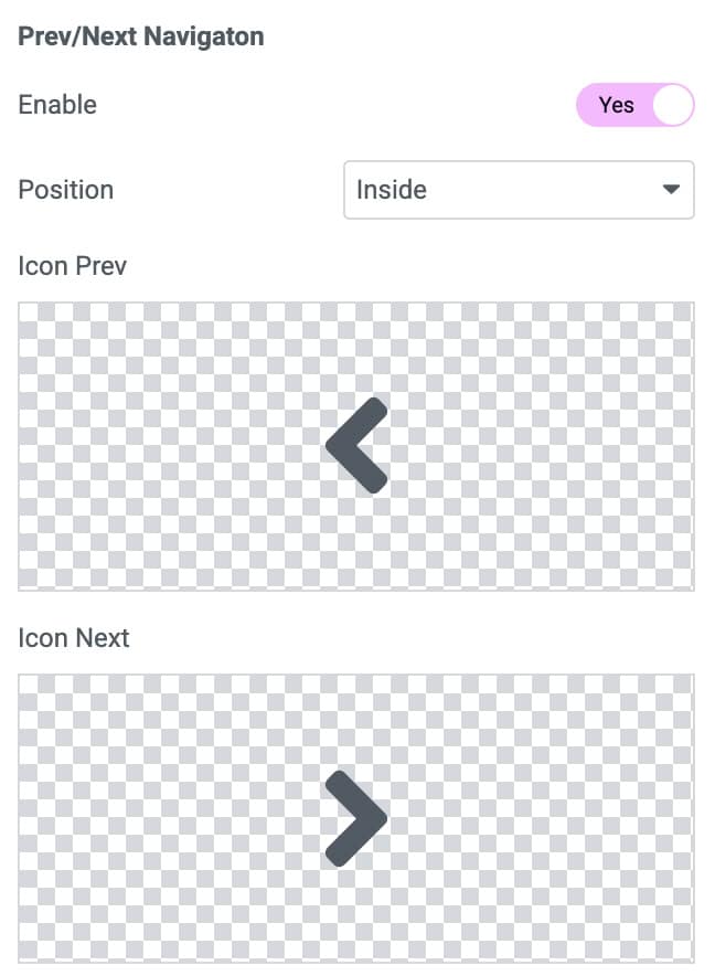
Prev/Next Navigation
- Enable: Enable the option to display the navigation in carousel.
- Position: Choose the position to display arrows.
- Icon Prev: Select the prev icon.
- Icon Next: Select the next icon.
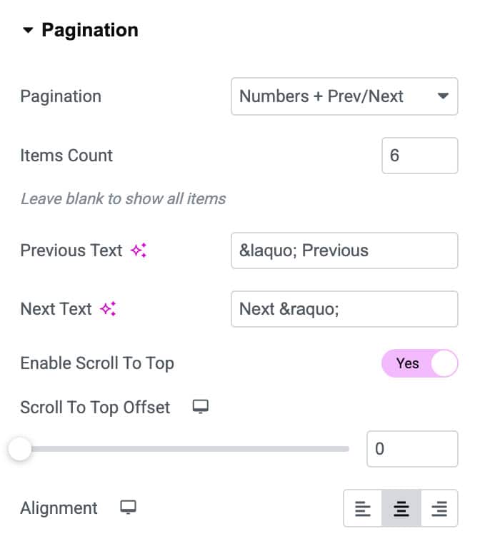
Pagination
Note: These settings are applicable when you enable Pagination control in Layout.
- Pagination: Enables or disables numbered pagination for navigating items.
- Items Count: Sets how many items to display per page before pagination triggers.
- Previous Text: Customizes the label for the “Previous” navigation button.
- Next Text: Customizes the label for the “Next” navigation button.
- Enable Scroll to Top: Automatically scrolls the page to the top when switching pages.
- Scroll to Top Offset: Sets how far from the top the scroll should stop after pagination loads.
- Alignment: Controls the horizontal alignment of the pagination.
Widget Title
- Title: Enter the Repeater title.
- Html Tag: Choose the HTML tag to render the title.
- Alignment: Set alignment for the title text.

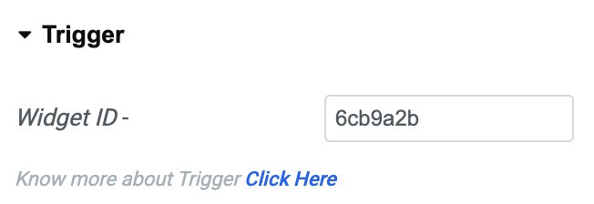
Trigger
- Widget ID: Copy this widget ID and paste it into the DA- Trigger widget to add trigger actions buttons.
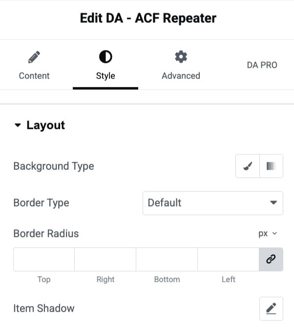
Style
Layout
- Background Type: Selects the background type from classic or gradient.
- Border Type: Defines the style of the item’s border.
- Border Radius: Controls the border radius.
- Item Shadow: Adds a customizable shadow effect behind the item.
General
- Border Width: Set the border width.
- Space between Tab/Content: Adjust the space between tab and content.
- Advance: Enabling this option will display more styling controls.

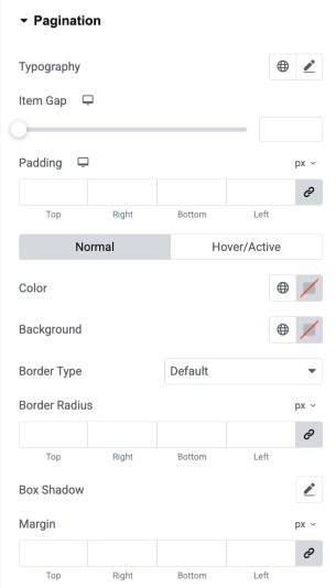
Pagination
- Typography: Adjust the typography of the pagination text.
- Item Gap: Control the spacing between individual pagination items.
- Padding: Add inner spacing around each pagination item for better sizing and structure.
(Normal/Hover/Active) - Color: Set the text color of pagination states.
- Background: Choose background colors for pagination items in all states.
- Border Type: Select the border style for pagination items.
- Border Radius: Round the corners of pagination items using radius control.
- Box Shadow: Apply shadow effects to pagination items for depth and emphasis.
- Margin: Add outer spacing around pagination items to adjust layout placement.
Widget Title
- Width: Adjust the overall width of the widget title container.
- Text Color: Choose a custom color for the title text.
- Typography: Modify font family, size, weight, spacing, and style for the title.
- Text Shadow: Add shadow effects to the title text for depth and emphasis.
- Blend Mode: Control how the title blends with the background beneath it.
- Background Type: Set a solid or gradient background behind the widget title.
- Border Type: Select the border style such as solid, dashed, or dotted.
- Border Width: Define the thickness of the border on each side.
- Border Color: Choose a custom color for the border.
- Border Radius: Round the corners of the title container using radius values.
- Box Shadow: Apply box shadow around the title to enhance visual elevation.
- Padding: Control inner spacing around the title text.
- Margin: Set the outer spacing around the title container.

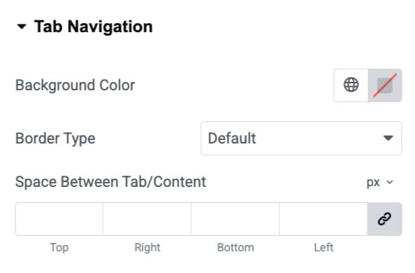
Tab Navigation
These settings are applicable for Tab.
- Background Color: Choose the background color for tab.
- Border Type: Select the border styles.
- Space Between Tab/Content: Adjust the space.
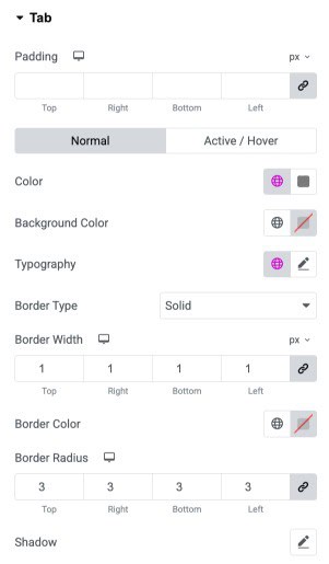
Tab
- Padding: Adjust the inner spacing of each tab from all sides.
Normal / Active–Hover
- Color: Set the text color for normal and active/hover tab states.
- Background Color: Choose a background color.
- Typography: Control font family, size, weight, and style for tab labels.
- Border Type: Select the border style applied to each tab.
- Border Width: Set individual border thickness for the top, right, bottom, and left sides.
- Border Color: Define the border color for the tabs.
- Border Radius: Round the corners of the tab using custom radius values.
- Shadow: Add shadow effects to enhance tab visibility and depth.
Content
- Border Type: Select the border style applied.
- Border Width: Set individual border thickness for the top, right, bottom, and left sides.
- Border Color: Define the border color.
- Background Color: Choose a background color.
- Padding: Adjust the padding.

Accordion
These settings are applicable for Accordion.
- Border Type: Select the border style applied.
- Border Width: Set individual border thickness for the top, right, bottom, and left sides.
- Border Color: Define the border color.
- Space Between: Specify the space between items.
- Transition Speed: Enter the transition speed.

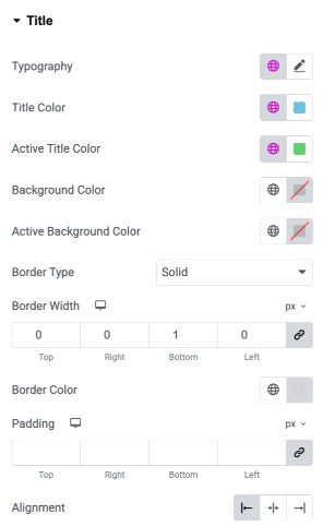
Title
- Typography: Customize the font style, size, weight, and spacing for the title text.
- Title Color: Choose the default text color for the title.
- Active Title Color: Set the text color when the title is in an active or selected state.
- Background Color: Apply a background color behind the title.
- Active Background Color: Set a background color for the active/selected title state.
- Border Type: Select the border style for the title container.
- Border Width: Define the thickness of each side of the title border.
- Border Color: Choose the color for the title border.
- Padding: Control the inner spacing around the title content.
- Alignment: Align the title to the left, center, or right.
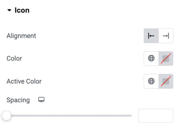
Icon
- Alignment: Choose the alignment of icon.
- Color: Select the color of icon.
- Active Color: Choose the icon color when it’s in active state.
- Spacing: Specify the spacing.
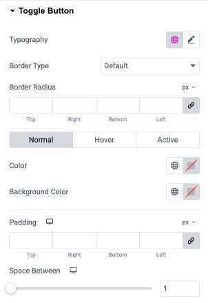
Toggle Button
- Typography: Customize the font style, size, and weight of the toggle button text.
- Border Type: Choose the border style for the toggle button.
- Border Radius: Round the corners of the toggle button by adjusting individual radius values.
Normal/Hover/Active - Color: Set the text color for normal, hover, and active states of the toggle button.
- Background Color: Assign background colors for each button state.
- Padding: Add inner spacing around the toggle button text on all four sides.
- Space Between: Adjust the spacing between multiple toggle buttons.
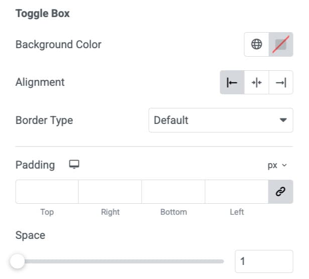
Toggle Box
- Background Color: Choose the background color for the toggle content box.
- Alignment: Set the horizontal alignment of the toggle box.
- Border Type: Select the border style for the toggle box.
- Padding: Add inner spacing inside the toggle box on all four sides.
- Space: Adjust the spacing between the toggle box and other elements.
List Item
These settings are applicable for List Item.
- Typography: Customize the font style, size, and appearance of list text.
- List Item Indent: Adjust the horizontal spacing between the list marker and text.
- Row Gap: Set the vertical spacing between individual list items.
List Marker
- Color: Choose the color of the list marker.
- Size: Control the size of the list marker for visual emphasis.

List Text
Normal/Hover
- Color: Set the default text color for list items.
- Color: Set the text color when hovering over a list item.
- Background Color: Define the background color behind list text in normal state.
- Background Color: Define the background color when the list item is hovered.
- Border Type: Select the border style for the list item container.
- Border Radius: Adjust the corner roundness of the list item background.
- Shadow: Add a shadow effect behind the list item for depth.
- Padding: Control spacing inside the list item container on all sides.

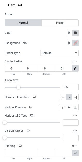
Carousel
Normal/Hover
- Color: Set the arrow icon color for normal and hover states.
- Background Color: Choose the background color behind the arrow icon.
- Border Type: Select the border style applied to the arrow container.
- Border Radius: Adjust the corner roundness of the arrow container.
- Arrow Size: Control the overall size of the arrow icon.
- Horizontal Position: Align the arrows left, center, or right.
- Vertical Position: Align the arrows top, center, or bottom.
- Horizontal Offset: Move the arrows horizontally using percentage or pixel units.
- Vertical Offset: Move the arrows vertically using percentage or pixel units.
- Padding: Add inner spacing around the arrow container on all sides.
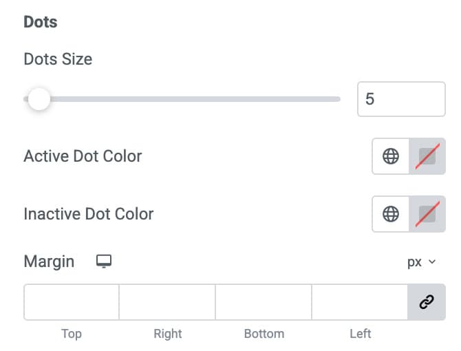
Dots
- Dots Size: Adjust the size of the pagination dots.
- Active Dot Color: Set the color for the active (current) dot.
- Inactive Dot Color: Set the color for all inactive dots.
- Margin: Add outer spacing around the dots container.
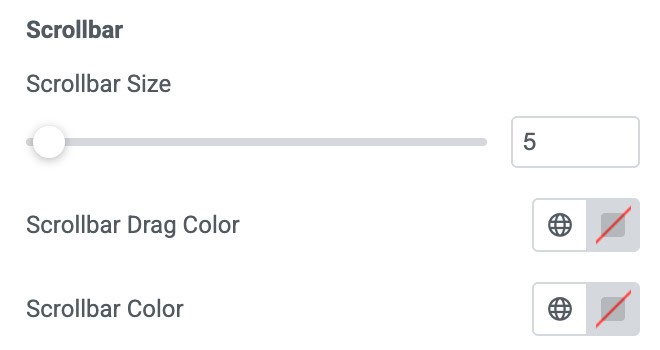
Scrollbar
- Scrollbar Size: Control the thickness of the scrollbar.
- Scrollbar Drag Color: Choose the color of the draggable scrollbar thumb.
- Scrollbar Color: Choose the background track color of the scrollbar.