DA – Woo Products
The DA – Woo Products widget helps you display products from your WooCommerce store in an attractive way. You can use it to show related products or upsell products on your website. It offers multiple layout options like Grid, Carousel, and Masonry, so you can choose the style that fits your design.
You can also select a block layout template that you created using Dynific Addons for Elementor to quickly create beautiful product sections without extra effort. This makes it easy to highlight products and improve user engagement on your store.
The DA – Woo Products features the following controls.
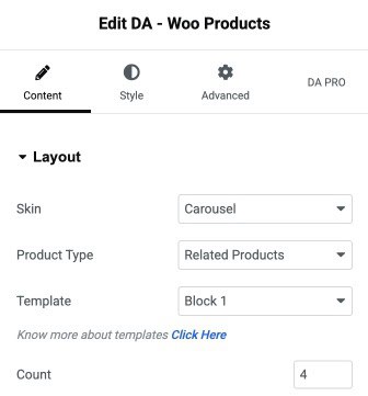
Content
Layout
- Skin: Choose how the products will be displayed, such as Grid or Carousel style.
- Product Type: Select which products to show like related or upsell products.
- Template: Pick a block design layout for displaying the products.
- Count: Set how many products you want to display in the section.
- Masonry Layout: Enable this option to display products in a masonry-style layout.
- Gutter: Adjust the spacing between each product item in the layout.
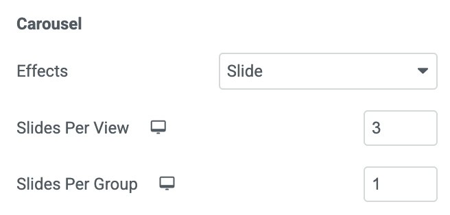
Carousel
Note: These settings are applicable when you select Carousel as skin.
- Effects: Choose the transition style used between slides.
- Slides Per View: Sets how many product items are visible in one slide.
- Slides Per Group: Determines how many slides move together during navigation.
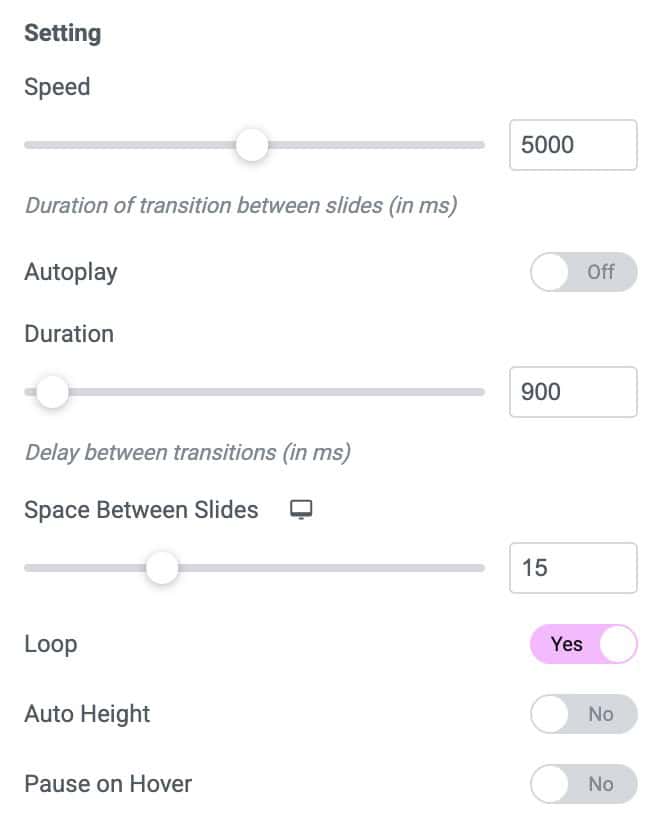
Setting
- Speed: Controls the transition speed between slides.
- Autoplay: Automatically rotates the slides without user interaction.
- Duration: Sets the delay time between each autoplay transition.
- Space Between Slides: Adjusts the gap between each slide.
- Loop: Enables continuous looping of slides, so the carousel never ends.
- Auto Height: Automatically adjusts the carousel height based on the slide content.
- Pause on Hover: Stops autoplay when the user hovers over the carousel.
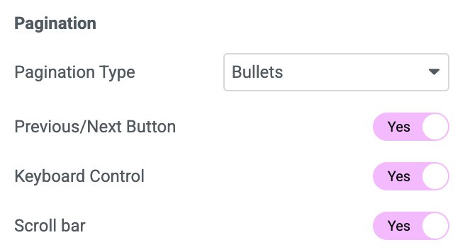
Pagination
- Pagination Type: Select how pagination is displayed.
- Previous/Next Button: Choose whether to show navigation arrows for moving between slides.
- Keyboard Controls: Enable to apply the keyboard effect on carousel.
- Scroll Bar: Activate to display the scroll bar.
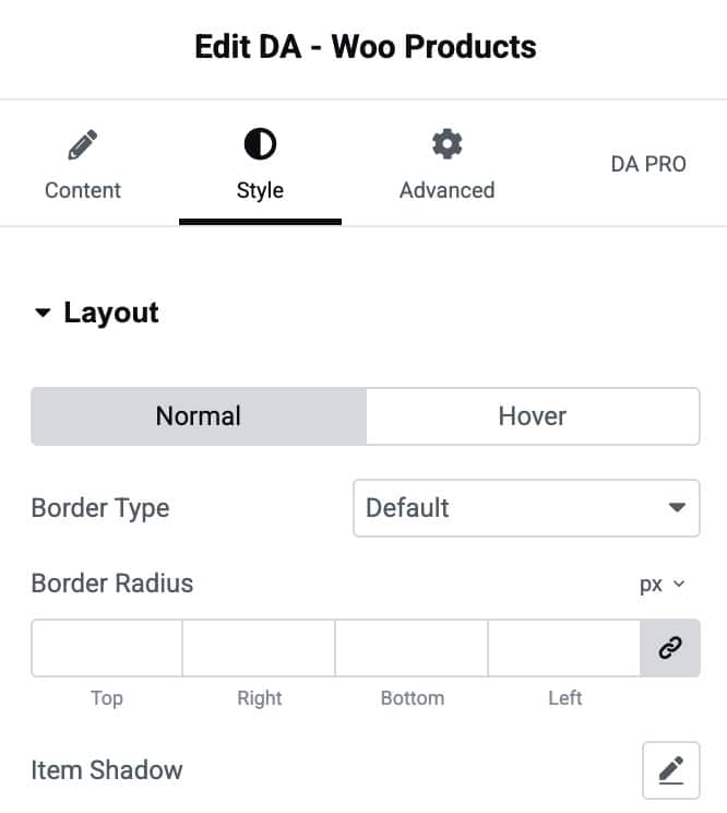
Style
Layout
- Normal / Hover: Switch between styling the product layout in its normal state and when hovered.
- Border Type: Choose the style of the border around each product item.
- Border Radius: Adjust the roundness of the product item’s corners.
- Item Shadow: Apply a shadow effect to the product item.
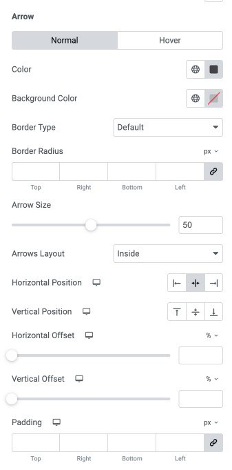
Arrow
- Normal / Hover: Customize the arrow appearance for both regular and hover states.
- Color: Sets the color of the navigation arrows.
- Background Color: Defines the background color of the arrow buttons.
- Border Type: Selects the border style for the arrow buttons.
- Border Radius: Adjusts the roundness of the arrow button corners.
- Arrow Size: Controls the overall size of the arrow icons.
- Arrows Layout: Choose whether the arrows appear inside or outside the carousel container.
- Horizontal Position: Align the arrows horizontally.
- Vertical Position: Align the arrows vertically.
- Horizontal Offset: Moves the arrows left or right for precise positioning.
- Vertical Offset: Moves the arrows up or down for exact alignment.
- Padding: Adjusts the inner spacing inside the arrow buttons for size and spacing control.
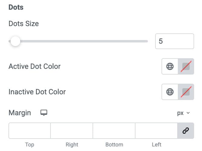
Dots
Note: Pagination controls will only appear based on the Pagination Type you selected in the settings.
- Dots Size: Controls the size of the pagination dots.
- Active Dot Color: Sets the color of the dot representing the currently active slide.
- Inactive Dot Color: Defines the color of the dots for non-active slides.
- Margin: Adjusts the spacing around the dots area.
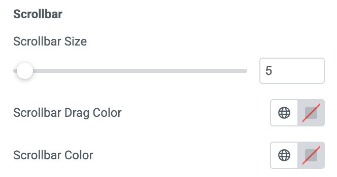
Scrollbar
- Scrollbar Size: Controls the thickness of the scrollbar.
- Scrollbar Drag Color: Sets the color of the draggable scrollbar.
- Scrollbar Color: Defines the background color of the scrollbar track.