
DA – Portfolio
DA – Portfolio is a collection of Post, Pages, Categories, or anything which have individual pages to be displayed.
It provides four options to create a portfolio.
Content
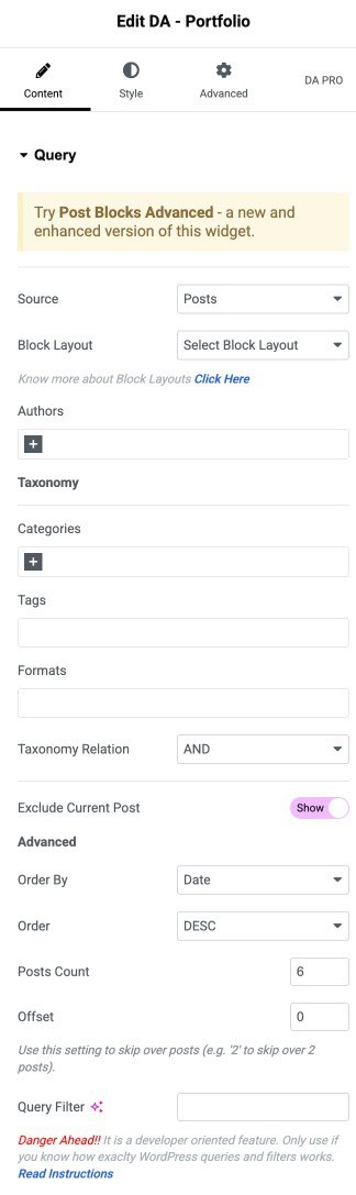
Query
- Source: Here, you need to select the content for which you want to create a portfolio. Content can be anything like a post, pages, categories, etc.
- Block Layout: Here, you can select the layout in which you want your portfolio content to appear. A list of all the layouts created by you will be displayed.
- Authors: Select the author’s name whose post you want to display.
- Categories: Select the category whose post/page you want to display.
- Tags: To display posts associated with a particular tag.
- Formats: Specify the name of the format created to display post content.
- Order By: In this, you can order the source for which you want to create a portfolio in a certain manner. You can use different options like Date, Title, etc., to filter your post.
- Order: It sorts your post in ascending or descending order based on the criteria selected in the Order By option.
- Post Count: You can use the Post Count option to display a specific number of posts on a single page. It takes a numeric value, which signifies the number of posts to be displayed at a time.
- Offset: Use this setting to skip over posts (e.g., “2” to skip over 2 posts).
- Query Filter: Add your custom query filter. Know More
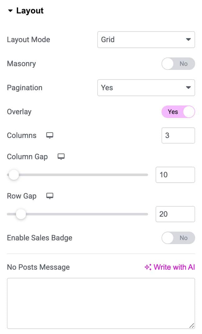
Layout
- Layout Mode: Here, you can choose whether you want to display your portfolio design in a list or in a grid format.
- Masonry: It is used to present the images seamlessly.
- Pagination: Here, you can choose if you want page numbers to be displayed or not.
- Columns: You can specify the number of columns you want to display containing posts as a portfolio.
- Column Gap: Here, you can specify the amount of space to be kept between columns.
- Row Gap: Amount of space to be kept within two individual rows.
- Enable Sales Badge: Activate the option to display the sales badge.
- No Post Message: Enter the message that will display when no post is displayed.
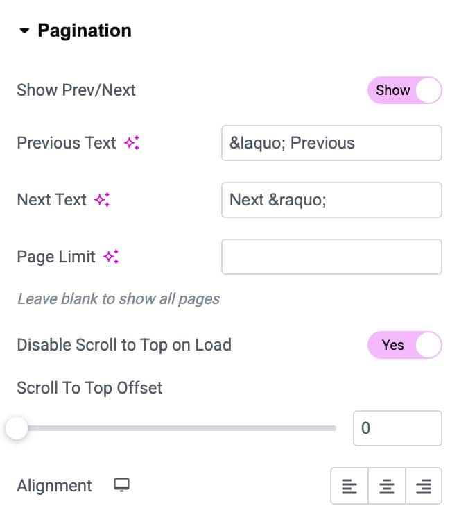
Pagination
If you have selected the Pagination option in the layout, then you have more settings available. Show Prev/Next: Select or deselect it if you want to display the next and previous buttons on your portfolio page.
- Previous Text: Here, you can give any name to your previous button.
- Next Text: You can give any other name to your next button.
- Page Limit: It signifies the maximum number of pages that can be included in your portfolio.
- Disable Scroll To Top on Load: Enable this option if you want to disable scroll on load.
- Scroll To Offset: Set the offset value.
- Alignment: Alignment can be set Left, Center, and Right.
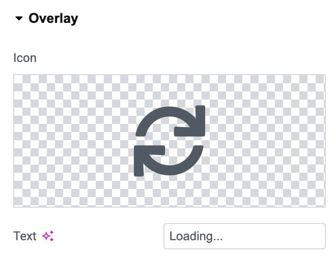
Overlay
- Icon: Choose the icon the display on overly.
- Text: Select the overlay text.
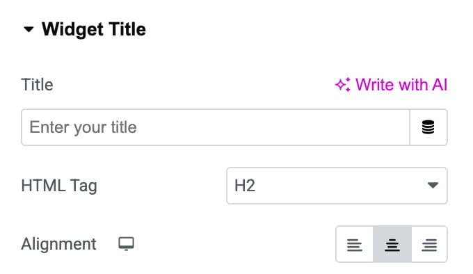
Widget Title
- Title: Enter the title.
- HTML Tag: Select the HTML tag.
- Alignment: Select the alignment of title.
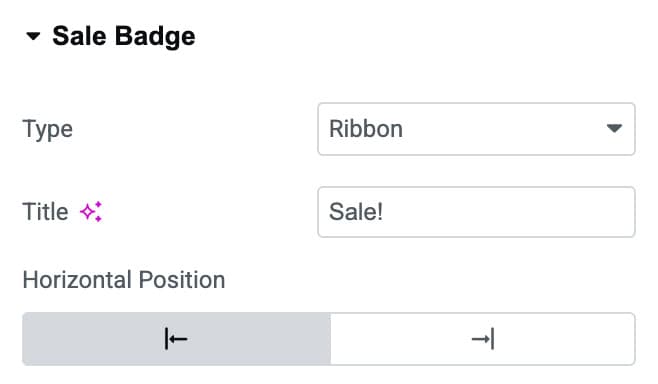
Sale Badge
- Type: Choose the type of badge you want to display.
- Title: Set the title of badge.
- Horizontal Position: Choose the horizontal position.
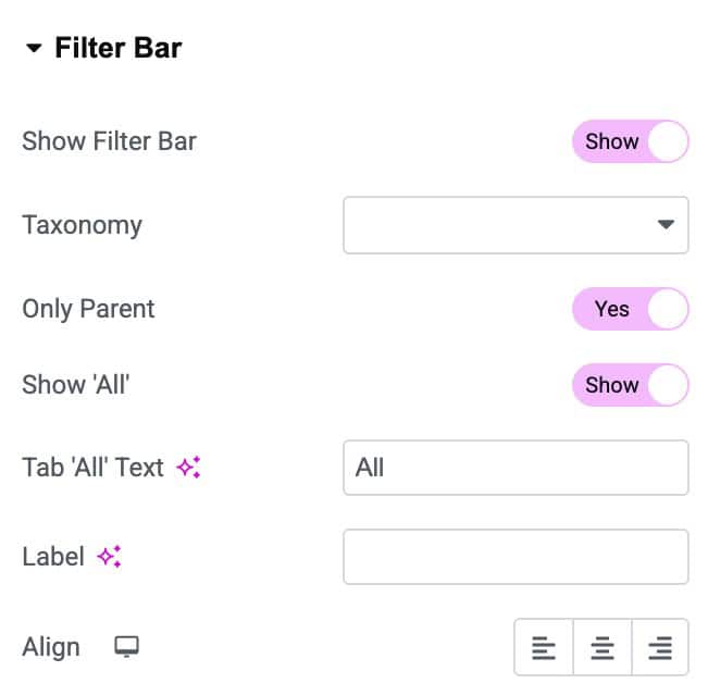
Filter Bar
It is a bar that is displayed on the top of your portfolio content.
- Show Filter Bar: You can choose whether you want to display the filter bar or not.
- Taxonomy: Here, you can select the content that you want to be displayed on the filter bar. All your created Taxonomies list is displayed from which you can choose.
- Only Parent: Enable it to show only the parent taxonomy
- Show All: If you want to display all the content of the selected taxonomy in a single tab, you can use it.
- Tab ‘All’Text: Here, you can assign a name to the Show All tab.
- Label: Add a text label for the filter bar.
- Align: Alignment can be given to the Filter Bar accordingly, like left, center, and right.
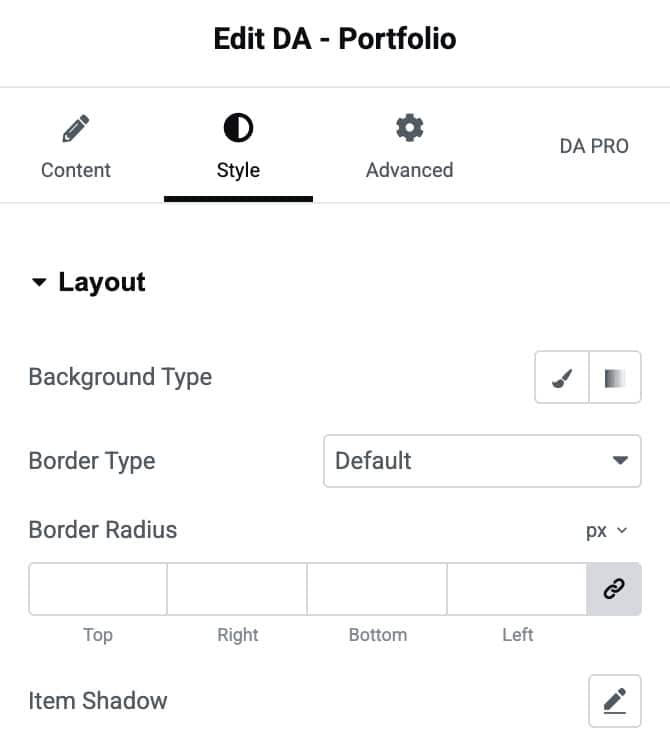
Style
Layout
- Background Type: Choose a background color for the layout container.
- Border Type: Select the style of the border.
- Border Radius: Adjust the border radius.
- Item Shadow: Apply a shadow effect to the container.
Overlay
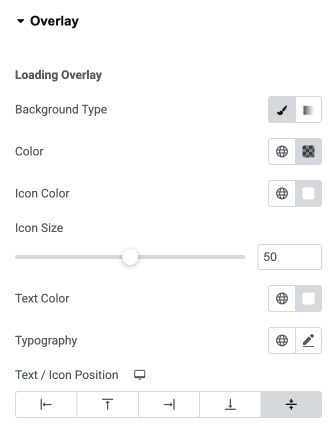
- Background Type: Choose a solid or gradient background for the loading overlay.
- Color: Set the background color used when the overlay is active.
- Icon Color: Select the color of the loading icon displayed on the overlay.
- Icon Size: Adjust the size of the loading icon using the slider.
- Text Color: Set the color of the loading text displayed with the icon.
- Typography: Customize the font style, size, and weight of the loading text.
- Text / Icon Position: Control the alignment and placement of the icon and text within the overlay.
Pagination
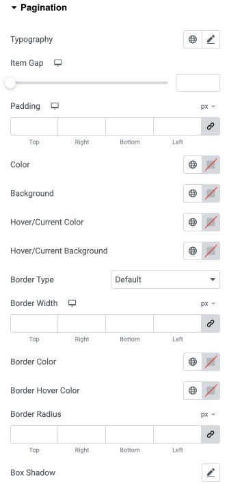
- Typography: Customize thetypography.
- Item Gap: Adjust the spacing between individual pagination items.
- Padding: Add inner spacing inside pagination items to control size and layout.
- Color: Set the default text color for pagination items.
- Background: Choose the default background color for pagination items.
- Hover/Current Color: Set the text color for the hovered or currently active page.
- Hover/Current Background: Choose the background color for the hovered or active page.
- Border Type: Select the border style.
- Border Width: Adjust the thickness of the border for each side of pagination items.
- Border Color: Set the default border color for pagination items.
- Border Hover Color: Choose the border color when items are hovered or active.
- Border Radius: Control the corner roundness of pagination items.
- Box Shadow: Add a shadow effect to pagination items for depth and emphasis.
Sale Badge
- Background Color: Set the background color of the sale badge.
- Distance: Adjust the spacing between the sale badge and the product image or container.
- Text Color: Choose the text color for the sale badge label.
- Typography: Customize the font style, size, and weight for the badge text.
- Border Type: Select the border style for the badge.
- Border Radius: Control the roundness of the badge corners.
- Box Shadow: Add shadow effects to the sale badge for depth and emphasis.
- Padding: Add inner spacing inside the badge for better text placement.
- Margin: Add outer spacing around the sale badge to adjust its position.
Widget Title
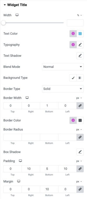
- Width: Adjust the width of the widget title container.
- Text Color: Set the text color for the widget title.
- Typography: Customize the typography of the title text.
- Text Shadow: Apply a shadow effect to the widget title text.
- Blend Mode: Choose how the title visually blends with the background (e.g., Normal, Multiply).
- Background Type: Select a solid or gradient background for the widget title container.
- Border Type: Choose the style of the border.
- Border Width: Define the border width.
- Border Color: Set the color of the border surrounding the widget title.
- Border Radius: Adjust the border radius.
- Box Shadow: Add shadow effects to the title container for visual depth.
- Padding: Set the inner spacing around the widget title.
- Margin: Add outer spacing around the widget title to adjust its placement in the layout.
Filter Bar
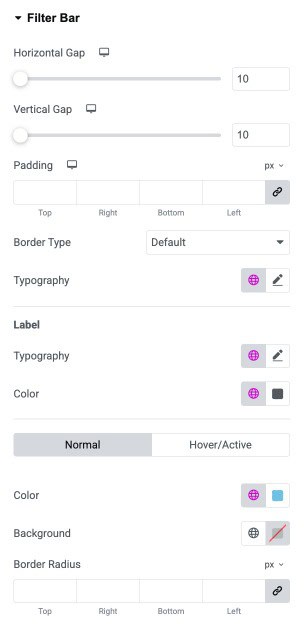
- Horizontal Gap: Adjust the spacing between filter items horizontally.
- Vertical Gap: Adjust the spacing between filter items vertically.
- Padding: Add inner spacing around the filter bar container (top, right, bottom, left).
- Border Type: Select the style of the border for the filter bar (default, solid, dashed, etc.).
- Typography: Customize the font style, size, and weight for all filter labels.
Label
- Typography: Customize the font for each filter label individually.
- Color: Set the text color for filter labels.
Hover/Active State
- Color: Set the text color when a label is hovered or active.
- Background: Choose the background color for hovered or active labels.
- Border Radius: Adjust the corner roundness of each filter label.
Check out the Post Block Adv widget to get more controls on functionality for displaying post-data.