DA – ACF Fields V2
The DA – ACF Fields V2 widget is an upgraded version of the DA – ACF Fields widget. It allows you to fetch and display data from the fields created using the Advanced Custom Fields (ACF) plugin.
In this version, you get all the existing data-fetching options along with a new Unfold feature that helps you control how much content is visible at first. Users can click a button to reveal or hide additional content dynamically.
This widget features the following controls.
Content
General
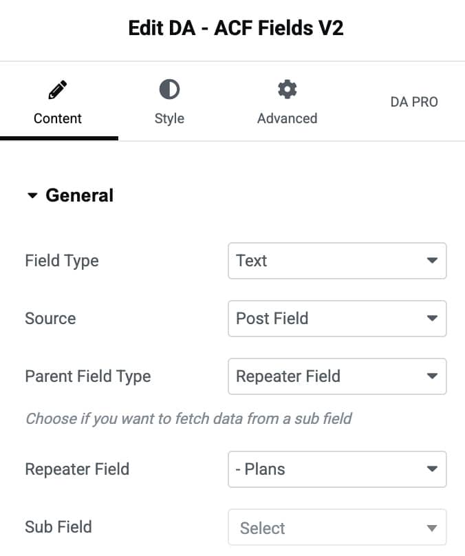
- Field Type: Choose the type of field data you want to display, such as Text, Image, URL, etc.
- Source: Select where the field data comes from (for example, Post Field, Term Fields, User Field, or Options Page).
- Parent Field Type: If your field is part of a repeater or group field, choose the option here.
- Repeater Field: Select the repeater field name that contains the sub-field you want to fetch data from.
- Sub Field: Choose the specific sub-field inside the selected repeater from which data should be retrieved.
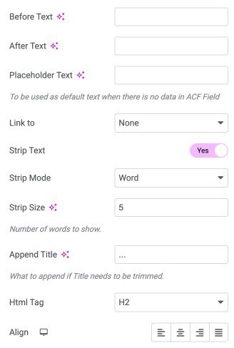
- Before Text: Add custom text that appears before the ACF field value.
- After Text: Add custom text that appears after the ACF field value.
- Placeholder Text: Enter default text that will display when the ACF field has no data.
- Link To: Turn the field data into a clickable link.
- Strip Text: Enable this option to shorten the displayed text.
- Strip Mode: Choose how you want the text to be trimmed by Word or Letter.
- Strip Size: Set the number of words or letters to display before trimming the rest of the content.
- Append Title: Add text at the end of the trimmed content to indicate that more text exists.
- HTML Tag: Choose the HTML tag to wrap the field output.
- Align: Select the alignment of text.
Unfold
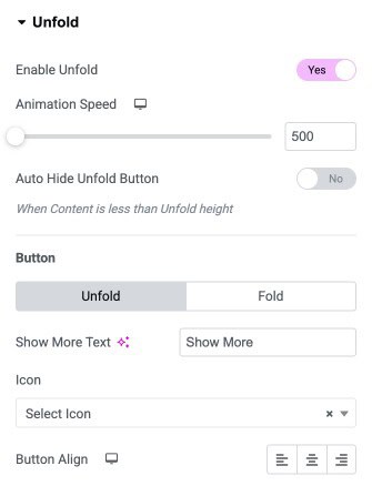
- Enable Unfold: Turn this option on to activate the unfold functionality.
- Animation Speed: Set the speed of the unfold and fold animation.
- Auto Hide Unfold Button: Automatically hide the unfold button when the content is shorter than the defined unfold height.
Button
- Unfold/Fold: Switch between the settings for the “Unfold” and “Fold” states of the button.
- Show More Text: Enter the text that appears on the unfold button.
- Icon: Choose an icon to display with the button text.
- Button Align: Set the alignment of the button.
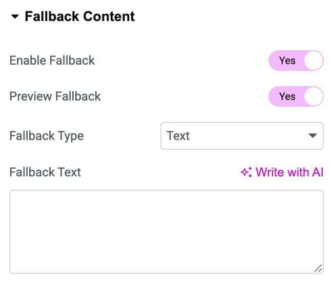
Fallback Content
- Enable Fallback: Turn this option on to activate fallback content for empty or missing ACF fields.
- Preview Fallback: Enable this option to preview the fallback content directly in the editor.
Fallback Type: Select the type of fallback content you want to display (such as text, image, or template).
Style
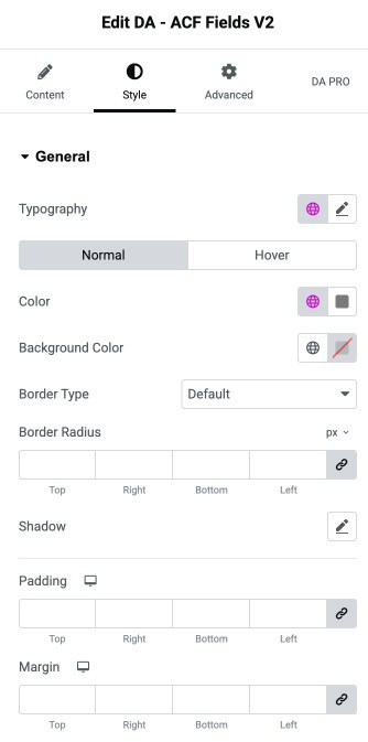
General
- Typography: Controls the typography.
- Color: Sets the text color for the text.
- Background Color: Defines the background color of the element.
- Border Type: Selects the border style.
- Border Radius: Adjusts the roundness of the element’s corners.
- Shadow: Applies a shadow effect to the element.
- Padding: Sets the inner spacing inside the element.
- Margin: Sets the outer spacing outside the element.
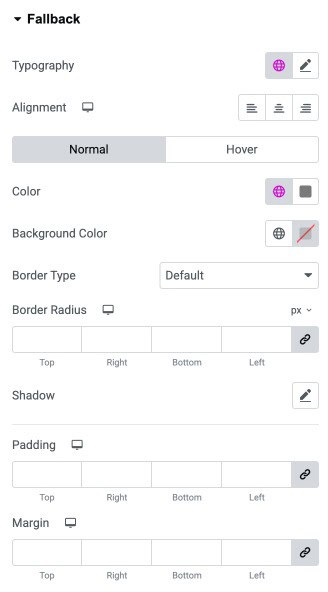
Fallback
- Typography: Adjusts the typography of fallback text.
- Alignment: Sets the horizontal alignment of the fallback text.
- Color: Defines the text color for fallback content.
- Background Color: Sets the background color behind the fallback content.
- Border Type: Selects the border style for the fallback box.
- Border Radius: Controls how rounded the fallback element’s corners appear.
- Shadow: Adds a shadow effect to the fallback element for visual depth.
- Padding: Sets the padding.
- Margin: Sets the margin.