Complete Guide to Elementor v4 Design System
As your website grows, keeping its design consistent can become difficult.
The same colors, fonts, spacing, buttons, and other styles may be used across many pages. If these styles are managed separately, even a small design change can require updating multiple elements manually.
A design system helps solve this problem by keeping commonly used design values and styles organized and reusable.
In Elementor v4, Variables and Classes help you build this system, while the Design System panel gives you one place to view and manage them.
In this guide, we’ll look at how the Elementor v4 Design System works and how you can use it to manage your website more easily.
What Do You Need Before Using the Design System?
- Elementor v4.0 or later, the Design System panel is a v4 feature
- Elementor v4.1 or later for the unified Design System panel this article focuses on. Classes and Variables existed from v4.0 onward, but they lived in two separate managers until v4.1 combined them into one panel.
- Elementor Free or Pro, the panel is available in both, but Pro is needed to view Variables (Free users see Classes only)
- Any WordPress theme
Why Use a Design System in Elementor?
On a small website, manually managing styles may work fine. But as you add more pages and elements, it becomes easier for the design to become inconsistent.
For example, you may end up with:
- Different shades of the same brand color
- Slightly different button styles
- Inconsistent heading sizes
- Different spacing between similar sections
A design system gives you reusable values and styles that you can use throughout the website.
This helps you:
- Keep the design consistent
- Reuse existing styles
- Make site-wide changes more easily
- Keep design settings organized as the website grows
Instead of styling every element separately, you create common design values and styles once and reuse them wherever needed.
How Does the Elementor v4 Design System Work?
Elementor v4 mainly uses Variables and Classes to create a reusable design system.
Variables
Variables store reusable values such as colors, typography, and sizes.
For example, you can create a Variable called color-primary for your main brand color and use it across buttons, headings, backgrounds, and other elements.
If you change the Variable later, elements using it can use the updated value.
For a detailed walkthrough, read our Complete Guide to Elementor v4 Variables.
Classes
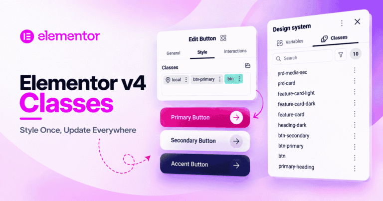
Classes store reusable groups of styles.
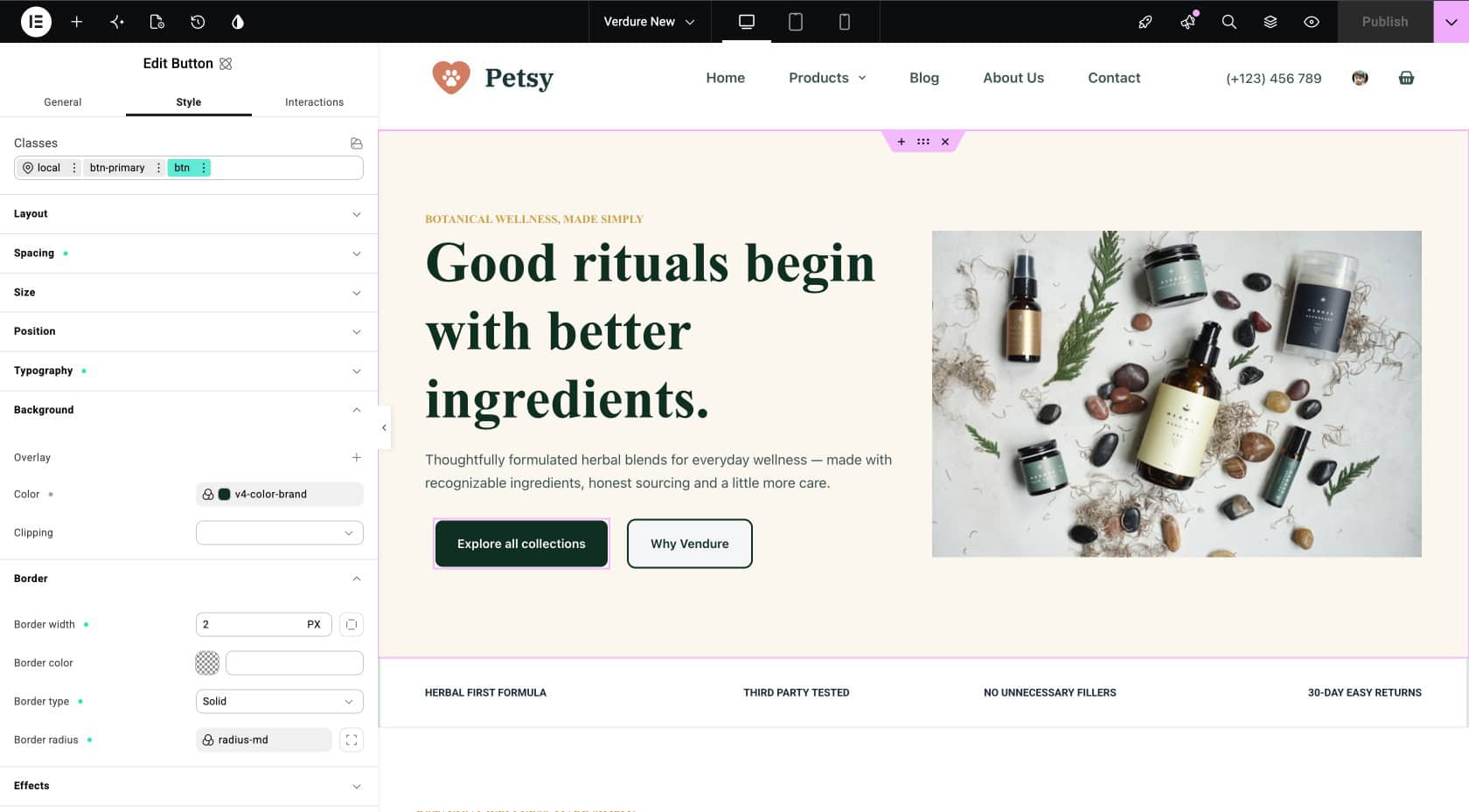
For example, a btn-primary Class can contain the background color, text color, padding, border radius, and hover styles for your primary buttons.
You can apply the same Class to multiple buttons instead of styling each one separately.
Learn more in our Complete Guide to Elementor v4 Classes.
Together, Variables and Classes form the foundation of your Elementor design system.
What Is the Elementor v4 Design System Panel?
The Design System panel is a dedicated view inside Elementor v4 that displays every Variable and every global Class registered on your site in one screen. It does not add new capabilities. It gives you visibility and control over the system you have already built.
Three things become possible once you use it regularly:
- See everything in one place: No need to open the Variables Manager, then separately open the Class Manager, just to find a color you set up weeks ago. It is all visible together.
- Edit any part from one place: change a color, adjust a Class, update a size, all without leaving the panel
- Present the system as a whole: to clients, teammates, or future you looking back on the project six months later
Where to Find the Design System Panel
Inside the Elementor editor:
- Look at the Top Bar and click the Design System icon.
- The panel opens directly, showing your entire system on one screen.
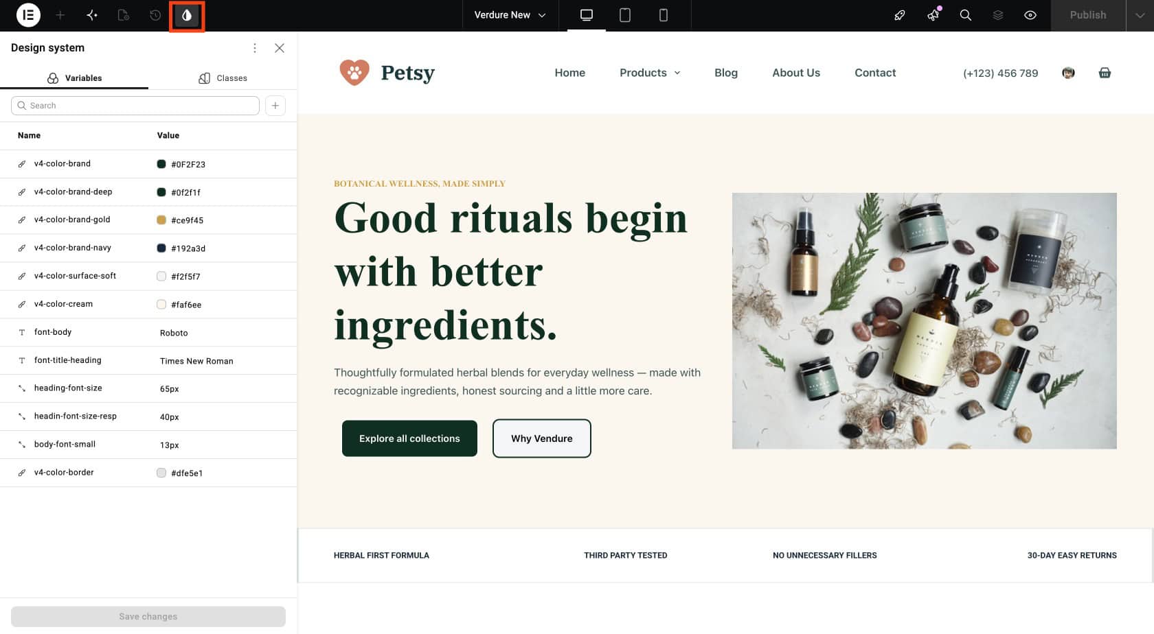
Notes: This panel is a v4.1 addition. If you are on an earlier v4.0 build, you will still have Classes and Variables individually, through the Class Manager and Variables Manager, but not this combined view. Update to v4.1 or later to get the unified panel described in this article.
What Can You Manage in the Design System?
The panel organizes your design settings into different sections.
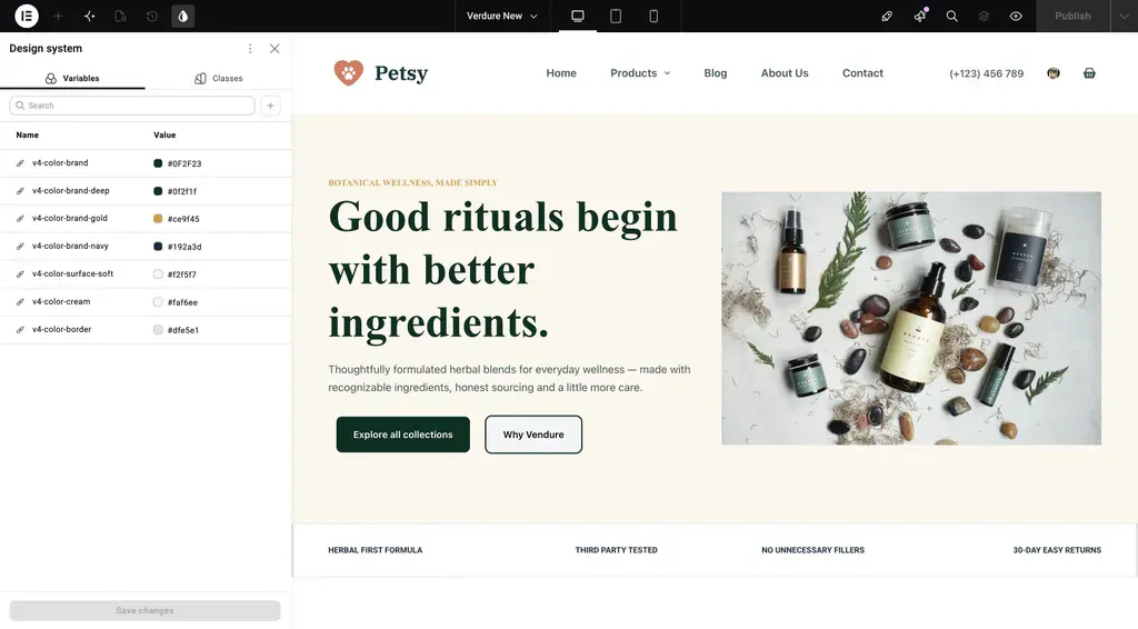
Colors
The Colors section contains the color Variables used on your website. Using named Variables makes it easier to understand where each color should be used.
color-primary, deep forest green (#0F2F23)color-primary-dark, hover state (#08201A)color-accent, warm gold (#C99A3D)color-text, body text (#24332D)color-text-muted, secondary text (#6B7770)color-bg, page background (#FFFFFF)color-bg-alt, cream background (#FAF6EE)
Typography
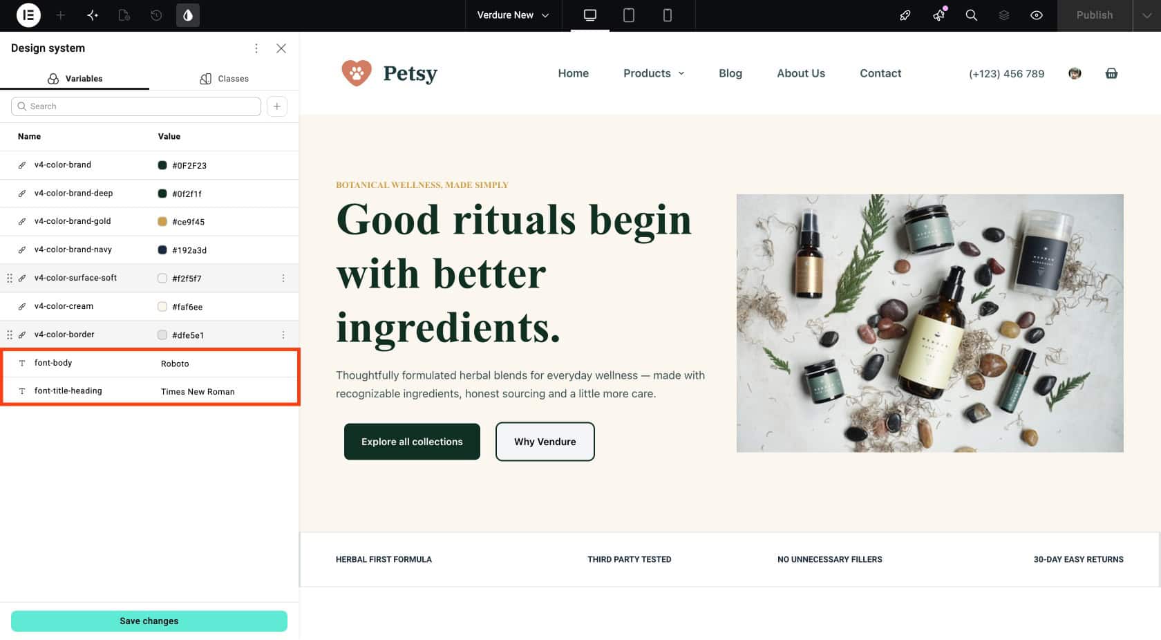
- The Typography section contains reusable typography values, such as your heading and body fonts.
font-display(Cormorant Garamond), used for headingsfont-body(Inter), used for body texttype-h1throughtype-small, the full type scale
Sizes
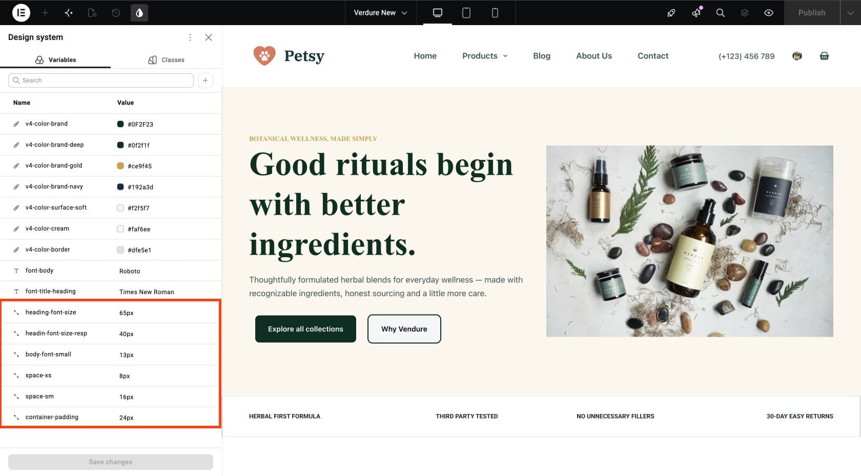
All size-based Variables: spacing, container widths, image dimensions, radius values.
- Spacing:
space-xsthroughspace-section - Sizes:
hero-image-size,product-image-height,container-width - Radius:
radius-smthroughradius-pill
Classes
Every global Class you have created, with properties visible on click.
- Button:
btn,btn-primary,btn-accent,btn-outline - Card:
card,card-product,card-category,card-benefit,card-blog - Section:
section,section-alt,section-dark,section-header - Layout:
container,grid-2,grid-3,grid-4 - Heading:
heading,heading-h1,heading-h2,heading-h3 - Text:
eyebrow,text-muted
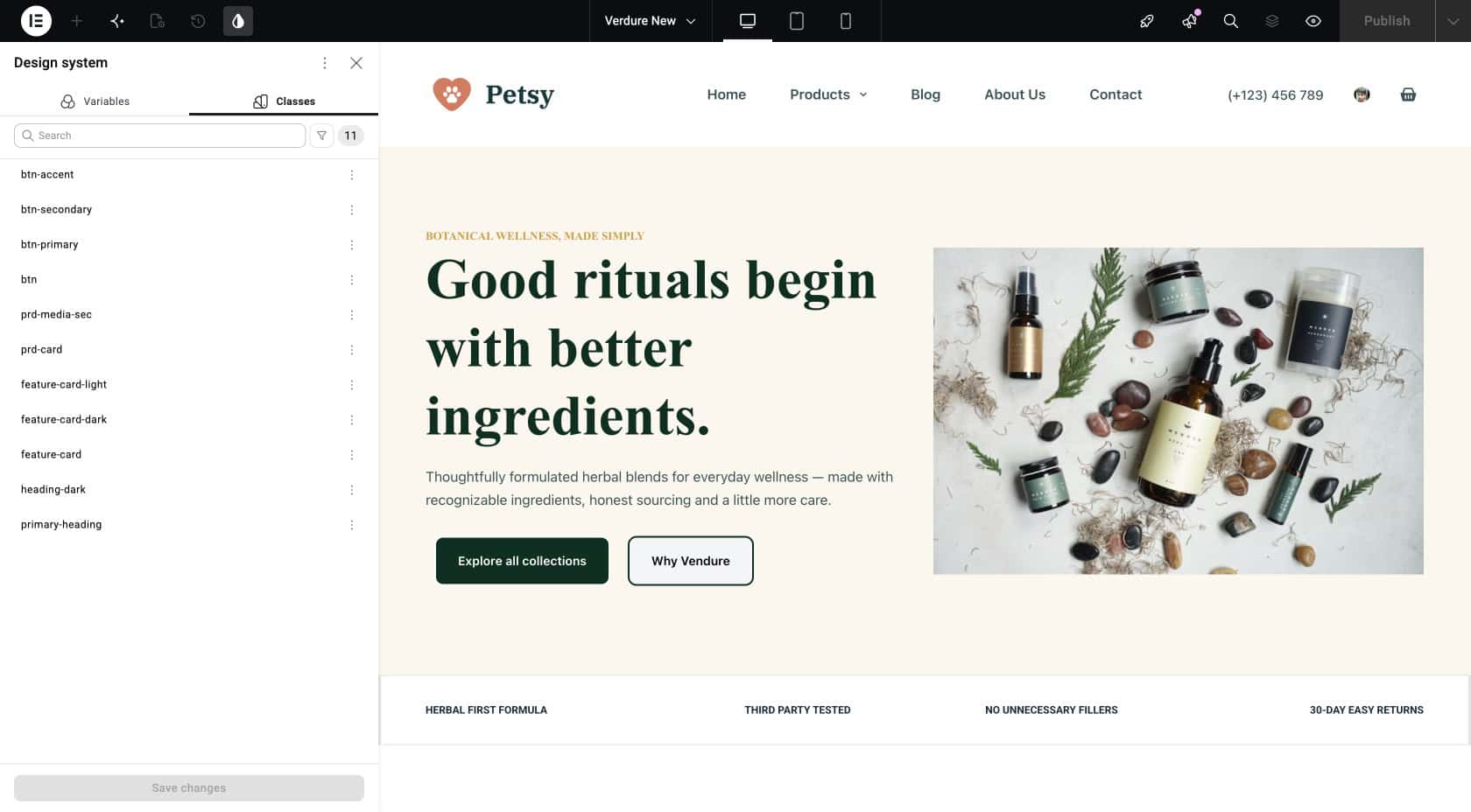
Important: The layered Class pattern covered in the Classes article is visible here: btn handles structure, btn-primary handles appearance. Applied together, they produce a fully styled primary CTA.
How to Use the Design System Panel on a Real Website
The Design System becomes especially useful when you need to make changes or review the styles used across your website.
Workflow 1: Update Your Brand Everywhere in Seconds
Suppose you want to change your primary brand color.
If your website uses a color-brand Variable, you can update that Variable instead of manually changing the color on multiple elements. With the Design System panel:
- Open Design System
- Click the
color-brandswatch - Change the hex value
- Save
Every button using btn-primary, every dark section, every heading using color-brand, every accent across every page on the site updates instantly.
Workflow 2: Keep Your Classes Organized
As you build more pages, you may create more Classes. Over time, similar Classes can appear, such as:
btn-primary and btn-primary-new.
Reviewing your Classes helps you find duplicates and reuse existing styles instead of creating unnecessary new ones.
Try to use clear names so you can easily understand what each Class is for.
Workflow 3: Present the System to a Client
When handing a project off to a client or presenting to a designer, screen-share the Design System panel instead of opening several different settings screens. It answers the “what does the brand use?” question in seconds.
For agencies, this might be the single most useful thing about the panel. Design reviews become shorter. Client conversations become clearer. The design system stops being a hidden technical detail and becomes a visible deliverable.
What Mistakes Should You Avoid?
- Treating the panel as read-only: The Design System panel is fully editable. Changes save immediately and propagate everywhere. Use it as your primary editing surface for design system work.
- Not auditing regularly: Class libraries grow. Open the panel on a regular schedule, delete unused Classes, consolidate duplicates. A short, regular check prevents a much bigger cleanup later.
- Building pages without setting up the system first: Some teams start designing and hope to extract Variables later. It rarely works cleanly. Set up your core Variables and a few base Classes before the first page. The rest of the system grows naturally from there.
- Skipping the panel during client handoff: The Design System panel answers most “what does the brand use?” questions in one screen. Not showing it during handoff means fielding those same questions over email for weeks afterward.
Frequently Asked Questions
What is the Elementor v4 Design System?
The Elementor v4 Design System brings reusable design values and styles together so they are easier to view and manage.
Does the Elementor v4 Design System panel work in Elementor Free?
Yes, with limits. Free users see the Classes section fully but see no Variables (Variables require Pro). Pro users see everything.
Can I edit Variables and Classes directly from the panel?
Yes. Clicking any Variable or Class opens it for editing inside the panel. Changes save immediately and propagate site-wide.
What is the difference between Variables and Classes?
Variables store reusable values such as colors, fonts, and sizes. Classes store reusable groups of styles that can be applied to elements.
How is the Design System panel different from the Variables Manager and Class Manager?
The Variables Manager shows only Variables. The Class Manager shows only Classes. The Design System panel shows both together in one organized view. Same underlying data – different way of looking at it.
Do I need a design system for a small site?
Not necessarily. A small website may be easy to manage manually. A design system becomes more useful as your website grows and the same styles are reused across multiple pages and elements.
Wrapping Up
The Elementor v4 Design System gives you a more organized way to manage repeated design values and styles.
Variables help you reuse values such as colors, typography, and sizes, while Classes help you reuse complete groups of styles.
The Design System panel brings them together so you can easily see and manage the styles available across your website.
You don’t need to build a large design system from the beginning. Start with the colors, typography, spacing, and styles you use most often, and expand the system as your website grows.
This keeps your design consistent while making future changes easier to manage.