How Do Elementor v4 Classes Work? A Complete Guide
Styling every button on a website the old way meant setting the same padding, font size, border radius, and hover color on each button, one by one. If you wanted to change how buttons looked later, you had to open every single button and update it by hand. Miss even one, and the site looked inconsistent.
Elementor v4 Classes solve this problem. You set a button’s styling once inside a Class, apply that Class to every button on the site, and every button looks the same automatically. Change the Class one time, and every button using it updates everywhere, instantly.
Here’s something most tutorials don’t explain clearly: in Elementor v4, every single element already has a Class attached to it, whether you set one yourself or not. So you’re never really starting from zero. The real question is just which Classes are worth turning into reusable ones, and which ones are fine staying as they are.
This guide covers how Elementor v4 Classes actually work, step by step: how to turn one element’s style into something reusable, a simple button pattern you can apply across a whole site, and how to break out of a Class for the rare one-off element that needs to look different.
Notes: If you’re on Elementor Pro, we strongly recommend reading the Complete Guide to Elementor v4 Variables first. Classes become significantly more powerful when their property values reference Variables.
What Do You Need Before Working With Classes?
- Elementor v4.0 or later. Classes are a v4 feature, so your site needs to be running v4 with the Atomic Editor active. Older, non-atomic elements don’t support Classes.
- Elementor Free or Pro. Classes work in both versions, so you don’t need Pro to follow this article start to finish. Pro users get more out of Classes because they can reference Variables inside a Class’s properties. For example, a
btn-primaryClass can usecolor-primaryas its background, so changing that one Variable updates every button using the Class.
- Any WordPress theme. Classes work regardless of which theme is active.
- Basic Elementor familiarity. You should already know how to open the editor, add elements, and adjust properties.
What Are Elementor v4 Classes?
A Class in Elementor v4 is a reusable style bundle you can apply to multiple elements. Instead of setting background color, padding, border radius, and hover state on every button one at a time, you define those styles once inside a Class named btn-primary and apply it wherever you need it.
Here’s the part most tutorials get wrong: every element in Elementor v4 automatically has a Class.
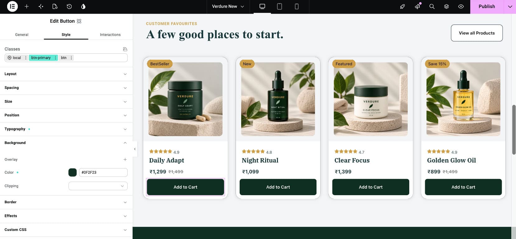
When you drop a button onto the canvas, Elementor creates a Class named local and attaches it to that button automatically. Every property you set, background, padding, hover state, sits inside that local Class. Nothing is truly inline anymore, the way it used to be in older versions.
This changes how you should think about styling:
- Local Classes (shown in pink in the Classes field) apply to one specific element only, and always take priority over any Global Class applied to the same element.
- Global Classes (shown in green in the Classes field) apply to every element that uses them.
The workflow
Style locally first, then promote to global once you know you’ll reuse it.
How Do You Create Your First Class?
There are actually two ways to create a Class in Elementor v4. The first is faster, the second is better once you already have a styled element you want to reuse.
The quick way: type a new Class name directly
Select any element, open the Classes field in the Style tab, and simply type a new name, for example btn, then press Enter. Elementor creates a brand-new Global Class on the spot (shown in green), ready for you to style. This is the fastest way to start a new reusable Class from scratch.
You’ll use this same process when we structure Classes for a real site later in this guide, so it’s worth getting comfortable with it here first.
The reuse way: style locally, then convert to global
Sometimes you style something first and only decide to reuse it afterward. Here’s that workflow using a button as the example.
Add and style an element
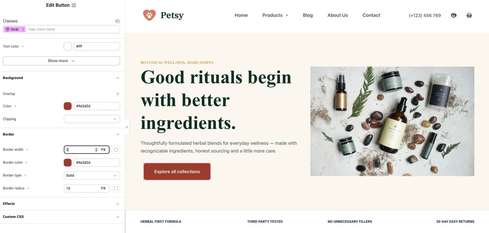
Drop a button onto the canvas. Notice the Classes field already shows local attached to it, in pink. Style the button:
- Padding: 14px 32px
- Typography: 16px, weight 600
- Border radius: 10px
- Background color
- Text color
- Hover background color
Every property sits inside the local Class right now.
Convert the local Class to global
Once you want to reuse the styling:
- Click the three-dot menu next to the
localClass name - Select Convert to global class
- Rename it to something meaningful, like
btn-accent - The Class name turns from pink to green: it’s now global
From this moment on, btn-accent
Apply the Global Class to Another Element
Drop a new button anywhere else. In the Classes field, type btn-accent
Now select either button, click on btn-accentbtn-accent
How Should You Structure Classes on a Real Site?
Here’s a pattern that scales across a production site: the button hierarchy example. Most tutorials show you one Class per element type. Real sites need a bit more structure than that.
Suppose a homepage hero section has two buttons, a primary CTA and a secondary CTA. Most people would create two Classes: btn-primary and btn-secondary. That works, but it duplicates a lot of styling, since both buttons share the same padding, typography, border radius, and hover behavior. Only the colors actually differ.
A better pattern is a layered Class approach.
The btn Class: structural styling
Type btn into the Classes field and press Enter to create it, the same way you created your first Class earlier. This Class will hold every button’s shared structure:
- Padding: 15px 25px
- Typography: 14px, weight 600
- Border radius: 20px
- Border width: 2px
This Class handles the “button-ness” of every button. Nothing color-related lives here.
The btn-primary Class: appearance only
Create a second Class the same way, called btn-primary, that only sets appearance:
- Background color
- Text color
- Hover background color
Apply both Classes to a primary button: btn handles structure, btn-primary handles appearance.
The btn-secondary Class: a different appearance
Same idea. A third Class called btn-secondary that only sets appearance:
- Background color (transparent or lighter)
- Border color
- Text color
- Hover appearance
Apply btn and btn-secondary to a secondary button.
The result: change the shared padding across every button on the site by updating btn once. Change the primary brand color by updating btn-primary once. No duplicated work, no styles quietly drifting apart from each other.
This layered approach, a structural Class plus an appearance Class, is how design systems stay manageable as a site grows past a handful of buttons.
How Do You Override a Class for a One-Off Element?
Sometimes you need a button that follows the same structure and appearance as every other primary button, but needs one thing to look different, say a unique background color for a special CTA on a promotional section. You don’t want to create a whole new Class for one element.
Elementor v4’s answer: use the
localClass every element already has, and let it override just the one property you need to change.
Here’s the workflow using the button example:
- Apply both
btnandbtn-primaryto the special button, so it inherits all the usual styling: padding, typography, border radius, hover behavior, and the standard primary background color. - In the Classes field, click on
local, the class every element already has by default, to make it your active editing target. - Set your custom background color there.
Even though btn-primary already defines a background color for this button, the local Class always takes the highest priority. Setting the background color on local overrides whatever btn-primary says, without touching btn-primary itself or any other button using it.
You can do this for any property on any element. The rule of thumb: inherit the Class for everything you want consistent, override locally only what needs to be different.
This is how design systems stay maintainable without becoming rigid. You get consistency by default and flexibility when you need it.
What Happens When You Change a Class?
Here’s the moment the whole system pays off.
Say you built a homepage with several buttons using the btn and btn-primary combination, spread across the hero section, the services grid, the case study section, the pricing cards, and the final CTA.
Your marketing team decides the primary brand color needs to shift from a dark green to a lighter, brighter green.
Without Classes, that means opening every one of those buttons across the homepage, and every other page they appear on, and manually changing each background color, hover color, and any related border colors.
With the layered Class system, you do this instead:
- Select any button that already has
btn-primaryapplied. - In the Classes field, click on
btn-primaryto make it the active class you’re editing. - Change the background color property.
- Save.
Every button using btn-primary, across every page of the site, updates instantly.
Pro users get even more from this: if btn-primary‘s background references the color-primary Variable instead of a hardcoded hex value, you don’t even need to update the Class. Update the Variable once, and both the Class and every button using it change together.
That’s the Variables and Classes combination in action.
What’s a Good Starter Class Set to Use?
The button hierarchy is one example. Here’s a starter set that covers what most business sites actually need, without over-engineering things.
Button
| Class Name | Purpose |
|---|---|
btn | Shared structural styling: padding, typography, border radius, transitions |
btn-primary | Primary appearance: brand-color background, white text |
btn-secondary | Secondary appearance: outlined or lighter variant |
btn-accent (optional) | Attention-grabbing variant using the secondary brand color |
Card Classes
| Class Name | Purpose |
|---|---|
card | Base card style: background, padding, border, hover shadow |
card-icon | Icon wrapper inside cards |
card-featured (optional) | Highlighted card variant with primary color accent |
Section Classes
| Class Name | Purpose |
|---|---|
section | Base section wrapper with standard vertical padding |
section-alt | Alternate background for tonal variety |
section-dark | Dark background for final CTAs and testimonials |
section-header | Centered header block above section content |
Layout Classes
| Class Name | Purpose |
|---|---|
container | Content wrapper with max-width and horizontal padding |
grid-3 | Three-column grid for card sections |
grid-4 | Four-column grid for metrics and features |
Why this specific set? It covers what a typical business site needs without turning into a maintenance headache. Start here, and add more Classes only when a real, repeating pattern actually demands one. A sprawling Class library is harder to maintain than a small, well-named one.
What Naming Conventions Should You Follow?
Class naming feels trivial on day one and becomes important once you’re maintaining a growing library. Three principles that hold up over time:
Name by purpose, not appearance
- Good:
btn-primary, since it stays correct even if the brand color changes tomorrow - Avoid:
btn-blue, since it becomes wrong the day the brand rebrands
Use consistent prefixes
Group related Classes with the same prefix:
- Buttons:
btn,btn-primary,btn-secondary,btn-accent - Cards:
card,card-icon,card-featured - Sections:
section,section-alt,section-dark - Grid layouts:
grid-2,grid-3,grid-4
Prefixes make Classes easier to find in the Class Manager and reduce naming collisions.
Use hyphen-separated lowercase
- Good:
btn-primary-outline - Avoid:
BtnPrimaryOutline,btn_primary_outline,btnPrimaryOutline
Consistency here matters more than which specific convention you pick. Choose one style and stick with it across every Class.
What Mistakes Should You Avoid With Classes?
A few habits worth avoiding before they cost you time later:
- Never promoting local Classes to global. If every element has its own unique
localClass, you have zero reusability. Every button, card, and section becomes a one-off. The Class Manager exists specifically to enable reuse. Use it.
- Promoting too early. Not every styled element needs to become a global Class. One-off decorative elements can stay local. Promote only once you’re confident you’ll reuse the styling elsewhere.
- Duplicating structure across appearance Classes. If your
btn-primaryandbtn-secondaryboth include padding, typography, and border radius, you’re duplicating work. Split into a sharedbtnClass for structure, plus appearance-only Classes (btn-primary,btn-secondary). One source of truth for structure, one for each appearance.
- Not using the local override option. When you need a one-off variation, don’t create a whole new Class for it. Apply the base Class for consistency, then switch just the properties that need to change back to local. This keeps your Class library lean and your special cases flexible.
- Not using Variables inside Classes (Pro users). If you’re on Pro and hardcoding hex values inside Classes, you’re missing the point. A
btn-primaryClass should referencecolor-primary, a Variable, as its background, rather than#0F4C81directly. That way, changing your brand color updates both the Variable and every Class using it.
Frequently Asked Questions
Do Elementor v4 Classes work in Elementor Free?
Yes. Classes are a Free-and-Pro feature. Pro adds the ability to reference Variables inside Class properties, but the core Class system works identically in both versions.
What’s the difference between a local and a global Class?
A local Class (pink) applies to one specific element only. A global Class (green) can be applied to any element site-wide, and changing the global Class updates every element using it. Every element starts with a local Class called local . You promote it to global when you want to reuse the styling.
Can I apply multiple Classes to the same element?
Yes. This is exactly how the layered Class pattern works. Apply btn for structure and btn-primary for appearance to the same button. Elementor merges the properties from all applied Classes, with later Classes taking priority when properties conflict.
How do I override a Class for a specific element without creating a new Class?
Apply the Class you want to inherit from, then switch specific properties back to local using the toggle next to the property in the panel. The element inherits everything from the Class except the properties you overrode locally.
Can I convert a global Class back to local?
Yes, but be careful. This breaks the connection between all elements that were using that global Class. They keep the styling but each becomes a separate local Class going forward.
How many Classes should I create for a typical site?
There’s no fixed number to hit. A small, well-organized set is usually enough: the starter set in this guide (buttons, cards, sections, and layout) is a good place to start. Add more only when a real, repeating pattern actually demands it.
What happens if I delete a global Class that elements are using?
Those elements revert to their default, unstyled state. Elementor warns you before deletion, but the change is hard to undo. You’d need to reapply the Class or restyle each element by hand.
Wrapping Up
Elementor v4 Classes replace the old “style every element from scratch” workflow with a reusable system. Set up your Classes once, and every new page inherits consistent styling automatically. Update a Class later, and every element using it updates instantly across the entire site.
The takeaways:
- Every element already has a Class. You’re not creating from scratch, you’re deciding scope: local or global.
- Local Classes stay unique to one element. Global Classes reuse across the site, and a Local Class always overrides a Global one.
- You can create a Global Class two ways: type a new name directly, or style locally first and convert it once you know you’ll reuse it.
- Layer your Classes. Split structure (
btn) from appearance (btn-primary) to avoid duplication. - Use the local override option for one-off variations instead of creating single-use Classes.
- Combine Classes with Variables (Pro) for the most powerful, maintainable design system.