Complete Guide to Elementor v4 Components
Think about the last card, testimonial, or CTA block you built that turned out exactly right, then needed to appear on a second page, a third, and a fourth. Did you copy and paste it every time, rebuild it from scratch, and hope nobody quietly changed the padding on one copy while leaving the rest untouched?
Elementor v4 Components exist for exactly this moment. Build the block once, drop it anywhere on the site, and when the original design changes, every copy updates with it. For that one copy that genuinely needs to break the pattern, say a product that’s gone out of stock, you can detach just that single copy and edit it freely, without disturbing anything else.
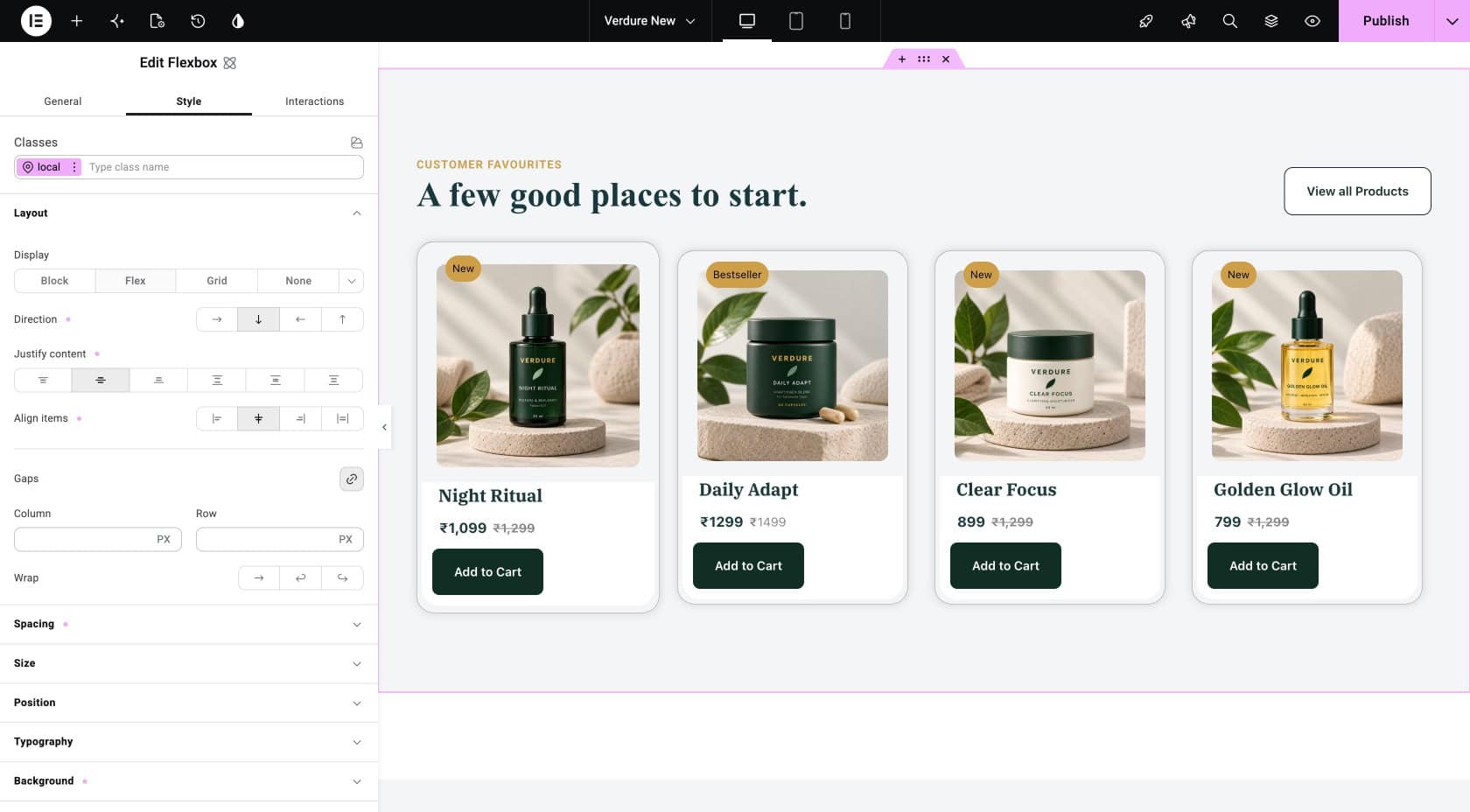
This guide walks through building your first Component, letting each copy show different content, reusing it across the site, and knowing when to detach a copy instead of forcing it to stay in sync. The running example throughout is a Verdure product card, built once and reused across the site, with one copy detached for an out-of-stock product.
Before You Start
Elementor v4.0 or later. Components are a v4 feature.
Elementor Pro. Components require Pro. The free version does not include this feature.
Admin permissions. Only admins can create or edit Components.
Atomic elements only. V3 (classic) widgets cannot go inside a Component.
Notes: We assumes that you already have Variables and Classes set up. If you haven’t, start with the Complete Guide to Elementor v4 Variables and the Complete Guide to Elementor v4 Classes first. Components sit on top of everything you build there.
What Is a Component, and How Is It Different from a Global Widget?
A Component is a reusable design block. Its structure and styling stay synced everywhere you use it, but specific content fields inside it, like a product name or an image, can be exposed so each copy shows something different. When one copy genuinely needs to break the pattern, you can detach it and edit it freely without affecting any of the others.
Elementor already had something similar called a Global Widget. Here’s how the two compare:
| Global Widget | Component | |
|---|---|---|
| Design | Same everywhere | Same everywhere |
| Content | Same everywhere | Different per copy |
| Want to change something on just one copy? | You have to unlink it, which breaks the connection to the others forever, even for a small text change | Small content changes (text, image, price) are built in, no unlinking needed. For a bigger change (like disabling a button), you can detach just that one copy |
| Best for | Things that should always look and say the exact same thing, like a floating CTA banner | Cards, testimonials, anything that shares a design but needs different content |
For most real work, product cards, service cards, testimonials, Components are the better fit.
How Do You Build Your First Component?
Building a Component happens in two parts: you design it like any normal element, then you mark the fields that should vary from copy to copy.
Build the design
- Start on any page. Add a Div block or Flexbox container as the outer wrapper, since every Component needs one.
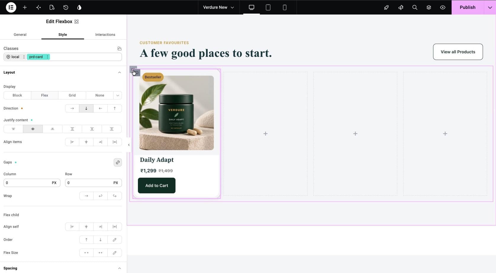
- Inside it, add your atomic elements. For the Verdure card that’s an Image element for the product photo, a Div block for the body, and inside that a Paragraph for the rating, a Heading for the product name, another Paragraph for the price, and a Button for Add to Cart.
- Style it exactly the way you want every copy of this card to look.
Turn it into a Component
- Right-click the wrapper Div block and choose Create component.
- Name it something meaningful, for Verdure that’s
product-card, and click Create. - Elementor processes this for a moment, then drops you into Component editing mode, a special view for working on the original design.
Tips: Get the design fully finished before you expose properties or place copies anywhere else. Change the styling later, after copies already exist, and you’ll have to double-check every copy by hand to make sure it still looks right.
How Do You Expose Editable Properties?
Right now, every copy of this Component would show identical content: same photo, same name, same price. To let each copy differ, you expose specific fields as properties.
While still in Component editing mode, click the element you want to make editable, say the product image, and look for a small diamond icon next to its setting in the panel.
Click it, give the property a clear name, and confirm. That field is now exposed, and every future copy will let editors change it.
A typical Verdure product card exposes:
- Product image
- Product name
- Current price (and old price, if you show a strikethrough)
- Star rating
- Button link
- Badge text (“Bestseller,” “New,” and so on)
Everything else, padding, colors, borders, hover animation, stays locked to the original design.
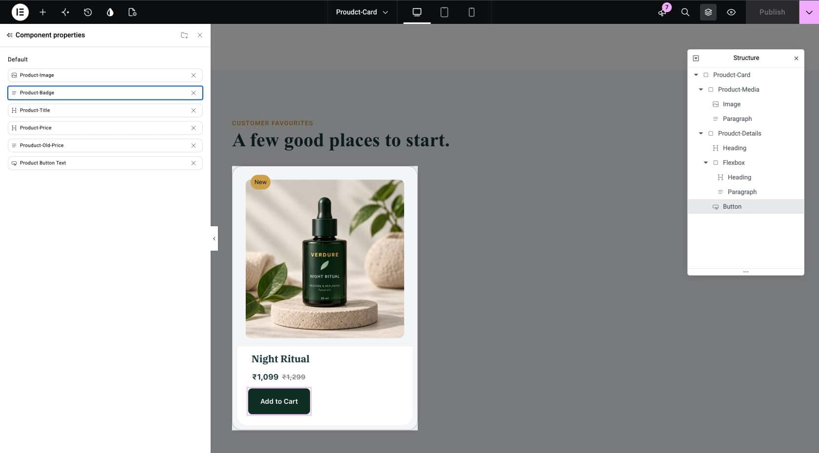
Once you’re done, click outside the editing overlay to return to your normal page editor.
How Do You Reuse a Component Across Your Site?
Once created, your Component shows up in its own Components tab in the widget panel, right next to the regular Elements tab.
To place more copies, drag the Component from that tab wherever you need it.
Click on a copy, and the settings panel now shows only the properties you exposed, not the full list of every style setting, so editors can’t accidentally break the design while filling in content.
Fill in the product photo, name, price, rating, link, and badge for each copy, and repeat for as many products as you need.
Every copy looks visually identical but can show completely different content. That is the entire point.
All of these copies stay synced to the original design. Go back into Component editing mode and change the border radius or padding, and every copy updates instantly. Content stays per-copy. Structure and style stay shared.
When and How Do You Detach a Component?
Here’s a real scenario. You need another product card on the homepage, but this product is out of stock. It should look like the other cards but show a disabled “Out of Stock” button instead of a clickable “Add to Cart” one, greyed out, non-clickable, different text.
This isn’t a content change you can solve by editing a property. Whether a button is clickable at all is a structural difference, and it only applies to this one card. The fix is to detach just this one instance from the original design.
Important: Detaching is permanent. Once you detach a copy, it stops receiving any future changes made to the original design, and there is no way to reconnect it. Only detach a copy once you’re sure you want it to stop following the original forever.
Detaching breaks the sync between that one copy and the original design, permanently. The copy keeps its current look, but becomes a normal set of elements you can edit freely from then on. Any future changes to the original design will simply not reach it anymore.
To detach:
- Right-click the copy you want to break away.
- Choose Detach from Component.
- Confirm the action.
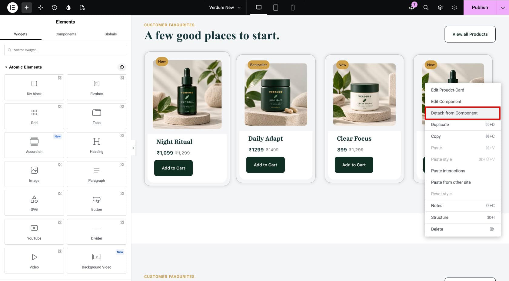
From there it behaves like any other element on the page: change the button text, swap its background, remove the link so it isn’t clickable, and add anything extra you need, like a “Notify me when back in stock” link.
Increase the padding on the original design later, and every synced card picks up the change automatically. The detached out-of-stock card stays exactly as it was, because it no longer listens to the master.
Should You Expose a Property or Detach?
The most common mistake with Components is reaching for the wrong tool between these two.
| Expose a property when | Detach when |
|---|---|
| The variation is only content: text, an image, a link | The variation is structural: adding or removing elements, changing behavior |
| It’s likely to repeat across several copies | It’s a genuine one-off, not a repeating pattern |
| You want future changes to the original design to keep reaching this copy | You’re fine with this copy no longer receiving those changes |
| Example: a different product name and price per card | Example: the out-of-stock card with a disabled button |
Get this wrong in either direction and it costs you. Detach too easily and your site fills up with copies that quietly miss every future design update. Refuse to detach when you should and you end up with one overloaded Component full of conditional properties trying to do the job a clean detach would have solved in one click. Most copies on a real site should stay synced. Detach is the exception, not the default.
What Mistakes Should You Avoid?
- Building Components before your design system is stable. If your Classes and Variables are still changing, every design tweak becomes a Component update too. Settle those first (see the Complete Guide to Elementor v4 Design System), then build Components on top.
- Placing copies before exposing properties. If you drop several copies on the site before exposing any properties on the original design, all of them show identical content. Finish the original design first.
- Detaching when you should have exposed a property. If you find yourself detaching several copies just to change the same field, that field should have been an exposed property instead.
- Forgetting what detaching costs you. Once detached, a copy stops receiving those changes. If a redesign happens later, every detached copy will visibly fall behind.
- Using V3 widgets inside a Component. Components only support V4 atomic elements. A classic widget dropped inside simply won’t work. Rebuild it with the atomic equivalent instead.
Frequently Asked Questions
Do Elementor v4 Components work in Elementor Free?
No. Components require Elementor Pro.
Can I use Components with V3 (classic) widgets?
No. Components only support V4 atomic elements. Your existing V3 widgets keep working elsewhere on the site, but they can’t be placed inside a Component.
What is the difference between a Component and a Global Widget?
A Global Widget shows the same design and the same content everywhere, and changing content on one copy means unlinking it, which permanently breaks the sync. A Component shows the same design everywhere but lets you expose specific content fields so copies can differ, without ever breaking the sync.
How do I know if a Component has been detached?
You can’t tell just by looking. A detached copy becomes a regular set of elements with no visible marker that it was ever a Component. On larger sites with several editors, it’s worth keeping your own note of what’s been detached.
Can I re-attach a detached copy to its Component?
No. Detaching is one-way. If you want a copy back in sync with the original design, delete it and drop in a fresh copy of the Component instead.
How many properties can I expose on one Component?
There’s no hard limit, but keep it practical. A Component with too many exposed properties becomes confusing to fill in. If you’re exposing a lot, it may be worth splitting it into two smaller Components instead.
Do original design updates reach copies immediately?
Yes, for every synced copy across the site. Detached copies are the one exception, they stop receiving updates the moment they’re detached.
Wrapping Up
Variables give you tokens. Classes give you reusable styling bundles. The Design System panel gives you visibility over both. Components give you reusable design blocks, the piece that turns all of it from theory into something you actually build with. Design a card once, reuse it everywhere, update the original design when the brand changes, and detach the rare one-off that genuinely needs to break the pattern.
The takeaways:
- Components are reusable design blocks with per-copy content. The natural next step after Variables and Classes.
- Expose properties for content that varies: text, images, links, prices.
- Detach only for structural, one-off changes, knowing you give up future changes to the original design in exchange.
- Most copies should stay synced. Detach is the exception, not the default.
- Components complete the Elementor v4 design system: Variables, Classes, the Design System panel, and Components.