DA – ACF Gallery
Advanced Custom Field Pro (ACF Pro) provided a powerful gallery field to upload multiple images. Read more about the ACF Gallery field.
You can display images from these ACF Gallery fields using the DA – ACF Gallery widget.
With this, you have an option to display multiple images in the form of a grid or carousel.
DA – ACF Gallery has many Layout options through which you can adjust the setting according to your creativity level.
Skin: Skins define the way you want to show the images. There are three modes available – Grid, Carousel, Smart Grids, and Justified Grid.
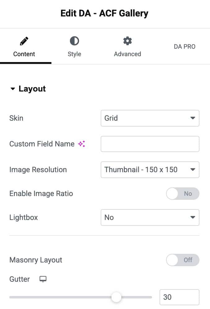
Content
Layout
Grid
Options available for Grid Skin
- Custom Field Name: In this, you have to enter the field name.
- Image Size: Select the image size for your gallery.
- Enable Image Ratio: Enable it to set the image ratio.
- Image Ratio: Set the image aspect ratio
- Lightbox: The gallery images will be displayed by filling the screen and dimming the rest of the Post/page with this option.
- Masonry: Enable the option to display gallery in masonry layout (applicable when Lightbox is disabled).
- Gutter: With a gutter option, you can create space between two columns.
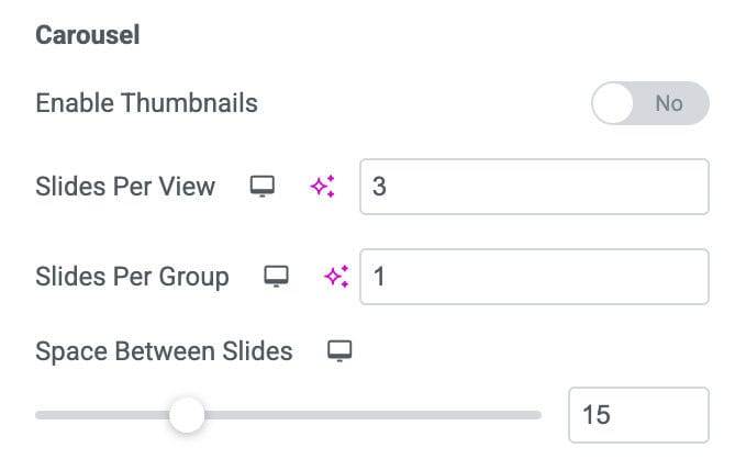
Carousel
Options available for Carousel Skin
- Slides Per View: Here, you can add slides to your Carousel according to the pictures you are adding to the gallery.
- Slides Per Group: Specify the number of sides you want to add per group.
Setting
- Speed: You can increase/decrease the speed of your Carousel slides.
- Autoplay: Enable Autoplay, and it will automatically play The gallery as you open your Post/Page.
- Duration: Here, you can decide the duration of your autoplay slides.
- Effects: Choose the Effect of your Carousel, which will be shown on the front end, i.e., Slides, Coverflow.
- Space Between Slides: you can increase/decrease the space between two slides from this option.
- Loop: It will continuously play the Carousel in a loop.
- Auto Height: Set the height of the carousel
- Zoom: In this, the Carousel images will be displayed in the zoom mode.
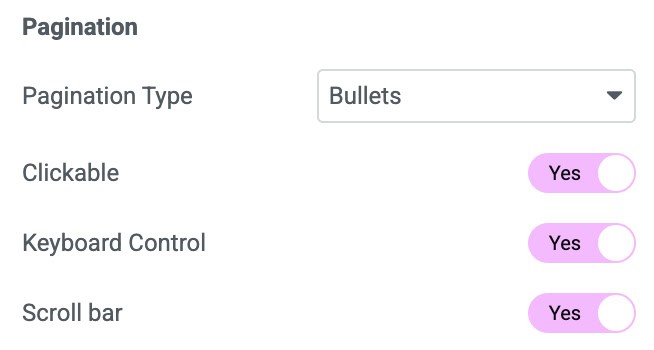
Pagination
- Pagination Type: add a type for the Pagination, i.e., Bullets, None, Fractions, Progress. This will be shown at the bottom of your gallery.
- Previous/Next Button: From this, you can add the Previous/Next Button to your gallery to move the gallery images.
- Keyboard Images: Here, you can control your gallery from the keyboard buttons.
- Next Scrollbar: If you enable this, then the scrollbar will be visible at the bottom of your gallery.
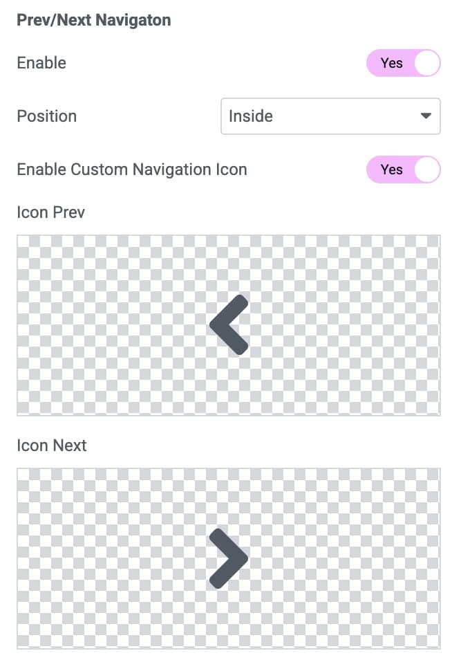
Prev/Next Navigation
- Enable: Enable it to add navigational arrows
- Position: Set the position for the arrows like Inside or Outside the carousel
- Enable Custom Navigation Icon: Enable to add custom navigational icons.
- Icon Prev: Select the previous icon
- Icon Next: Select the next icon
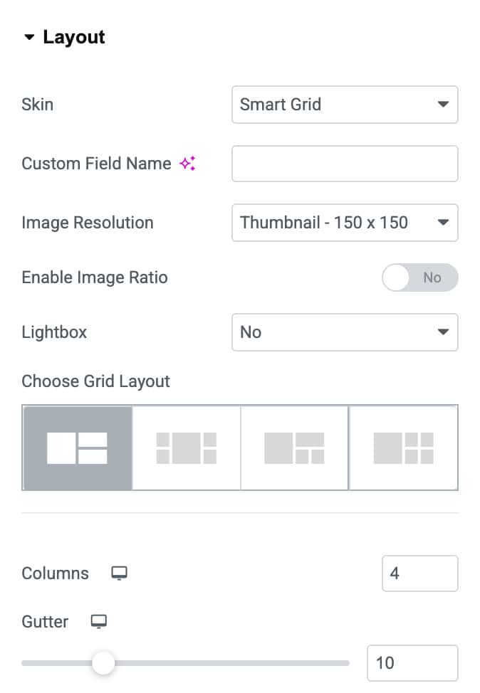
Smart Grid
- Custom Field Name: In this, you have to enter the field name.
- Image Size: Select the image size for your gallery.
- Enable Image Ratio: Enable it to set the image ratio.
- Image Ratio: Set the image aspect ratio
- Lightbox: The gallery images will be displayed by filling the screen and dimming the rest of the Post/page with this option.
- Choose Smart Grid: Choose the layout styles to display the gallery images in Smart Grids. There are four layout styles available to choose from.
- Columns: Here, you have to input the column’s size for your grid format.
- Gutter: With a gutter option, you can create space between two columns.
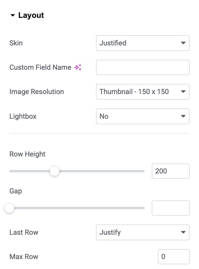
Justified Grid
- Custom Field Name: In this, you have to enter the field name.
- Image Size: Select the image size for your gallery.
- Lightbox: The gallery images will be displayed by filling the screen and dimming the rest of the Post/page with this option.
- Row Height: Adjust the preferred row height accordingly.
- Gap: Adjust the amount of space between images.
- Last Row: Select whether to Justify the last row or not. Or hide the last row if it can’t be justified. You can also set the alignment of images in the last row as Left, Right, or Center.
- Max Row: Limit the number of rows to show.
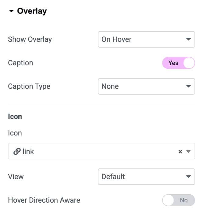
Overlay
When selecting Skin as Grid, Smart Grids, and Justified Grid, there are settings available to apply overlay effect to the gallery images.
- Show Overlay: Select On Hover to have an overlay appear upon hovering over each image, or choose Hide on Hover to hide the overlay on Hover. You can also select Never if you do not want to apply the overlay effect.
- Caption: Enable it to display a caption as an overlay title.
- Caption Type: Choose which meta attribute to be displayed as the overlay Caption. Select from the image’s Title, Caption, and Description.
- Icon: Choose an icon to be displayed.
- View: Select an Icon style like Default, Stacked, or Framed.
- Hover Direction Aware: Enable to apply Overlay on hover direction aware.
- Overlay Speed: Adjust the Overlay Speed accordingly.
Note: The return format Image Array is supported for the Gallery Field Type.
Trigger
Copy this widget ID and paste it into the DA – Trigger widget to add trigger actions for the Carousel skin.

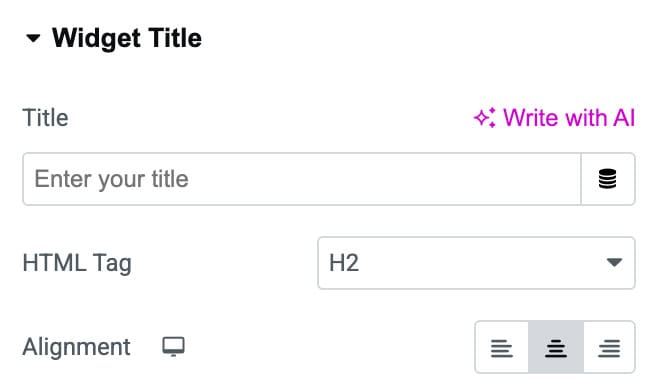
Widget Title
- Title: Enter the ACF Gallery title.
- HTML Tag: Choose the HTML tag to render the title.
- Alignment: Set alignment for the title text.
Style
Layout
- Border Type: Choose the border type.
- Border Radius: Set the border radius.
- Item Shadow: Adjust the item shadow.

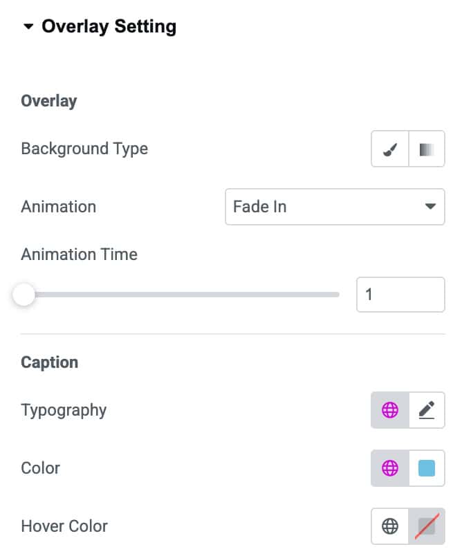
Overlay Settings
Overlay
- Background Type: Choose the background color or gradient for the overlay layer.
- Animation: Select how the overlay appears (e.g., fade, slide, zoom).
- Animation Time: Adjust the duration of the overlay animation effect.
Caption
- Typography: Customize the caption text style including font, size, and weight.
- Color: Set the default color for the caption text.
- Hover Color: Define the caption text color when hovered.
Icon
- Primary Color: Set the main color of the overlay icon.
- Secondary Color: Choose an optional secondary color for dual-tone icons.
- Primary Color Hover: Change the icon’s primary color on hover.
- Size: Adjust the size of the overlay icon.
- Rotate: Apply rotation to the icon by setting the rotation angle.
Widget Title
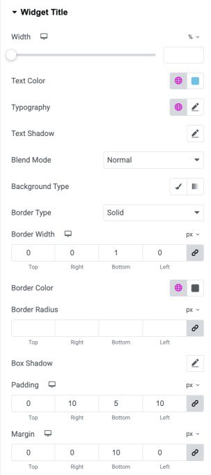
- Width: Adjust the overall width of the widget title container.
- Text Color: Set the color of the title text.
- Typography: Customize the title’s font, size, weight, and style.
- Text Shadow: Add and adjust a shadow effect behind the title text.
- Blend Mode: Control how the title blends visually with the background.
- Background Type: Choose a solid or gradient background for the title.
- Border Type: Select the style of border applied to the title container.
- Border Width: Set the thickness of each side of the title border.
- Border Color: Choose the color for the border around the title.
- Border Radius: Adjust the corner roundness of the title container.
- Box Shadow: Add outer shadow effects to the title area.
- Padding: Control inner spacing around the title text.
- Margin: Add outer spacing to position the title within the layout.